Considering how dynamic, enthusiastic, and hyper-niche the Reddit community is, it’s a bit of a shame to know that the Reddit logo has never been able to live up to the community’s unfiltered, unabashed spirit. It always fell short, looked a bit dated, and lacked personality.
Until now.
In November last year (2023), Reddit got itself a brand new logo, courtesy of Pentagram — the identity design powerhouse that has created the likes of the MasterCard logo, the new DC logo, and most recently, the Wonka movie logo.
The redesign has infused a new life to the Reddit brand. It’s livelier, much more expressive, and quite polished, to be honest. The mascot, Snoo, is especially delightful.
The Reddit Logo Before and After
While the new Reddit logo comes on the coattails of an in-house controversy and some overripe rumors of a potential IPO, it’s got some great things going on. See all the differences in this quick before and after.
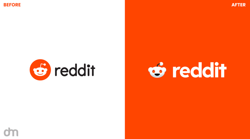
Breaking Down the Bold New Reddit
The Reddit logo redesign contains 5 key changes. We discuss all of them below.
The stylized Snoo logo
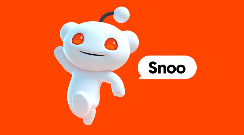
The new Reddit logo features the floating head of Snoo as its logomark. It’s contained in the conversation bubble — another new addition to the Reddit brand — and has an engaged and happy expression. It’s got a bigger and wider smile too now.
The new logo is in all three signature colors of the brand — OrangeRed, black, and white. According to the brand guidelines, the new logo mark should accompany all marketing assets and be visible on all official channels.
In the full version of the logo, the wordmark joins with the logomark. But on the Reddit platform, the Snoo icon can appear on its own without any help from the brand logotype.
A livelier and more expressive 3D mascot
Snoo has been the Reddit mascot for as long as anyone can remember. He is an anthropomorphic alien with a bent antenna on his head. Through that cherubic smile and that sprouting antenna, Snoo is supposed to be a symbol of Reddit’s relevancy for all the future generations.
But if you look at the original and earlier versions of Snoo, he’s always been in 2D — severely limited in his ability to humanize the Reddit brand.

The new Snoo changes that with a bang!

The 3D Snoo is infinitely more expressive, lively, and fun. He’s got a spring in his step and two opposable thumbs! His smile has also gotten bigger and he’s not afraid to use a range of emotions to show you exactly how he’s feeling.
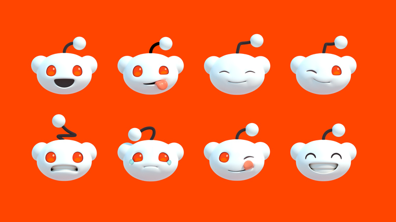
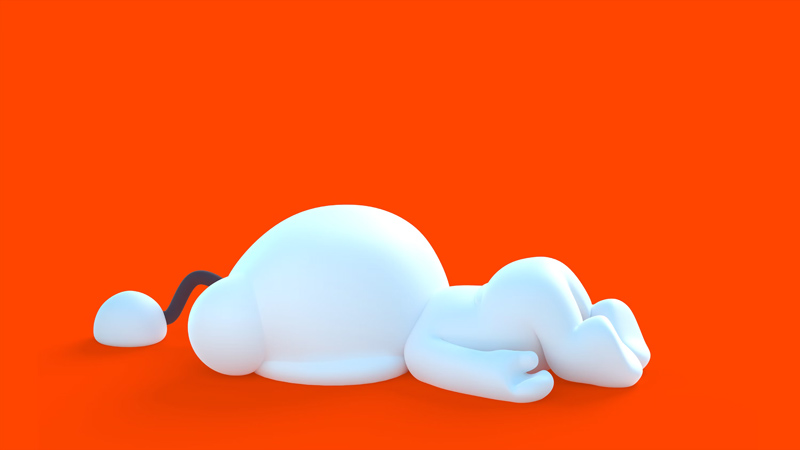
The original Snoo was always contained in an orange circle next to the logo wordmark, but the new design sees him free of any constraints. You can now appreciate Snoo in all his different gestures and poses — just like the one below.
The expansion in the color palette
When we talked about the Reddit glowup, we didn’t lie. Look at all the vibrant new colors the brand is sporting.
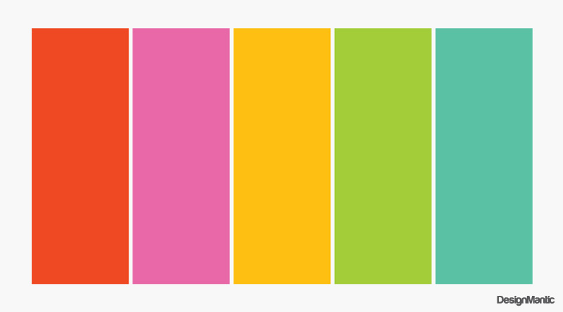
In addition to the brand’s signature OrangeRed, Reddit now boasts hues as colorful as the GuavaPink, the JuniperBlue, the LimeGreen, and BananaYellow. These colors are grouped under the brand’s primary and secondary color palettes.
The primary color palette contains three colors: OrangeRed, Black, and White.
The secondary color palette is a bit more diverse and contains all the rest — GuavaPink, JuniperBlue, LimeGreen, and BananaYellow — along with the signature OrangeRed.
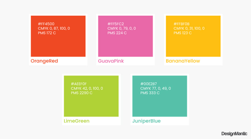
Then the color palette further branches into secondary tints, tertiary colors, and even tertiary gradients. If you’re really into it, here’s a link to where Reddit talks about its colors.
For the casual reader, here’s the TLDR:
- Reddit is now more expressive and has various color choices to support its voice and expressions.
- Reddit primary colors are there to represent and uplift the brand.
- The secondary color palette is for Redditors and their communities to express themselves more fully.
- When prioritizing primary colors, keep OrangeRed as your main player.
- When working with the secondary palette, tints should be used to add contrast and distinction.
Traditionally, the Reddit branding colors have been somewhat subdued, compared with the enthusiastic subcultures driven by its communities.
The variety in the new color palette is a breath of fresh air. It guarantees that Reddit is now better able to express its personality, communities, conversations, and global perspectives.
A custom new typeface
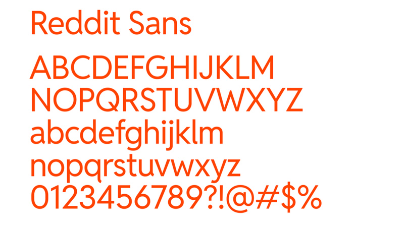
The new Reddit logo font is getting some serious buzz in the office. We all love the custom typography system introduced by Reddit. There are two typefaces in the system: Reddit Display and Reddit Sans. Each is a bespoke design, reserved for headings and body, respectively.
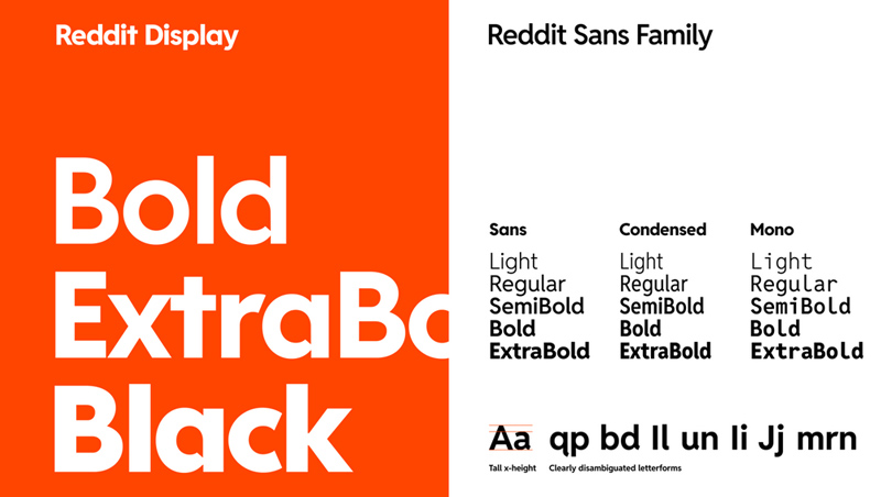
Reddit has huge plans for its custom typefaces. While the Reddit Display embodies the themes of conversation — character strokes join to form chat bubbles — the brand has reserved it exclusively for its bold wordmark and expressive headlines.
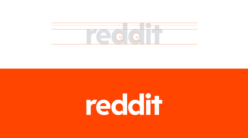
Its sans serif font, Reddit Sans, on the other hand, is going to go public as an open-source font both on GitHub and Google Fonts. Reddit has created this typeface to be internet-friendly. Its x-height is versatile, ensuring good readability with disjointed letterforms aiming for quick identification and an accessible online experience.
Introducing the conversation bubble
Along with dusting off existing logo design details and creating them anew, designers at Pentagram have given Reddit brand-new visuals that are designed to highlight the dynamic culture of the brand.
These details include the introduction of the conversation bubble in the rebrand.
While you won’t see the chat icon appearing anywhere on the Reddit platform, the detail is there to highlight what Reddit is all about — conversations and conversations.
The introduction of the chat bubble may not have utility on the platform but it certainly has meaning — which Reddit is really excited about. The conversation icon appears prominently all over the rebrand, making its first appearance as a container for the floating head of Snoo in the video.
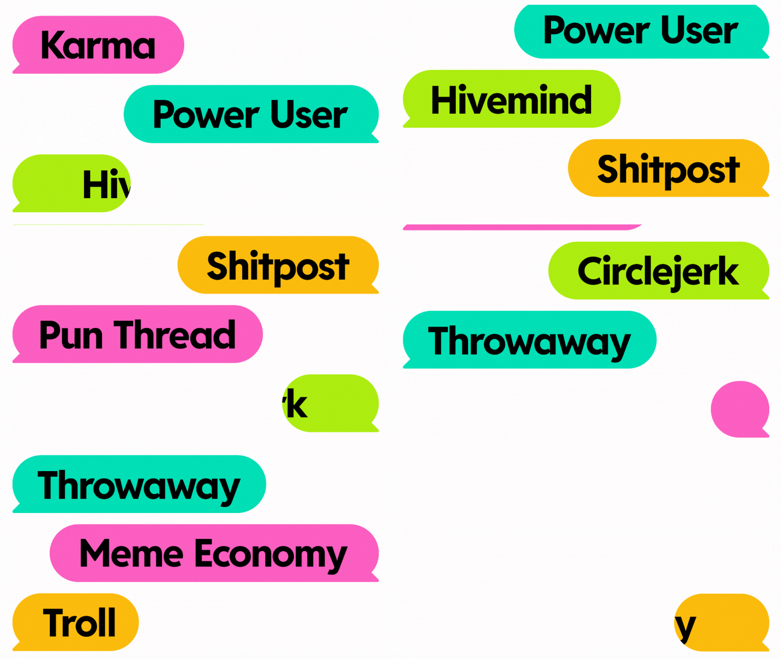
You then see it throughout the brand update and receive the message that Reddit, first and foremost, is a platform that supports conversations, discussions, and open dialog.
So, do you upvote the redesign?

The old Reddit logo was just another asset in the brand’s ever-expanding design store. It was overcrowded and sometimes made little sense.
The new Reddit logo has changed all that. With a bold new logo, Reddit branding has finally stepped into its digital presence. It has embraced an identity that supports its expressions, conversations, and eclectic personality.
Whether you are in love with the custom Reddit logo font or the lovable new Snoo, the Reddit redesign has something for everyone.
What do you think? Does it get your upvote?

