Typography is one of the core tenets of a brand’s visual identity. Along with color and logo design, typography serves unique brand purposes. It gives depth to the brand character, makes reading easier, and adds emotional dimension to the design.
When we develop a typographic system, this is what we are doing:
- Choosing a set of 2-3 fonts for various components of the brand (logo, website, packaging, CTAs, and so on)
- Arranging those fonts in levels of hierarchy so the content becomes easy-to-understand, recognize, and digest.
It may look like a straightforward process, but usually isn’t. You have to think about things like if your chosen fonts go well together, whether their different combinations are flexible enough to go on a variety of brand media, and are they able to help your brand stand out from the competition.
A well-structured typography system achieves all that and more.
But landing on such a solid system comes with practice and experience. In this post, we are sharing some well-tested design practices that will help you get there.

But, first let’s visit some terminology.
The Difference Between Typefaces and Fonts
For a casual learner of typography, there isn’t much distinction between typefaces and fonts. In digital design, the two terms are routinely used interchangeably. But if you are designing an entire system of typography, you need to get all the details right and knowing the right terminology will help.

Typeface: Also referred to as Type Family; it points to a particular design of letters and numerals. Examples: Helvetica, Arial, Times New Roman, and so on.
Font: It’s a subcategory within a typeface and refers to a particular size, weight, and style of a typeface. Examples: Helvetica, 18 pt, Italic. Or Arial, 9 pt, Bold.
Again, for all intents and purposes, it doesn’t matter if you say font and mean typeface. The distinction will only be relevant when you are sitting down and assigning font sizes to your CTAs on app, website, social media, and more.
Related: The Handy Type Glossary For Noobs
How To Establish A Typographic System: 7 Steps
1. Keep Your Logo Design Separate
Many people think a brand’s type system covers the typeface and font pairings you use in your logo design, too.
However, the truth is, your logo type and your brand’s larger type system need to be two different things.
The reason?
To make your logo stand out — even within your brand’s larger scheme. It should be a distinct piece of design, prominent on the website, app, product packaging, and more. While your brand’s typography language must make legibility a fundamental need, a logo type needs to convey the brand’s inherent character, emotion, and personality.
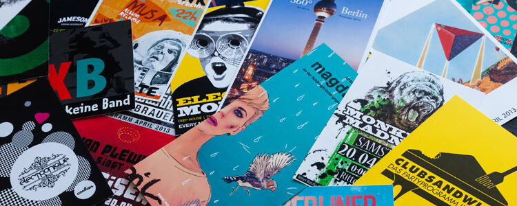
Look at these beer names for example:

Each name, with a different font, gives off a unique vibe. A distinct character.
Sixty Nine is round, fuller, and makes you think that the beer will be as rich and hearty as this meaty font. Renegade is bold, confident, but follows tradition. You can rely on this beer; you’ll taste a familiar sample.
It is no accident that these fonts elicit these particular emotions in us. Designers have worked hard here to choose fonts that converge well with each brand’s unique character.
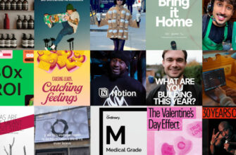
2. Line Up Your Brand Assets
Next, it’s time to begin working on your type system.
Start by listing down everything that needs a typeface. Typically, this list will include:
- Website
- App design
- Social media (feed, header, images, videos)
- Print assets (stationery, posters)
- Packaging and labels design
- And more.
This list will also include sub categories. CTAs, photo captions, and blog pages for websites. Headings, subheadings, and body text for print assets. Same thing with packaging and labels.
So list everything down so you know what you are working with. It will not only give you a scope of the problem but will also help you organize your list. You can, for example, group all the headings — across the brand —- and assign a single font to them.

Similarly, you can reserve one font in a certain color for all CTAs no matter where they are — website or app —- and do the same thing.
It not only improves consistency but works to make your system more coherent and cohesive, too.
Important Note: this discussion does not apply to the fonts you will choose for your logo. Those should be kept separate to make your logo design appear truly distinct.
3. Decide between Free, Paid, and Custom
We have a wealth of typefaces to choose from. Millions of them, actually. Some are paid, some are free, and some you design by yourself.
- Paid typefaces are more exclusive and help you create a brand identity that’s hard to match.
- Open source fonts come free and are less exclusive. But if you aren’t yet ready to commit to a particular style, free fonts are ideal. You have a lot of variety to choose from and Google Fonts is a good place to start.
- Custom typefaces are font designs that you create from scratch. You need to hire a typography designer for this and it won’t come cheap.
Since, there are many variables that will make you lean towards one option or the next, stick to what works for your brand. If you are an SMB or a startup, the most efficient route is to use either a custom font or a free font.
With paid fonts, your licensing fees can add up and you’re still using something that’s available for others.
While free fonts can be limited and available to anyone, they are a huge time-saver. Plus, for a startup, it makes sense to leave room for a future rebrand. As your business and your needs evolve, so can your brand font without costing you an arm and a leg.
Custom fonts give you something truly unique and are worth the price. You are not competing with anyone else and have full control over the typeface.
You can also mix and match. Pair a custom font with a free one or use a paid font for primary content areas whereas use the free type for things that are less important, such as photo captions.
4. Make A List
Now that you know which way you are going, shortlist your favorite typefaces. This is a critical phase. You run the risk of getting lost here, overwhelmed by variety. Keep yourself anchored by thinking about what your brand needs, and make a shortlist containing 10-15 typefaces.
Some factors that help in your search:
- Distinct: the type must be unique; help your brand stand out.
- Comprehensive: it should contain all the characters, symbols, letters, and numbers you need, now or in future.
- Flexible: the fonts you choose must be accessible, responsive, and work equally well both in print and digital media.
- Legible: must be easy to read and comprehend.
- Compatible: the fonts you choose should work together with each other as well as your brand.
- Accessible: users with varying amounts of visual and perceptual abilities are going to consume your content. Make your type accessible for all users so you can widen your target market.
Once you have shortlisted your strongest contestants, let’s move to the next step.
5. Mix And Match
This is the meat of the matter. Here you are creating the actual typography system that we are talking about. Everything we have done so far has led us to this point.
So jump right in.
Take a look at the fonts you have shortlisted. Highlight your strongest suits. And then, mix and match.
You want a maximum of 3 typefaces in your system. Two is the ideal but if you are looking for more flexibility and variety, perhaps a third typeface can help you get there.
Here are a few things to take care of and mistakes to avoid.
– Ideally, Pair A Serif Font With A Sans Serif.

The contrast between the two will make your design and content more digestible and appealing. Designers typically choose the serif font for headers and sans serif for body text but you can flip the script for more effect.
– Your Font Pairings Should Have Visible Differences.

This includes differences in sizes, weights, moods, and personalities. Sufficient contrast is necessary to distinguish headers from body text and make reading easier. Fonts that gel well together in terms of moods and personalities are also better than those that are too different. Remember, you want harmony in your design, not discord.
– Pair Fonts From The Same Family/Typeface.

It will make your pairings more harmonious while still staying true to contrast. Variations in size and weight can achieve great font pairings that remain loyal to the brand mood and personality.
6. Create A Type Hierarchy
Hierarchy refers to the system of organization in order of importance. Elements such as size, weight, scale, and colors are used to arrange things in order and highlight what’s most important and what’s less.
Font organization makes the text more understandable. It’s the reason you can look at this article and discern between the title, headings, and text body.
Without type hierarchy, the content can look like a long piece of similarly-sized, -scaled, and -colored object.

For your brand’s typography language, hierarchy will also serve to assign rules to your fonts. You can divide your hierarchy into three levels:
– Primary:
This is your default typeface. It usually aligns well with your logo type and carries the core vibe of your brand. It’s used for things like titles and headers, etc.
Your primary type is the heaviest, largest, and most prominent font so it stands out from the rest of the text.
– Secondary:
It’s shorter and milder than the primary typeface but is still heavy and prominent. It’s usually reserved for subheadings, product labels, and so on.
– Body:
This is the font that will be used the most throughout your content and brand platforms. This is the one where you need the most legibility. It’s used for the body of the text, call-to-action buttons, and such.
To truly master the art of typography, it’s important to remember that along with size (how large/big the font is) and weight (is the font thick or thin), color is also an integral part of type hierarchy.
It not only conveys the importance of different sections of the text but assigns emotions to them, too, and influences behavior. Take CTA buttons, for example. You can make them the same size as the rest of your text but color them green and immediately they’ll stand out on the website. Kind of like the underlined blue of the hyperlinks. Same size as the rest of the text but the color and the underline helps us spot them from a mile away.
7. Record the System in Your Style Guide
Finally, it’s time to write everything down.
We have talked about brand style guides before, so this is a great moment to remind ourselves and everyone that your brand’s typography system needs to have its own entire section in that guide.
Write down all the rules. Which font goes where and in what color; which is the maximum font size for your headers; as you move from one platform to next, how will the fonts accompany you?
Write everything down so nothing is left to chance. By recording your type system in your brand guide, you ensure consistency of style irrespective of the platform of your brand. It also helps you follow a thought and pattern when your brand starts to grow and your type system needs to evolve with that.
The Takeaway
Creating a brand’s typography system is a huge task requiring detailed work. To get it right, two things will work in our favor:
- A set of 2-3 typefaces that sync with each other but still have enough contrasting qualities that allow distinction between different sections of the text and font moods complement the text; and
- Knowing about our brand’s core assets (website, labels, and packaging etc.) that require a typeface and then assignit fonts and font rules to each of those assets.
While this whole process is going to be a game of trial and error, following a few simple guidelines will keep you on the right track. Hopefully, this article has introduced you to some of those essential guidelines and you can use them to mark your path as you go.
Remember, wherever you get stuck, use your brand to point you towards the north again!