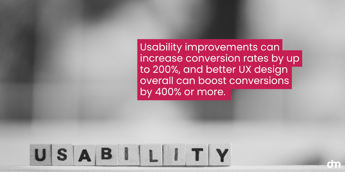
Isn’t it frustrating when a website takes forever to open, and when it does, the design is botchy, and reading it feels like a mind game? If you’re a business owner and your website is not up to the mark, there is a high chance that this is the reason why your leads are not converting. Each second of delay can decrease conversions by 7% or more, meaning lost revenue.

In a world where the internet is lightning fast, a slow and buggy website will never attract visitors who stay for more than two seconds.
But what does it take to design a website that converts visitors into leads? The answer is in the user experience (UX). UX is the intentional strategy of designing a seamless, enjoyable, and effortless journey for every user. It can turn frustration into trust and clicks into paying customers. Here is your guide to making UX your ultimate secret weapon behind high-converting websites.
Why UX and Conversions Go Hand In Hand
User Experience (UX) focuses on how a user feels, thinks, and acts as soon as they click on a website. The UX design ensures that the user is not frustrated, has a good impression of the website (ultimately the brand), and takes the appropriate action.
UX designers implement strategies from the first step to accomplish a successful user journey. This is intended to solve problems, empathize with the user to simplify their journey, and boost conversion rates.
Let’s take a look at the key principles of a UX strategy:
When designing a website’s user experience, it is crucial to consider some key principles. These principles will help you ensure visitors cruise through your website without a hiccup.
1. Usability
This metric decides how easily your visitors can use your website. If your website lags or has empty pages with bad navigation, this will only confuse the user, and they will bounce off to other, more usable websites.
Think of it this way: When you enter a shop, would you like to find the product you came in looking for easily, or would you prefer to roam around the shop for several minutes, as the salesperson, only to find what you need? The latter is not just a waste of time and energy; you might lose interest halfway, which can negatively impact business.
This is why UX designers focus on making the website easier to use with practical design elements. When designing the website, ensure your users have a low cognitive load and can navigate with minimal effort. Keep in mind that they should find what they came looking for in the first few seconds of their visit. To assess your website’s usability, you can always use a checker to determine what needs improvement.
2. Prototyping & Testing
How will you know your design works for users until you test it? Basing a website design on assumptions is a rookie mistake. Remove the guesswork from the equation and validate your design by checking it.

Once the prototype is complete, you need to test it immediately. To assess your website’s usability, you can always use a checker to determine what needs improvement. In addition to usability, you should also compare two versions of a live page to track performance and use the one with the better results. This is called A/B testing, which will help you test different theories.
To turn test results into decisions, ensure your team can read metrics, segment users, and validate hypotheses with real data. Upskill with introductory data analysis courses that cover SQL, Excel, and BI tools so designers and PMs can crunch usability logs, analyze funnels, and visualize A/B outcomes without waiting on engineering. This shared data literacy shortens the feedback loop and leads to faster, more confident UX iterations.
Performing tests can help you remove bugs even before you write the code. Rectifying the mistakes at this stage will help you minimize costs.
3. Information Architecture
Knowing where to put what is crucial to improving user experience. Information hierarchy is the structural design and organization of your website’s content. It determines how easily your users can find what they are looking for. Each page and its placement are decided within the information architecture, so they are harmonious and logical.

For instance, if your user is coming in looking for services, don’t offer solutions. Give the user exactly what they are looking for without complicating it. Use a predictable path so the conversion doesn’t take much time, and visitors can easily access the service and the price, and then follow the CTA to place an order.
Your website’s design strategy and plan should focus on information hierarchy, but ensure the visual hierarchy complements it. With visual elements, correct labeling and content placement can push the lead in the right direction.
4. Accessibility
Your website represents your business, and web designers make it accessible to everyone. Accessibility on a website means that whatever product or service you offer is available and easily accessible for both able-bodied and differently abled people, such as people living with dyslexia.

And not just that, but environmental and situational factors also impact your website’s user experience. To help you understand the concept better, here are some key design elements that improve accessibility:
• Color Contrast
This ensures that the text and background colors are contrasting and readable for visually impaired users. It also ensures that your website can be used even if the user is outdoors and in sunlight.
• Keyboard Navigation
Since not all users will access your website with a mouse, they should be usable without one. This is to facilitate assistive tech.
• Alt Text
Screen readers can’t see images; therefore, all the images on your website should have alt text.
• Clear Form Labels
Forms should be placed strategically so the screen readers can spot them easily.
UX Design Process
To design a website that converts leads and is loved by users, you must follow a well-structured design process for the best possible outcomes.

Step #1: Discover
Think of this step as your brainstorming session. This is where you gather information, such as your main users’ needs and actions, and your competitors’ actions. To get this information, you must analyze all the existing data and research to clearly identify the pain points and understand consumer behavior for your ICP.
Step #2: Define
Once you have all the raw data, it is time to think inwardly. Filter out all the insights and keep only those relevant to your business. Then, create user personas for direct or first-degree customers of your product or service. After that, you can list all the pain points your ICP faces with other websites and then use them to develop the necessary solutions.
Step #3: Ideate
In the ideation stage, you use all your research to come up with solutions to all the problems you have identified previously. The next step is to loosely draw the website’s layout with a digital wireframe and explore layout and flow options. Don’t worry about designs just yet; instead, focus on the interface and validate your idea by discussing it across teams.
Step #4: Prototype
When all the teams give their approval, it is time to design a prototype. This prototype will be used for user testing and internal review, so it must be an interactive working model.
Gauge what level of detail is necessary at this stage of UX design, which will aid in testing usability. Other than that, focus on the core interactions that begin as soon as the visitor lands on your landing page. Track all conversion paths so they can be tested before the website design is finalized.
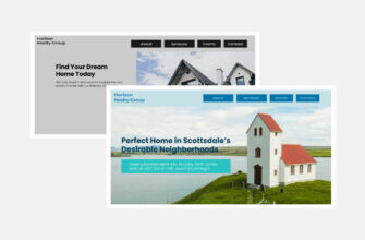
If you don’t have a UX designer, you can improve conversion rates by using DesignMantic’s predesigned website templates. This way, you can personalize a half-baked template and make it uniquely yours.
Step #5: Test
The prototype is just a rough draft; unless you test it, you cannot highlight all usability issues or friction points that may spoil the user experience. Therefore, it is best to test the website interface through multiple tools and testing strategies. As mentioned earlier in the article, focus on usability testing services and A./B testing so you can weed out the issues before the code is finalized.
Gather all sorts of data, reviews, and even general suggestions when testing. All of these can be helpful when making necessary changes to improve user experience.
Step #6: Launch
Using insights from the testing, prepare the final design for launch. Once the website is live, you must conduct quality assurance to ensure the fully developed site matches the final design and functions correctly across all browsers and devices, especially mobile phones, as most people access websites on their phones.
Launching may bring technical issues or potential downtimes, so it is best to prepare for them beforehand so you can deal with them accordingly.
Step #7: Iterate
Iterations are an ongoing process. To keep your website relevant and in line with consumer behaviour, you must be prepared for future iterations, which may occur at different intervals.
How UX Helps Websites Convert?
80.8% of people begin a website redesign project because of low conversion rates. Understanding UX’s role in boosting conversion rates is extremely important. Here is how these UX design aspects help increase conversion rates.
1. Website Speed
The math is simple: One in four visitors will leave a website if it takes more than four seconds to load. Even Google says that if a website’s speed drops from one second to 10 seconds, the bounce rate can increase to 123%.
This means speed is one of the most important aspects, and the faster a website is, the more people it is likely to convert. Our attention spans are becoming shorter with every passing minute, and so is our patience. Internet surfers do not stay to allow a website to open when they can instantly check out the competitor and take their business elsewhere.
The speed adds an advantage and ensures that visitors are guided to take action within a few seconds.

And this is not just a claim; Pinterest experienced it firsthand. They rebuilt their pages to improve performance, which led to a 40% decrease in pinner wait time, a 15% increase in conversion rate, and another 15% increase in SEO traffic.
2. Mobile Optimization
Mobile devices account for 64.35% of global web traffic. Thus, more than half of web traffic comes from mobile phones, and if your website is not mobile-optimized, you will lose all this traffic.

Walmart Canada saw the traffic and business slipping right through their hands, so they launched a mobile-responsive design that saw a 20% boost in conversions and a 98% increase in mobile orders. That is a big win!
If you want to optimize your website for mobile access, here are some tips:
- Design for thumb reach zones
- Keep tap targets large, such as buttons or links
- Aim for a less than 3-second loading speed
- Compress image files for faster loading
- Use the hamburger menu for easy and concise navigation
- Offer auto-fill to save user time and give ease
- Avoid full-screen pop-ups
- Test every few days so that you can update accordingly
3. Site Navigation
A website should not feel like a maze. Getting stuck on a page that the visitor does not know how to return to will result in broken trust. So, if you want to build customer trust, stick with the same navigation style throughout the website so your visitors can access the information they need without trying to pass a hurdle race.

HubSpot identified that their Contacts and Deal/Tasks pages were used simultaneously in day-to-day activities, but the pages were so far apart and parked in different categories. This meant more time was spent looking for them, but after the redesign:
- 10.16% of daily switches removed- Contacts and Deals
- 9.3% of daily switches removed- Contacts and Tasks
4. Logical Site Structure
Having a logical site structure is like a chain reaction. The structure first makes it easier for the user to access information, but that’s not all. The logical site structure is a hint at user journeys. It includes a homepage that introduces the value, then the visitors are led to the service page that further explains the benefits, then a pricing page with a CTA that closes the deal. All of these actions should flow in a logical fashion.

Basecamp learned this lesson the hard way.
When they redesigned their website, they removed the sign-up form from the homepage in an attempt to create a cleaner, more aesthetic design. But that illogical step backfired. Their customer sign-ups significantly dropped, and when they brought back the form on the home page, they saw a 16% increase in sign-ups.
Other than that, a logical structure also helps search engines better understand and index your content. This, in turn, improves your ranking, meaning more people will click on your website. This increases traffic, which is then turned into leads and paying customers. A logical site structure is a must, not just for conversion but also for website traffic.
Types Of Conversions For Different UX Priorities
UX is not a one-size-fits-all strategy. Different businesses have different end goals, and their priorities need to match to accomplish them. Let’s break down how user experience can directly impact conversions for each of these business types:
E-Commerce Sites
E-commerce websites rely heavily on conversions, and a good UX means that more visitors check out their carts. The most successful e-commerce websites have one thing in common: They remove friction from their websites.

SEASE is one of such brands; the checkout process was inefficient, causing high cart abandonment rates. But with UX optimization, the brand was able to boost its conversion rate to +288%!
| Conversion Goals | UX Priorities |
| Completed purchases | Fast loading speed |
| Increased Average Order Value (AOV) | Smooth checkout flow (limit fields, simple payments). |
| Reduced cart abandonment | Mobile-first design |
| Returning customer purchases | Trust elements (reviews, security badges, clear returns). |
Service Providing Businesses
When it comes to service providers, they need to earn customer trust so their conversions can look like booking or quotation requests. You can earn trust through UX by using clear navigation, easy contact options, and high testimonial visibility.

Faces by Bae wanted to boost its conversion and discovered that 68% of potential clients abandon the booking process because it is too complex. However, with restructured navigation, adding social proof, and improved readability, the bounce rate dropped from 65% to 38% and booking conversions increased by 33%.
| Conversion Goals | UX Priorities |
| Lead form submissions | Clear service hierarchy |
| Appointment bookings/quote requests | Simple contact points (sticky "Book Now" or "Contact Us" CTAs). |
| Increased customer inquiries | Social proof (prominent testimonials, client logos, certifications). |
| Brand trust and credibility | Local optimization |
SaaS Platforms
If SaaS platforms are in question, the conversion journey doesn’t just stop at sign-up; it guides users to onboarding a paid plan. SaaS buyers do not just buy the software subscription by looking at the website; instead, they compare and contrast to see how the platform benefits them and what the onboarding experience can look like.

Take this individual’s personal test, for example. He made some UX changes to the SaaS platform that reduced the onboarding time from 2 hours to only 5 minutes. And that’s not all, he also managed to increase conversion rates by 60%.
| Conversion Goals | UX Priorities |
| Free trial sign-ups | Clear first impression |
| Demo requests | Seamless signup (remove distractions, shorten forms, social sign-in). |
| Onboarding completions | Guided onboarding |
| Trial-to-paid conversions | Dashboard clarity (avoid clutter, use visuals for progress/success). |
What Does The Science Say About UX And Conversions
Science does not beat around the bush; good UX is essential for high conversion. There have been multiple studies that show how improving navigation, speed, and usability can make the conversion rates go up! Here are summaries of some scientific papers that highlight how different UX factors positively influence conversion.
Analysis of the Impact of UX (User Experience) Design on E-Commerce Website Conversion- Wahyu Asmaul Husna & Wahyu Asmaul Husna
This literature review analyzed six reference papers and identified that five consistent UX elements directly improve conversion outcomes. These include:
- Intuitive navigation
- Website speed
- Responsive design
- Content personalization
- Simplified checkout
The review’s findings also showed a positive correlation between conversion rates, well-structured UX design, retention, and higher user engagement. It concluded that UX is not just a design preference but a measure that helps drive business.
The Impact of Website Usability and Mobile Optimization on Customer Satisfaction and Sales Conversion Rates in E-commerce Businesses in Indonesia- Fadliyani Nawir & Satya Arisena Hendrawan
This study was conducted with 170 respondents. Using structural equation modeling, it was concluded that usability and mobile optimization can significantly increase customer satisfaction, which in turn boosts conversion rates. Furthermore, these UX factors together explained about 70% of the variations in conversion rates of e-commerce sites.
An examination of retail website design and conversion rate- William C. McDowell & Rachel C. Wilson & Charles Owen Kile Jr
This research goes a little deeper and examines how specific design features contribute to the ‘flow experience,’ which is defined as a psychological state in which users are completely engrossed and motivated to navigate through the website.
The study concluded by highlighting that smoother navigation, well-organized product catalogues, and distraction-free checkout experiences directly increase conversions.
UX In Focus
Now that we have discussed most of what you need to know about UX and conversions, let’s explore the real-world examples of websites that have mastered the art and have become an inspiration for us!
• Airbnb
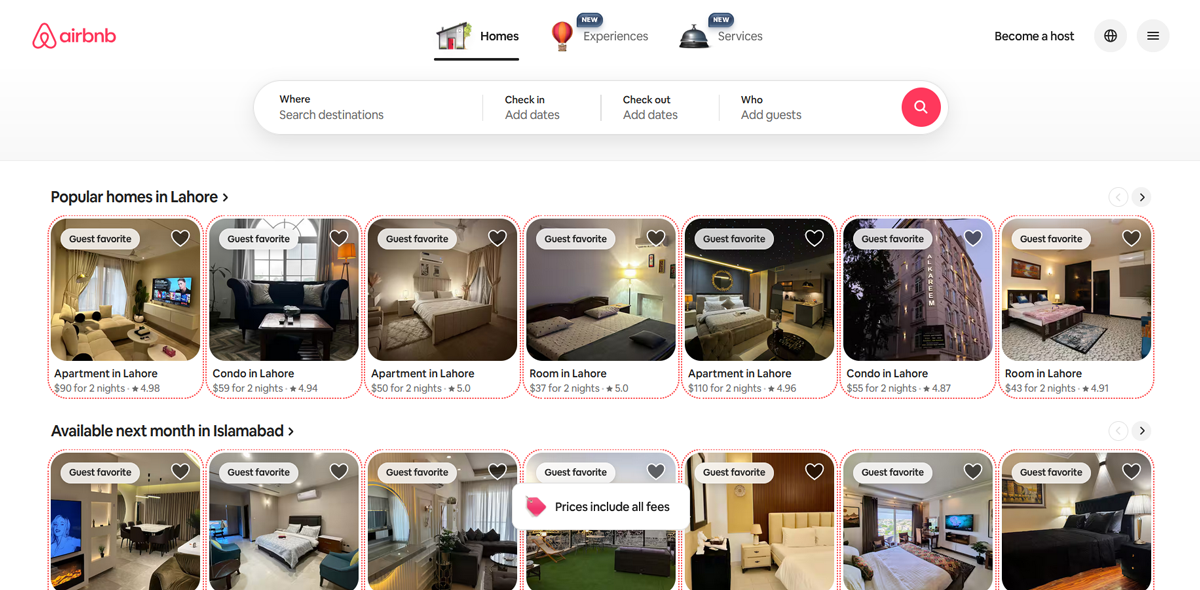
Looking at this pop-up alone shows just how user-friendly the design is. With high-quality imagery and a consistent interface, this design feels light and reassuring. Airbnb’s user journey is intuitive and simple with progressive disclosure, meaning all information is shown gradually to avoid overwhelming users.
• Behance

The Behance website is nothing short of a storytelling experience. It capitalizes on visual hierarchy and a clean grid with designs that minimize cognitive overload. The contrast and whitespace make the experience more soothing, making users scroll and scroll.
• Notion

While the design may not be as attractive as the other examples, Notion’s design is built around flexibility. The interface is intuitive, so users can start building what they came for without wandering around. Simple yet so powerful, the design definitely converts.
Design Your Website With DesignMantic
Every click on your website should indicate how well you understand your visitors. UX is the bridge that helps you connect with your audience, their needs, and how you can fulfill them.
This is where DesignMantic’s website builder shines through. It is built by experts and on the foundation of the aforementioned UX principles. Using the templates, you can guide your users naturally with clear navigation, logical hierarchy and responsive layouts. This way, your visitors know exactly where to go and what to do next.
If you are ready to design your website and be certain that it will work, then build with DesignMantic, and the conversions will come automatically.