The human brain processes visual data very differently than text. Instead of the eye moving along the lines, a massive amount of information is collected and processed at just a glance. Impressions are made, associations are created (or not), and decisions are taken. What causes all this commotion is contrast – a design technique that makes one element so different from the rest in the design that it draws the eye.
The effectiveness of contrast determines whether the viewer will engage with the design further or abandon the effort.
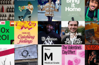
In marketing, where graphic design plays a central role in connecting customers with the brands, contrast in social media design is used to identify as well as distinguish. On platforms like Instagram, visual impact is critical, making effective contrast a powerful tool. By enhancing your visual appeal and acquiring Instagram followers, you can significantly improve your engagement rate. When it’s successful, it makes the brand design noteworthy.
All of the famous and beloved logos around the world use contrast in one way or another to hook and entice the consumers. Pepsi, McDonald’s, Nike, and Xbox are some prominent examples.
Importance of Contrast
Contrast adds drama and depth. It organizes the design and helps establish a visual hierarchy. What is the design element that you want people to notice immediately? Contrast helps you highlight it.
But the single most important objective of contrast is to make things legible, accessible.
Two identical squares are indistinguishable from each other. But make one smaller than the other, and the contrast will immediately pop. Black and white, fat and thin, straight and wavy – in contrast, you will find meaning and attention.
The reason these words on the screen are visible to you is because of color contrast – black letters on a white background. If we skew the contrast even a little bit, the text may become difficult to read and comprehend. Web Accessibility Initiative has even devised guidelines to ensure visual design uses appropriate levels of contrast to make the web more accessible to people with disabilities.
In graphic design, contrast is used to make information visible and notable.
What other goals does it help you achieve?
Introduces Asymmetrical Balance:

Balance in graphic design is the distribution of the visual weight of all the elements equally on both sides of the image – start and end, right and left. While symmetry is the most popular way of achieving balance, asymmetrical compositions make the design more interesting and dramatic.
Contrast allows a design to be balanced without being even. For example, three hexagons on two columns are symmetric and balanced. But a large hexagon on one and three hexagons of varying sizes on the other also make the design look balanced, without repeating the details.
Makes the design more diverse and inclusive:

When we add contrast – whether through color, size, or shape – we make the design accessible to a wider audience. Consider user groups that are color blind, for example. Without color contrast in your logo, they’ll have trouble identifying true details of your brand mark and may end up confusing it with somebody else’s.
By adding contrast to your design, you invite a larger body of audience to engage with your brand.
Easy to navigate through
Since contrast is used to catch the eye, designers add contrast to guide the user’s attention from one element to the next. Through contrast, we come to know which part of the layout is most important and which is secondary. With good use of contrast in layout, navigation becomes easy and intuitive.

Subtle contrasts of asymmetrical balance on both ends, red CTA buttons with white text, and different sizes of text on the left help the eye navigate the page more intuitively.
Types of Contrast:
Contrast is based on a variety of design elements: colors, shapes, sizes, orientation, position, texture, and more.

In this article, we will talk about the four most prevalent types of contrast.
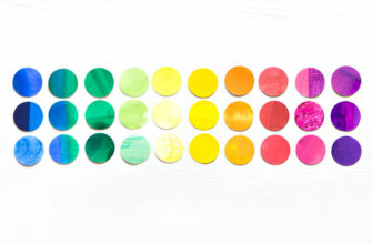
1. Color
The human eye is sensitive to contrast, and color is the most prominent form to draw attention. Bold, contradictory colors especially do the job well. Think of dark vs. light, and light vs. dark.

Hit TV series Mad Men poster showing the efficacy of color contrast
Using the color wheel, the complementary colors – colors that are directly opposite to each other – are chosen to create contrast as they differ the most in their properties. Red and green, yellow and purple, orange and blue.

Do remember, though, that choosing colors for a logo design that are directly opposite to each other isn’t necessary. As long as you are staying away from neighboring colors, you are fine. For example, instead of pairing red with orange, use green. Green and orange make a nice, non-irritating contrast that also creates a very organic, natural vibe.
2. Size
Sure, color is a popping element in design. But what will you notice first if placed side by side? A billboard in dusty pink or a coin in striking red?

In product label designs, the brand name always supersedes other elements, even the logo, in size and scale.
Due to the sheer amount of it, we’ll first notice the difference in size. That’s why the scale is often used to capture attention and guide the eye. Yet, that’s not the only thing it does. Size also conveys meaning.
Bigger means more important in design. It means ‘look at me first, I have important information’. Size variations are used to establish visual hierarchy and organization. In UI/UX design, for instance, differences in size are used to make navigation more natural. Our attention goes from big to small and we know which elements are meant to be taken more seriously than others.
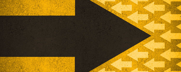
3. Shape
Shapes are primarily of two kinds: geometric and organic. Geometric shapes are defined and have clear edges. Triangles, squares, circles, and ovals. The human mind associates particular meanings to each of these shapes. Circles are pure, natural, and calming. Triangles are firm, directional, and opinionated. Due to these psychological associations, geometric shapes are commonly used to infuse meaning in logo designs.
Mercedes-Benz logo uses contrasting shapes of a triangle within a circle and achieves a striking effect with perfect balance.
We also have organic shapes that are wild forms and figures found in nature. They do not follow geometric rules and have no refined edges. Leaves, cow spots, and shapes of various fruits are some examples.
Abstract shapes, another type used extensively in logo design , are reduced, reimagined, and simplified versions of shapes and forms that are found in nature.
Combining all these different kinds of shapes in a single composition creates high levels of contrast. You can also create variance and contrast by using shapes of a similar kind. For example, if the background is a bed of triangles, a circle in the middle of it will grab the attention. You can create intrigue and interest in your core design element by assigning it a different shape than the rest of the design.
4.Font
The contrast in fonts can be of several different types. In fact, this is where all the rest of the contrasts can make an appearance. A large and small font (size contrast), a serif font versus script font (shape contrast), and one font in yellow and the other in red (color contrast) are some compelling examples.
Bed Bath and Beyond logo uses contrasting font sizes in three weights. It guides the eye and balances the design.
Using font contrasts in harmonious colors, shapes, and scales is used to convey important information – which is the brand name and which is the tagline. It also supports psychological associations, brand character, and visual hierarchy. Pleasing contrast in fonts also influences moods and emotions.

But accomplishing these goals may be more complicated than it seems. Through consistent experimenting, you have to learn how to pair fonts perfectly, so you know what to do and also study the font pairs that you should avoid.
Takeaways
I think the most important takeaway from this entire discussion is to not overdo the contrast. As significant and impactful it is, too much contrast can easily make a design look chaotic. Choose one form of it and stick with it. Also, contrast is most effective when the remainder of the design is happy to stay in the background. Only then can you shed the spotlight on a single element.
So, to sum it up: use it with care.