We see epic fails in our social media feeds. We also see some masterfully put together works to behold. And believe it or not, in the cutthroat world of advertising, both the fails and the ooohs happen with frequency as well. Sometimes it all comes together and sometimes it doesn’t even pretend to keep it all together.
But this is advertising. And people say there aint no such thing as bad publicity today.
We take a look at 7 awesome and 7 not-so-awesome business logos created by the captains of the advertising agencies for their own promotion, taking a gander at why they succeed and why they don’t. After all, their own logo design speaks volumes about their portfolio and values, serving as a litmus test of their own relevancy in the advertising industry.
Logo Done Right – The Wow-Sters And Darlings Of The Advertising World
Here be dragons of the advertising world that sit atop majestically.
1. Grey
Why it works: The ‘GREY’ logo design beckons the observer to admire its confidence and simplicity with all-bold typeface. The ad agency’s design seems self-assured, and that makes their clients feel like they’re in good hands.
Social Media Link: Facebook
2. SimplyZesty
Why it works: Another unassuming logo that only relies on typography to convey its simple philosophy to branding, the SimplyZesty logo succeeds at a conscious level to endear clients to them.
Social Media Link: Facebook
INFOGRAPHIC: The 10 Commandments of Typography
3. 360i
Why it works: The logo for 360i seems simple and sleek at the same time, speaking to its forward-thinking approach to advertising and branding.
Social Media Link: Facebook
4. Starcom Mediavest Group
Why it works: Ever seen a starburst? We neither! But even the name gives away the splendor-ific emotions that brand elicits from the people. This same principle of greatness is weaved into the Starcom Mediavest logo design, with its multicolored trippiness making a statement about the ad agency’s creative acumen and experience.
Social Media Link: Facebook
5. Weber Shandick
Why it works: Maybe life is about framing things differently. Like viewing things from a proper perspective. The Weber Shandwick logo attempts to do just that, going with the choice of a vintage frame icon in its logo design.
Social Media Link: Facebook
6. Isobar
Why it works: The proof of the pudding is in its taste. For advertising agencies like Isobar, their typeface-centric logo design speak a lot louder than a flashy and busy logo design ever would.
Social Media Link: Facebook
7. Big Spaceship
Why it works: You see those book covers with nothing much than a bold title? Turns out they work fabulously well as advertising agency logos as well like Big Spaceship’s design.
Social Media Link: Facebook
Logo Gone Awry – The Boo-Inducing And Cringe-Worthy Agency Creations
And here be agencies that could’ve handled things a lot better than their current fare.
1. Droga5
Why it doesn’t work: The 5 in Droga leaves many a scratching head. There’s no way it looks like a ‘g’ any way you look at it.
Social Media Link: Facebook
2. STEAK London
Why it doesn’t work: Is this supposed to be an advertising agency or a farm/slaughterhouse/food company? So much confusion abounds when viewing this logo. Could be much better.
Related: 9 Striking Logo Designs That Speak Volumes About Their Start Ups
3. Naked Europe
Why it doesn’t work: One would’ve expected the logo for ‘Naked Europe’ to be pedestrian and minimal to the extreme. An isometric ‘N’ would work so much better for a advertising brand, save for this one.
Social Media Link: Twitter
4. Lean Mean Fighting Machine
Source: Leanmeanfightingmachine.co.uk
Why it doesn’t work : The choice of business name denotes something cool and yet the choice of old-fashioned Victorian-era font is ‘uncool.’ Lean Mean Fighting Machine’s logo would’ve being so much better if only the font and name matched.
Social Media Link: Twitter
5. Omobono
Why it doesn’t work: They still using that Photoshop ‘Inner Shadow’ effect in 2015? The Omobono logo certainly seems to follow this out-of-favor effect for their brand. This could’ve been handled better in the right hands but this aint it.
Social Media Link: Facebook
6. Chopping Block
Why it doesn’t work: There’s too much going on in this logo for it to be easily readable. If only this logo design would’ve ended up at the chopping block instead. It takes more than some squinting to make out the agency’s name.
Related: 5 Logo Design Mistakes To Learn From …
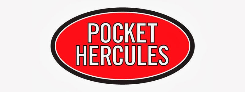
7. Pocket Hercules
Why it doesn’t work: An advertising firm with a derivative design that’s a dime a dozen? Orginality matters if you do branding for other people. This is a basic premise that branding agencies are supposed to know for sure.
Social Media Link: Facebook
Be It A Stumble Or A Home Run, Change Comes For All
The advertising agencies are staffed with some of the most creative people on the planet. Sometimes they get the client brief just right and make magic happen, and sometimes quite the reverse happens. Brands acquire a reputation based on how their values are crystalized in their logo designs. The designs that we looked at above show us how they can get it right and wrong as well. Rome wasn’t built in a day, and the same goes for brands. Evolution is the name of the game. The key is to learn from the right and the wrong choices we make, a process that can benefit greatly if we adopt an 8 steps approach to logo design.








I dig the chopping block’s (though it does take a second to digest, I stayed with it a lot longer). The ones that you say ‘nailed it’ are TERRIBLY uninteresting to me. They’re okay but I certainly wouldn’t be calling them out as amazing design examples.
Also, the drop shadow thing? Calling out drop shadows as if they are some awful design element is strange to me. At least that company is making some attempt at a graphical brand.