Every piece of art or design ever created is always intended to send a message. In the arsenal of designers, one of the most potent tools that play a central role in the communication of the said message is color. Colors contain certain inherent properties and psychological meanings that do not need any explanation on the part of the artist or the audience. Due to common human experiences and conscience, we all automatically understand what a certain color is trying to say. We associate certain feelings, emotions, and messages to the colors in the world.
In the abstract logo design universe, the function of colors becomes ever more important. As the human mind understands its surroundings through various visual cues – one of them being shapes and forms – abstract design makes the use of this cue quite complicated. That’s where color plays a vital role. It fills the void of literal meaning, provides understanding where the audience may feel confusion, and renders the complicated design deceptively simple to understand.
This last part is especially crucial in logo designing. The purpose of a logo is to send clear and concise messages to the audience and encourage them to create an association with the business/brand. Therefore, smart abstract logo designs make bold and confident color choices to ensure that the vagueness of forms is made understandable with the clever use of colors.
In this piece, we are going to share the different styles of coloring that logo designers use when creating abstract logo designs.
• Single Color Blocks
The minimalism approach has heavily influenced the world of logo design and abstract logos haven’t been immune to it. Therefore, while abstract art has always been fearless, adventurous, and challenging, we see designers taking a minimalist approach in their color choices when creating abstract design.
One of the reasons behind this is to keep the design as concise and easy to understand as possible. So icons, shapes, and forms are designed in abstract galore but with single color choices in logo design, it is made sure that the design sends a single and solid brand message.
Famous examples of this approach in commercial work are Chanel, Nike, and Mitsubishi.

Image Source: Behance
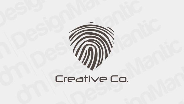
Fingerprint logo in heart shape
Image Source: Dribbble
• Two Color Combinations
With the choice of two colors, the designers’ work becomes somewhat easier as they are able to add layers of meaning to the abstract logo work. Most of the time these two colors will be a contrast of each other in the true abstract traditions. However, we also see enough complementary and monochromatic mixes in abstract logos to know that contrast is not the only way to go.
Famous logos that sport two tones in their brand designs are Target, Spotify, and Adobe.
Image Source: Behance
Abstract shapes and star logo
Image Source: Dribbble
• Three Color Designs
Abstract logo designs in three different colors/shades are quite close to their abstract art roots. Using different colors or different shades or tones of the same colors, multiple aspects of a brand’s personality and message are covered. This approach is particularly suited to brands that want to cover a lot of ground through their logo but don’t want to seem spell it all out.
Related: How To Pick The Right Complementary Colors For Your Logo
So, the allure and mystery remain through the abstract design and colors do all the talking. This color style mostly uses two distinct colors and then a shade of one of them. This way, the modernity of the design is kept alive and the brand seems spot-on-trend.
The famous brands that follow this style are Pepsi, Snapchat, and NASA.

Image Source: Behance
Skyline logo with blue and pink buildings
Image Source: Dribbble
• Multiple Colors/Color Gradients
Multiple colors or color gradients are the most popular color styles for abstract logo designs. For brands that want to go all out, or that want to project an image of adventure and thrill, a colorful, bright, and vibrant abstract logo seals the deal.
Colors used for such designs are mostly brighter and bolder shades of red, blue, yellow, green, purple, and such. Color gradients – a coloring technique in which multiple colors merge, thus giving the look of color bleeding to the design – are also popular in abstract logos. However, not all commercial industries use the gradient approach. Technology is one of the most dominant industries when it comes to color gradients for abstract logo designs. Therefore, always choose colors based on your industry to make the right decision.
Popular brands that sport a colorful abstract logo are Instagram, Play Station, and NBC.
Image Source: Behance
Leaf logo in a circular shape
Image Source: Dribbble
Related: Break The Color Trends: 28 Logo Colors That Are Too Old To Be New!
The Takeaway
So, these are the four most common styles in which colors are used to represent meaning in abstract logo designs. Depending on how much you want to say through your logo design, you can increase or decrease the number of colors in your abstract logo. It also depends on the abstract shape you’ve used in your design. For a simple shape, one or two colors would suffice. However, if you are going for a complex form, perhaps use more colors to convey the meaning so no room for error remains.
Check Out Our Logo Maker Tools:
Create natural logos for businesses
Artistic logo design ideas for SMBs

