Ever notice how your logo looks amazing on your laptop, but the moment you print it, the colors feel a little… off? Maybe that sleek navy suddenly turns dull, or your vibrant orange ends up looking more like pumpkin pie. Annoying, right? No, that’s not your printer messing with you; it’s the world of color systems at play.
The thing is, colors don’t speak the same language everywhere. Your screen talks in RGB, printers prefer CMYK, and Pantone acts like the referee making sure shades stay consistent no matter where they show up. Miss that detail, and your brand’s colors can lose their punch fast.
And that matters because colors act as memory triggers. Research shows that consistent brand colors can increase recognition by up to 80%. What if Coca-Cola’s red wavered between crimson and maroon depending on where you saw it? You probably wouldn’t connect with it the same way.
So, if you need a color survival kit, this is it. We’ll lean into the secret codes behind how colors travel from your screen to print to pretty much everywhere your logo lives. By the end, you’ll know how color systems work, when to use them, and how to keep your logo looking bold wherever it appears.
The Power of Color in Design
When was the last time a logo instantly caught your eye? We assume that more than anything else, it was color that pulled you in. Color psychology works in mysterious ways we don’t always notice. They set the mood, create associations, and make a brand feel familiar the more we see it. Staying true to the good book of colors can turn a simple logo into something unforgettable, while inconsistent colors can make even the best design feel unpolished.
To see the power of consistent color use in action, think about how we connect Starbucks with green or Target with red. If your shades shift across platforms, your brand can start to feel less reliable and harder to pin down in people’s minds.
That’s why deciding which colors your logo design should be is only half the story. The other half is making sure they show up the same everywhere. If you don’t account for that, your logo may end up looking like a different brand.
Here’s where the three main color systems come in:
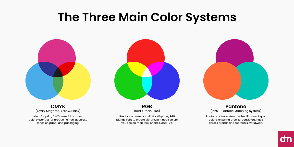
- RGB (Red, Green, Blue): The language of screens, think about websites, apps, and digital ads.
- CMYK (Cyan, Magenta, Yellow, Black): The standard for anything printed, from flyers to product boxes.
- Pantone (Pantone Matching System): The perfectionist, ensuring your brand color stays exact across different materials and printers.
Now let’s look at each system more closely and show you how they shape the way your logo appears in the real world.
The RGB Color Model
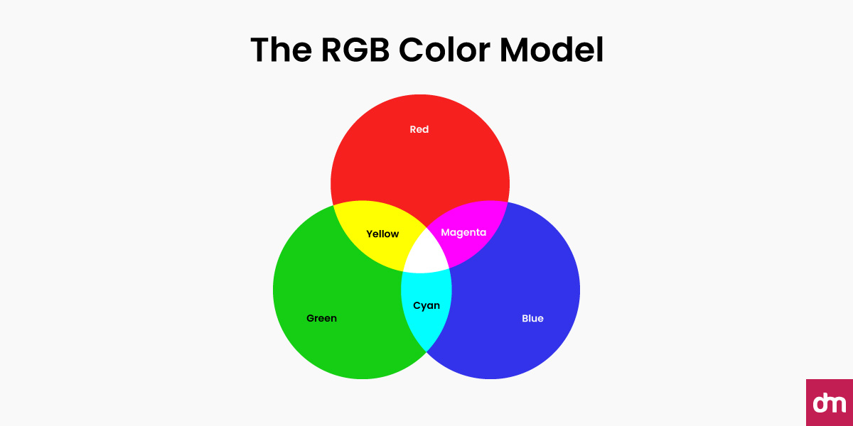
If your logo is used online, for example, on your website, social media, or digital ads, RGB is its native language. RGB stands for Red, Green, and Blue, the three primary colors of light. By mixing these in different intensities, screens can display millions of vibrant shades.
Let us tell you a fun fact. If you grab a magnifying glass and look closely at your phone or laptop, you’ll see tiny red, green, and blue dots (called sub-pixels). When they light up together in different combinations, they create every color you see. All digital devices (TVs, tablets, smartphones, even LED billboards) use this model because they emit light rather than reflect it.
A Sneak Peek into Its History
Scientists in the 1800s discovered that human vision relies on three receptors sensitive to red, green, and blue. In 1861, James Clerk Maxwell famously demonstrated the first color photograph by projecting images through red, green, and blue filters, proof that RGB mixing works in the real world.
By the 1950s, color TVs used RGB phosphors to deliver full-color broadcasts. In the 1980s, personal computers adopted full-color RGB displays, cementing RGB as the digital standard we still use today—think Netflix, games, websites, apps, all of it.
RGB is an Additive Model
RGB is called an additive model. It means that the more light you add, the brighter the color gets. Combine all three at full blast, and you get white. Turn them all off, and you get black. That’s why neon colors pop so brightly on a screen; they’re literally made of light.
In short, RGB is the go-to for anything digital. If your logo is meant to catch attention online, designing in RGB ensures your colors stay bold and eye-catching.
How RGB Works
If your logo is designed for digital-first branding, RGB is your best friend. Here’s how it works:
- 0% R + 0% G + 0% B = Black (no light at all)
- 100% R + 100% G + 100% B = White
- Red + Green = Yellow
- Red + Blue = Magenta
- Green + Blue = Cyan
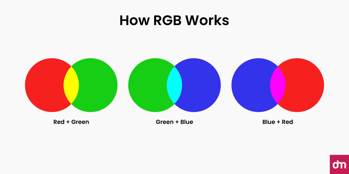
Up close, each pixel contains sub-pixels (tiny red, green, and blue elements). Vary their intensity and you get millions of colors. This is the opposite of mixing paint. With RGB, adding colors makes things brighter, not darker. That’s why neon shades or glowing gradients look incredible on a screen but often fall flat when printed.
Best Uses for RGB
- Websites, apps, UI/UX, social posts, online ads, eBooks, motion graphics
- Anything viewed on a screen or projected
- Brand kits for digital use (HEX + RGB values) and dark-mode assets
Impact on Your Logo and Brand
Designing your logo in RGB makes it look punchy and luminous on screens. That “glow” helps your brand feel modern and energetic in digital spaces. However, if you hand that same RGB file to a printer without planning, the colors can shift or dull. That mismatch chips away at consistency, which is the bedrock of logo recognition.
So when designing in RGB, watch out for these common pitfalls and learn from the practical tips.
Common Pitfalls
- Designing only in RGB, then converting at the last minute for print
- Relying on ultra-saturated RGB colors that cannot be reproduced in ink
- Forgetting that different screens display color differently (calibration matters). For example, what glows on screen may look dull in print (ink can’t match light)
- If you’re going to print later, soft-proof early so you’re not surprised
Pro Tips
- Print and web design differ greatly. For web, work in sRGB unless you have a managed color pipeline (it’s the safest common space online)
- Keep HEX/RGB values in your brand guide—and plan CMYK equivalents for print
- Check contrast for accessibility (e.g., WCAG) so text-on-color stays readable
- Export right: PNG/SVG for logos with flat color; JPEG only for photos. If your logo is only available as a JPG, you can easily convert it into SVG vector format using an online JPG to SVG converter to keep it crisp and scalable.
- If print is coming, keep a “print-friendly” alternate palette (avoid super-neons and ultra-saturated teals/purples that won’t survive CMYK)
The CMYK Color Model
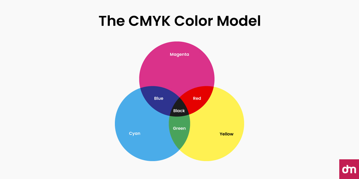
CMYK is the color system printers use. Instead of emitting light, it lays down inks on paper (or packaging, labels, etc.). That’s why it behaves differently from what you see on screen. CMYK stands for Cyan, Magenta, Yellow, and Black (Key), the four inks that printing presses use to create full-color images.
Unlike RGB, which creates color by emitting light, CMYK works by absorbing it. White paper reflects light back to our eyes, and each layer of ink subtracts certain wavelengths to leave behind the colors we see.
A Sneak Peek into Its History
Traditional printing used a key plate, usually the black plate, to align (or “key”) the image. Modern offset and digital presses still follow the same principle: combine four process inks (C, M, Y, K) to reproduce full color efficiently. It’s the backbone of magazines, packaging, and commercial print.
CMYK is a Subtractive Model
CMYK is a subtractive color model. It means that the more ink you add, the darker things get. Cyan and yellow make green, magenta and yellow make red, and cyan with magenta produce blue. Combine all three, and you don’t get a crisp black; you get a muddy brown. That’s why black ink (the “K”) is added to deepen shadows, strengthen contrast, and save on ink.
Printers achieve this blending with a technique called halftoning, where tiny dots of cyan, magenta, yellow, and black overlap at different angles. To the naked eye, they look like smooth, solid colors.
How CMYK works
In CMYK, adding more ink makes the color darker.
- Cyan + Yellow = Green
- Cyan + Magenta = Blue
- Magenta + Yellow = Red
- C + M + Y together = Muddy Brown/Black (why the “K” is needed for true black)
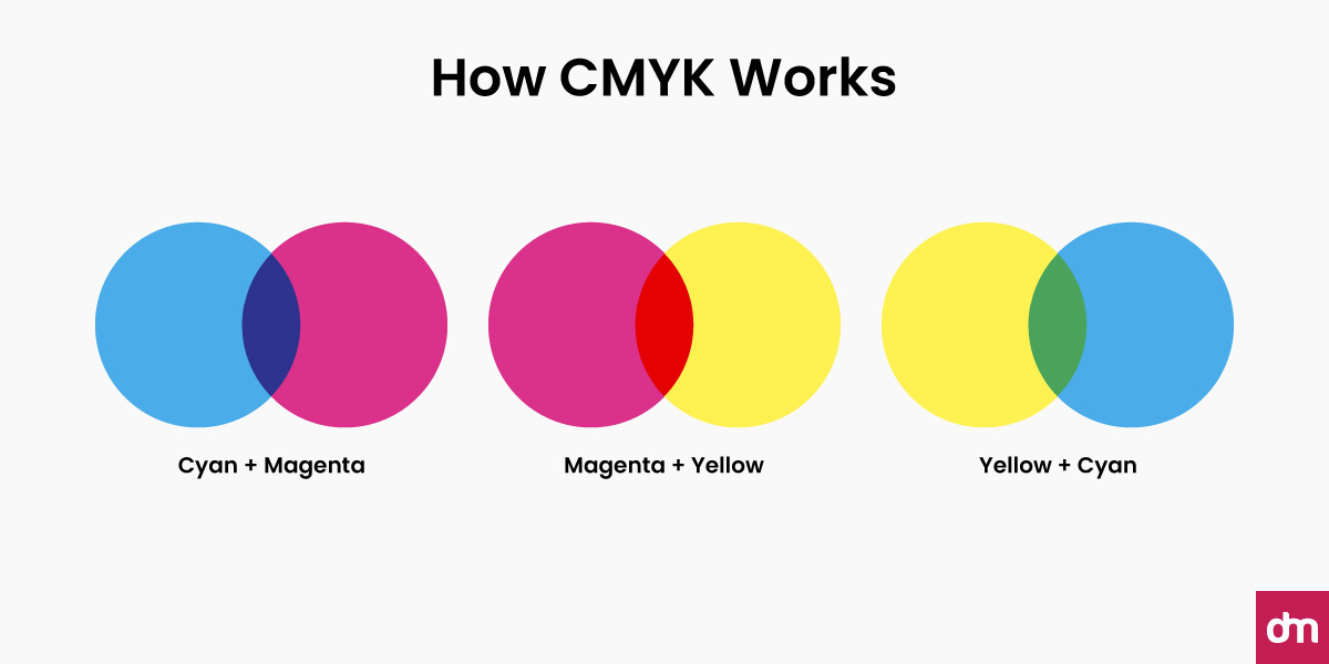
Printers create these colors via halftoning (microscopic dots at specific angles). Your eye blends them into smooth tones. Paper type (coated vs uncoated) and dot gain affect the final look.
Best Uses for CMYK
- Business cards, stationery, brochures, flyers, magazines
- Packaging, labels, signage, point-of-sale
- Home/office printing, trade-show materials, large-format posters
Impact on Your Logo and Brand
Your logo must feel as intentional and consistent in print as it does online. If you convert from RGB at the end, vivid digital colors can turn muted, pushing your logo off-brand. Consistency across boxes, cards, and signage builds trust; visible color drift makes the brand feel sloppy, even if the design itself is great.
To get a print-ready design, here are a few mistakes to avoid and best practices to learn from.
Common Pitfalls
- Late RGB→CMYK conversion causing dull or shifted hues
- Building black from only C+M+Y (muddy text and shadows)
- Ignoring paper stock differences (coated stock looks more vibrant than uncoated)
- Exceeding total ink coverage limits, leading to smudging or drying issues
Pro Tips
- If print is the final destination, design in CMYK from the start
- Use 100% K for small black text; use a rich black mix for big, solid black areas (e.g., 60C 40M 40Y 100K, confirm with your printer)
- Ask your printer for recommended ICC profiles, ink limits, and a proof on the actual stock
- If your design tool is RGB-only, convert thoughtfully and manually tweak swatches; don’t rely on a blind one-click conversion
RGB vs CMYK: Two Different Worlds of Color
If RGB rules digital design, CMYK takes charge in print. Both color systems use completely different recipes to cook up color.
RGB works with light, layering red, green, and blue beams until you get brilliant, glowing hues. Add enough, and you end up with pure white light.
CMYK, on the other hand, works with ink on paper. It starts with a clean white sheet, then stacks cyan, magenta, yellow, and black inks on top of it. Each layer takes light away, making the final result darker. That’s why printed colors often feel softer or more natural compared to the punchy glow of digital screens.
Here’s a quick side-by-side snapshot:
| Feature | RGB (Digital) | CMYK (Print) |
| Color model | Additive – mixes light to create color | Subtractive – uses ink to absorb light |
| Primary colors | Red, Green, Blue | Cyan, Magenta, Yellow, Black |
| Mixing effect | More light = Brighter, ends in white | More ink = Darker, ends in muddy black/brown |
| Best for | Screens, web, digital media | Printing, packaging, and physical materials |
| Color range | Can display super-bright and neon tones | Limited to natural, print-friendly shades |
| Black creation | 0 light = Black | Uses separate black (K) ink for depth |
Why this matters: If you design your logo in RGB and send it straight to print, chances are the colors won’t look the same. For instance, the vibrant electric blue on your laptop might turn into a dull navy on paper. Some RGB colors simply don’t exist in CMYK, which is why converting your files before printing is a must. So, when you go from pixels to print, ensure versatility in your logo design.
The Pantone Color Model
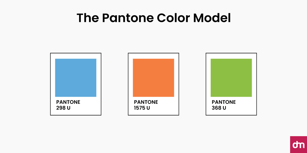
The Pantone color system is the gold standard for consistency. Introduced in 1963, the Pantone Matching System (PMS) was created to solve one big problem: how do you make sure the same shade of red, blue, or green looks identical whether it’s on packaging, a billboard, or a t-shirt? Unlike RGB or CMYK, Pantone doesn’t rely on mixing colors on the fly. Instead, it uses pre-mixed inks, like grabbing a specific paint shade straight off the shelf.
For example, if you ask for “Pantone 485 C,” you’ll always get the exact same fire-engine red, no matter where or how it’s printed. That’s why Pantone has become a universal design language used across industries from printing and branding to fashion and product design.
A Sneak Peek into Its History
Pantone’s story began in 1963 when Lawrence Herbert introduced the Pantone Matching System to give designers and printers a reliable way to achieve consistent colors worldwide. By creating a standardized library of swatches, Pantone eliminated the guesswork of traditional printing.
Pantone launched its now-famous “Color of the Year” program in 2000, a cultural and design trendsetter that has since influenced fashion, branding, and product design. Each year, color experts select a shade that reflects the global mood and direction of design. For 2025, the chosen color is PANTONE 17-1230 Mocha Mousse, a warm, chocolatey brown with a comforting, versatile appeal.
How Pantone Works
Pantone offers over 3,000 standardized colors, each with a unique name and number. Designers set them up as “spot colors” in their design software, which means they’re treated as separate swatches rather than being created from a mix of inks on the spot.
Some highlights:
- Spot Colors: Each Pantone color is a formula-based ink, mixed exactly the same way every time
- Special Shades: Pantone includes metallics, fluorescents, and other finishes that CMYK simply can’t replicate
- Cross-Material Consistency: Pantone codes work across paper, textiles, plastics, and more, solving the “why does my logo look different on fabric vs. print?” problem
A Standardized Color Language
One of the frustrations with CMYK is that every printer, ink batch, and paper type can produce slight variations. For example, a bright orange in CMYK might look bold on one printer and slightly dull on another. Pantone eliminates that guesswork by using pre-mixed inks, so “Pantone Orange 021 C” will always look the same, everywhere.
That’s why Pantone is called a “spot color” system. You don’t rely on overlapping layers of cyan, magenta, yellow, and black; you print with the exact ink shade itself.
Why Pantone Matters for Logos
Your logo is the face of your brand, and color is one of the strongest memory triggers. In fact, studies show that up to 90% of snap judgments about products are based on color alone. That means consistency isn’t optional, it’s essential.
Pantone helps with:
- Exact Brand Colors: Companies like Tiffany & Co. (with its signature Tiffany Blue®) and Samsung rely on Pantone to ensure their brand colors never vary
- Cross-Material Branding: Whether your logo is embroidered on a polo, printed on packaging, or displayed in-store signage, Pantone ensures it looks identical
- Unique Shades: If your brand wants a neon green or shimmering gold, Pantone can deliver shades CMYK can’t
Best Uses for Pantone
Pantone isn’t always necessary (or cheap), but it shines when precision matters most.
Use Pantone when:
- You need absolute consistency across different printers or materials
- Your brand depends on a signature color (like Tiffany Blue)
- You want colors that CMYK can’t reproduce (like neons or metallics)
For day-to-day projects like company flyers or posters, CMYK often does the job just fine. But for your logo, brand identity, and high-stakes designs, Pantone is the safe bet.
How to Choose the Right Color Model for Your Logo Designs
Color plays a decisive role in how people perceive your brand. However, choosing the wrong color model for your logo can lead to washed-out prints, inconsistent branding, or mismatched colors across platforms. Once you understand when to use RGB, CMYK, or Pantone and how to convert between them, you’ll have full control over your brand colors.
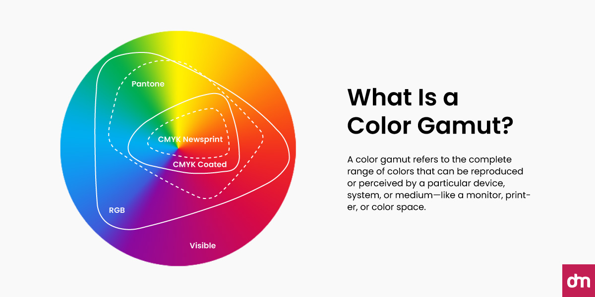
RGB vs. CMYK vs. Pantone
- RGB for Digital: If your logo will primarily live on screens, including your website, app, or social media, RGB is the best choice. It ensures bright, vibrant colors that pop on displays.
- CMYK for Print: CMYK is essential for preparing print materials (brochures, packaging, posters). It prevents unexpected color shifts and ensures that what you see on screen translates more accurately to paper.
- Pantone for Brand Consistency: If your logo needs to look exactly the same everywhere, whether on a business card, fabric label, or billboard, Pantone delivers unmatched precision. It’s the go-to for maintaining a brand’s signature color across all mediums.
The challenge is that switching between RGB, CMYK, and Pantone isn’t always seamless. That’s why color conversion is often the trickiest step here. Thankfully, designers don’t have to guess. A range of color tools can help bridge the gap between systems and ensure color accuracy.
Some useful options include:
- RGB Color Pickers: Quickly identify and adjust exact RGB values to fit digital projects.
- Color System Converters: Convert colors between RGB, CMYK, and Pantone to preview how they’ll look in each format.
- Swatch Libraries in Design Software: Tools like Adobe Illustrator and Photoshop come with built-in Pantone libraries and conversion features.
- Online Color Tools: Websites and apps allow you to test, tweak, and convert colors on the spot, which is handy for both beginners and pros.
The Bottom Line
No single color model is “better” than the others; it all depends on context.
- Designing for digital? Go with RGB.
- Printing marketing materials? Use CMYK.
- Need absolute consistency? Pantone is your answer.
By combining smart choices with the right tools, you can avoid costly reprints, mismatched branding, and frustrated clients. Most importantly, you’ll ensure your logo looks just as striking in print as it does on screen. Design a free logo today.


