Gym logo designs are one of our favorite brand identity types. They are wild, raw, bold, and beautiful. With striking graphics and devil-may-care color schemes, designers truly go all in when creating fitness brand identities.
Yet all of this passion and confidence has come at a cost. The space for a gym logo or fitness logo design to be anything other than loud and brash has become very narrow. Creative gym logos usually only experiment with graphic fonts and contrasting colors — which isn’t experimentation.
Real experimentation lies in going against the flow of the flood and striking a balance between familiar and inspiring. Below we share 5 easy and practical tips to transform your fitness logo training. Use these tips to create gym logo designs you’d feel proud to flaunt online and on your gym fixtures, merchandise, and print assets.
Whip up your gym logo into shape with these 5 clever tips
Learn what it takes to turn a standard gym logo from okay to OMG!
• The fewer details the better
If you really want a unique gym logo, cling to minimal design principles no matter what. Gym logos contain some of the most intimidating design elements — loud colors, imposing fonts, and striking symbols. But so much show of energy can begin to drain viewers.
To break through this noise, immediately shed all this extra weight. Choose only a handful of details, and make all of them mean something. Every stroke, color, or font size variation must diligently serve a deeper brand message. This will communicate a brand of substance and integrity, making you stand out in a crowded market of loud but empty graphics. When you are creating a gym business plan, make sure you factor in your brand’s purpose, mission and visual identity to make an impact on the audience.
• Add a twist to your descriptive symbols
While an abstract icon is probably the most natural choice for any designer wanting to create a unique and outstanding logo, the evidence is overwhelming in favor of descriptive icons for the most effective branding.
However, descriptive icons are extremely risky to pull off. If you aren’t careful, they fall over to the side of bland and boring quite instantly. So how do you keep a tight leash? By adding something special to it. A feature or detail that lifts off a simple graphic into the territory of witty and clever.
![]()
Image Source: wikimedia.org
Take the Gymshark logo for example. Its shark face imagery would have been nothing to boast of, if not for that slanted shark eye. That one detail singlehandedly turns this gym wear logo design from routine to can-you-believe-this-logo-is-so-powerful!
![]()
![]()
• Lively colors set the pace
You aren’t going to see a lot of pastel shades in gym logo designs. While light and soft colors do have a huge demand in spa logos or yoga logos — forms of fitness mediums —, the traditional idea of fitness and exercise is associated with gyms. Places of hard cardio workouts, passionate boxing training, or sweaty workout routines.
To capture this display of raw physical energy, designers go to high-contrast colors for gym logo designs. Blues, oranges, yellows, greens, and lots and lots of neons.
![]()
Image Source: wikimedia.org
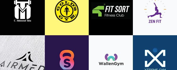
Gold’s Gym logo is a standard example.
To go against the grain here, you have to be more strategic. Instead of experimenting with pale colors, try this:
- Color gradients where you can mix and match soft and dark colors for a striking effect.
- Instead of deepening color saturation, try brighter shades of dark colors. Eg: bright purple, cobalt blue, and hot pink.
- Combine cooler colors for a more sophisticated and calming effect without giving away the visual power.
Remember that every industry has inherent color associations you can’t go against without risking recognition and recall. If your gym logo doesn’t look like a gym logo potential members may ignore it when searching for a gym. But if it looks too much like a gym logo, it’s just one of the many and has no pull.
So strike the right balance with one of the color ideas above and find the perfect fit for the gym logo design of your dreams.
![]()
Image Source: dribbble.com
![]()
Image Source: dribbble.com
![]()
Image Source: dribbble.com
• Remind yourself: sans serif isn’t the only choice
Brand typography systems used to be heavily influenced by sans-serif fonts. Many considered them the epitome of minimalist aesthetics. So much so that at one point they were on every logo design, from fashion to insurance and food to sports. That time of vain minimalism is over.
One of the leading logo design trends in 2024 is going back to the roots of design. Retro logos are seeing a comeback and so are serif fonts (albeit in their simplified version). So there’s really no need for your fitness logo design to be hampered by a bland typeface. Inject some personality and flair to your gym logo with a customized font. Since many gym logo ideas still lean towards sans serif fonts, you with your pristine serifs or symbolic letters stand a strong chance of breaking through this white noise of mundane design.
![]()
Image Source: behance.net
![]()
Image Source: behance.net
![]()
Image Source: behance.net
• Work up the white space
The white space is the blank space in and around your logo design. Though it’s called white, the correct term is negative space. It can exist in many different colors and its primary purpose is to provide a clean environment for the logo to shine on. However, clever designers use white space to do much more.
- Add playful details;
- Hide meaningful clues to the brand identity; and
- Create a logo design with additional messaging, among others.
Most modern gym logos seem to have not caught up to the amazing things white space can do. So, don’t let this opportunity go! Use the white space to further your brand’s storytelling. Manipulate the space to form shapes and symbols. Hide creative meaning into it and use it to elevate your visual hierarchy.
The more creative you are with your white space utilization, the cleverer your brand will seem. But don’t do it for the doing’s sake. Whatever additional shape or form you make out of the negative space must correlate with the core idea of your fitness brand’s identity.
![]()
![]()
Create a unique gym logo with DesignMantic
Let our faithful AI design bot help you in your quest for the best gym logo design. Our premade logo templates give you a solid base to work on your way up to create a stellar boxing logo, fitness logo, dance studio logo, and more. No matter the type of workout you offer at your gym, we have a logo design that can be tweaked to match it!
With our full-scale branding studio, get print-ready PDFs to launch your gym marketing with full force. Use our merchandising services to get your custom gym towels, custom gym bags with your logo, and gym equipment to establish a cohesive visual identity.
Give our AI logo maker a try today. It’s free to try and easy to use!