We all have our favorite colors. Mine is yellow. But did you know that global industries and international brands also have colors that they prefer over others? Especially when it comes to their logo designs?
The fashion industry is notorious for its obsession with black. And technology companies veer towards blue whenever given a chance. So, what’s at play? Just industry practices where brands keep following each other without original thought? A desire to belong to the group, to gain the benefit of immediate recognition and relevance? Is it color psychology that dictates these decisions?
Or is it something else entirely? Perhaps a blend of it all.
Let’s see.
• Industry Practices When Choosing Logo Design Colors
Certain industry practices seem to be at play when you look closely. Take fashion logos as an example. There is nothing inherent in apparel, shoes, and accessories that can be better represented in black than by any other color.
If we go by relevance, fashion logo designs should be a cacophony of shades, hues, and tones. Yet most of them are just black and white monochromes. You can argue that this is because black exudes sophistication and class, and what high-end fashion studio won’t want to be associated with that? But it’s important to note that black is also a bleak color. A color of mourning in many cultures and societies.
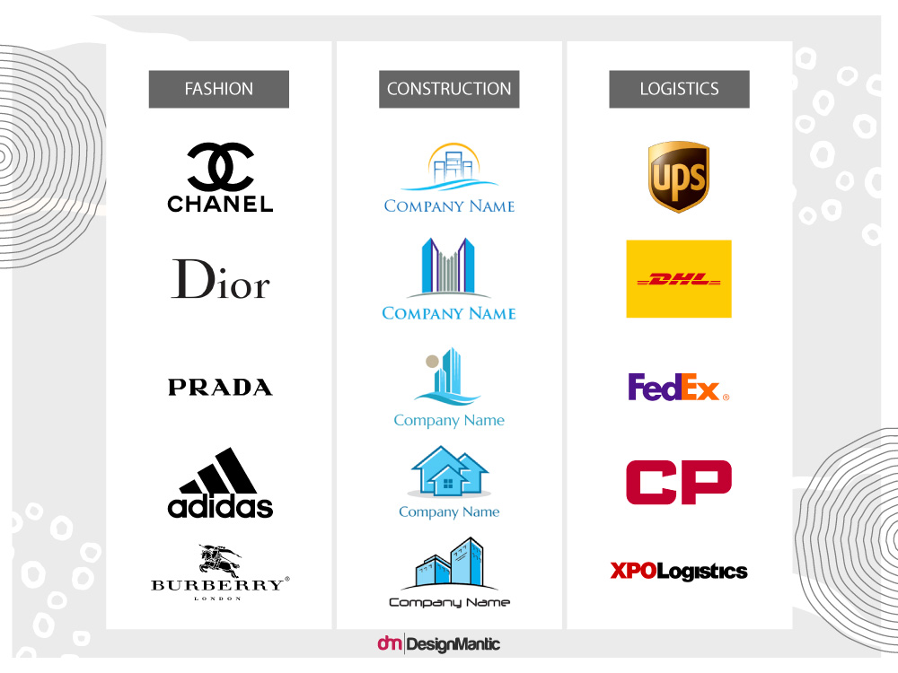
At its heart, fashion brands gravitating towards black and white in their logo designs seems more like an industry practice than anything else. The same can be said for transport logos that are mostly always in orange-red hues, as well as blue for construction logo designs.
• We Associate Certain Colors to Certain Types of Businesses
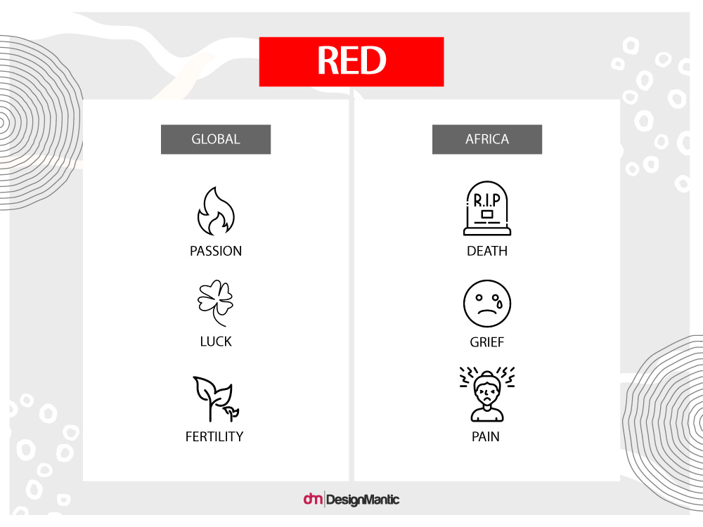
Cognitive, emotional, and cultural associations are also a thing to consider when talking about logo design colors. For example, red is a color of passion, luck, and fertility in almost all cultures of the world, but in Africa, it symbolizes death and grief.
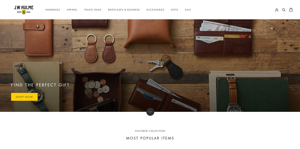
On an emotional and cognitive level, we associate brown with rot, wood, and mud. It’s the color of the leather too. Many companies dealing with leather goods choose brown (with black) over other colors in their identity designs.
We also associate blue with vastness and mystique because both the sky and the ocean seem blue to us. It’s the color of stability for us, as the sky will always be there for us as well as the ocean.
• Color Psychology in Logo Design
Color psychology is another important factor that influences logo design choices. And it’s not limited to color alone. Psychology in design is evident in our choices of shapes, icons, fonts, and even the layout. In color, though, it makes its largest splash.
It’s an entire field of research that’s consistently growing. Researchers, designers, marketers, and scientists continue to be fascinated by how colors impact our moods, behaviors, and actions. In logo designs, certain colors are chosen for certain businesses and industries based on their psychological meanings alone.
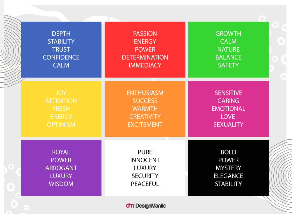
For example, purple elicits emotions of sexuality, creativity, and imagination. Cadbury – a candies and chocolate brand – displays itself proudly in purple and shows off the color in rich purple branding everywhere. Melted chocolate that you can eat off of your fingers was a series of especially sensuous ads by the brand for its Indian market that received immense popularity a few years back.
Color Palettes for Industries:
To see what color palettes are chosen by which industries, we are going to review the logos of the top 5 companies from 10 different sectors and see if we can see any color themes emerging.
1. Restaurant
The top 5 restaurant companies in the world are Starbucks, McDonald’s, Yum Brands, Darden Restaurants, and Autogrill.
Let’s take a look at their logos and see if we can spot a color palette.
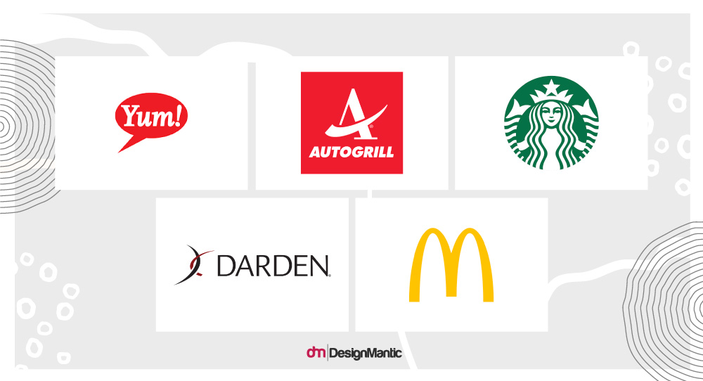
As we can see, red emerges as the most prominent color. No surprises there. As a symbol of hunger and urgency, red dominates the fast-food industry as well as casual and some fine dining brands. People also associate red with foods such as tomatoes, chili, ketchup, and many others.
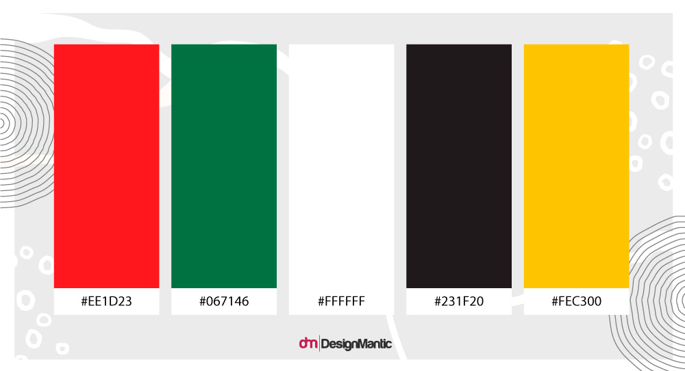
Black and white also emerge as the strongest secondary colors used with red. Both these colors balance the intensity of red and make it appear more inviting and welcoming. Yellow and green are two other secondary colors with strong ties to agriculture, farming, food, and eating.
Looking at this color palette, it’s clear that red should be a part of your color palette when creating a restaurant logo design. You can bring down the heat of red by pairing it with a cooler shade – black or white – or mix it up with yellow to turn it up a notch.
2. Banking
The top 5 banking corporations in the world include:
- Industrial and Commercial Bank of China
- JP Morgan Chase & Co.
- Japan Post Holdings
- China Construction Bank
- Bank of America
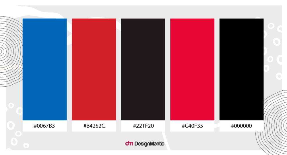
Dominant colors for this sector include red, blue, black, and white. Apart from Bank of America, the rest of them only use two colors in their logos. This understated and conservative design strategy has always been a highlight for older banking establishments.
New financial brands and FinTech companies try to incorporate more colors in their logo designs. Not only do we see more color variety in newer financial logos but shape and style variations too. For example, fintech app development has embraced these trends, utilizing bold, innovative designs to stand out in a competitive market.
3. Beverage
The beverage industry particularly refers to the manufacturing of products that are ready to drink. In addition to sodas and soft drinks, the beverage industry also produces teas, coffees, liquor, beer, and juice.
The 5 largest beverage companies in the world are Pepsi, Anheuser-Busch, Coca-Cola, Fomento Economico Mexicano, and Heineken.
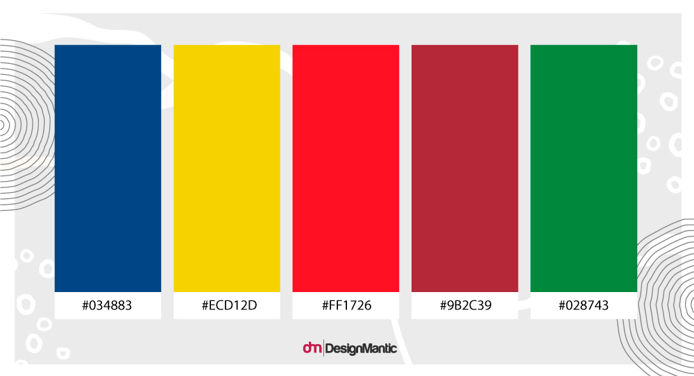
The color palette of the beverage industry, when compared with the previous two industries, is quite varied. It includes red, green, white, brown, gold, and blue. Anheuser-Busch uses the most colors in its brand logo and also the most details. The rest of the designs are more subtle and minimal. But it works for the brand. As a brewery, it allows the brand to showcase its rustic feel, its grandeur, and its range.
If you are also starting a brewing company, Anheuser-Busch is a great place to take your beer logo inspiration from.
4. Retail
In retail, we sell goods and services directly to consumers, instead of other businesses like wholesaling. The five major players in this industry include Walmart, Amazon, Costco, Walgreens, and Kroger.
White emerges as the dominant background color present in almost all of these retail company logos. Red and blue are the next two contenders. Then we also have yellow and black, making an occasional occurrence.
It is important to note here that the retail industry is vast, and almost all colors of the rainbow make a presence there. However, these few dominate the palette, especially for retail industry leaders. The reason it makes sense is that blue as a major color seems pleasant and inviting. Red draws the eye and is easy to spot in a crowd. Brands that want to attract major portions of the population do well with these two shades.
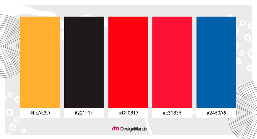
White is a great accent color and gives your logo a nice background to stay on. If you are designing a retail brand logo, don’t think your choice is limited to this palette only. As a newer brand, experiment with other shades present in the retail spectrum and make your mark.
5. Apparel And Accessories
In the fashion industry, black is considered the height of sophistication. The industry leaders are so fixated with black that we hardly see any other color donning its logos. It is the color of Nike, Gucci, Louis Vuitton, Adidas, and Chanel – the top 5 apparel brands in the world.
But black is also the color of Fendi, Armani, Calvin Klein, Prada, and so many others. The only few fashion brand logos that dare to consort with other colors include Hermes (an orange and white logo), Levis (red and white logo), and Lacoste (with its green crocodile) among others.
Apparel logo designs are also marked by their desire to opt for wordmarks compared to any other styles.
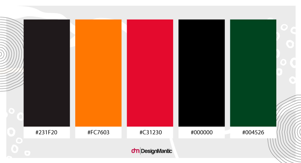
Keeping brand names front and center on their logo designs helps them enjoy a higher brand recognition and equity in the market. If you are opening a clothing shop and looking to invest in your brand with minimum effort, go with black and spell out your company name on the logo design.
6. Hospitality
The hospitality industry is a service industry. The leaders of this pack include hotel giants such as Marriott, Hilton, Intercontinental, Hyatt, and Host Hotels.
As these companies offer food, lodging, and event services at a palatial level, the colors they have chosen for their logo designs represent that height of luxury. Black, white, and gold are the colors of hospitality leaders.
We’ve talked about black and white, and how they symbolize sophistication and class. With gold getting in the mix, the design gets more royal. Gold not only signifies wealth and riches but it’s also a color of success, abundance, and endurance.
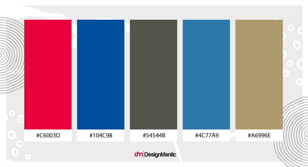
If you are creating a hospitality logo and want to bring a bit of shine to your design, consider gold with black for ultimate elegance and style.
7. Software And Programming
Let’s talk about technology branding a little. Like the industry itself, technology branding is also oversaturated. Sans serif fonts, simple wordmarks, and primary color palettes underline the tech branding of the modern era. From Google to Pinterest, all the designs look so similar.
Let’s look if Microsoft, Oracle, SAP, Salesforce, and Adobe (the top 5 global tech companies) also fall into this rut?
Thankfully, we can see some variety – if not much in color then at least in design.
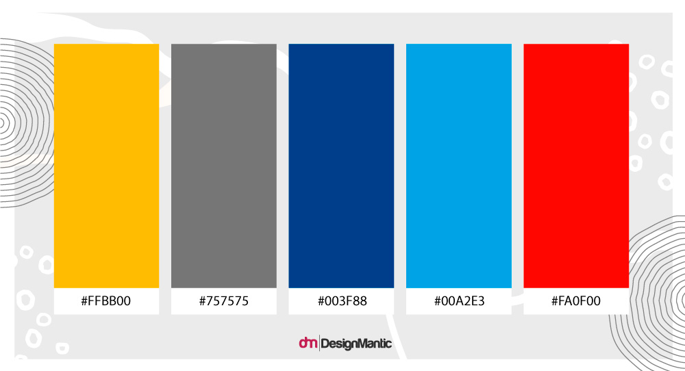
As you can see, the tech industry color palette is again pretty standard: red, white, and blue. But, as you move away from these leaders and focus more on newer brands, you can see a lot of experimentation. Gradient colors abound. Colors palettes become brighter and more populated. With icons still the obvious choice for tech industry logos, we see more variety in styles and colors.
8. Telecommunications
Here are the top 5 global tech companies:
- AT&T
- Verizon
- Nippon Telegraph and Telephone
- T-Mobile
- Vodafone
Here’s what their logos look like:
Unsurprisingly, blue again emerges as a popular choice. As most people’s favorite color, we see blue as one of the most common colors in corporate branding. As telecom is a highly complicated technical field with billions of dollars invested in it, going with a dependable and universally favorite blue shade in branding seems like a viable choice.
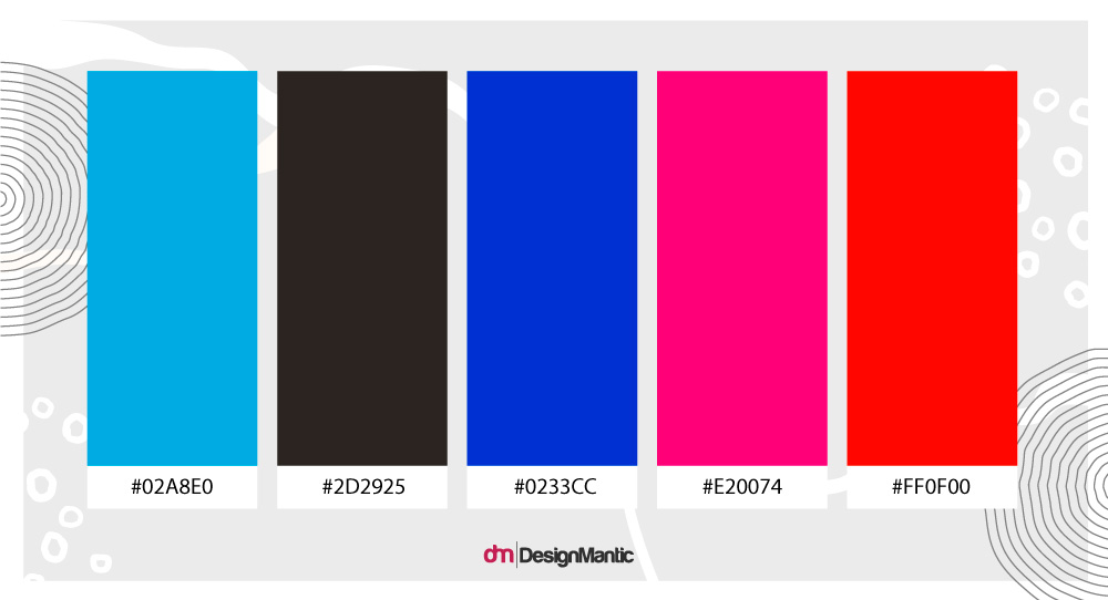
Red and black, with their passion and elegance, keep things stylish. As a new telecom brand, if you want to bank on the style, may we suggest a black and red combo? Much like Verizon. Or you can also go with a monochrome shade like T-Mobile’s red if you want to make a statement.
9. Entertainment
The industry leaders do not have much to offer when it comes to design variety as far as the entertainment logos are concerned.
Apart from Comcast, the 4 other players with high stakes in the industry do not have much going on in terms of unique logos. From Walt Disney to Charter Communications and from Viacom to Bolloré, all their logos look very similar. With blue being the popular shade.
Here’s their color palette from the combined logos:
What’s sad to witness is the lack of creativity in branding for an industry that runs on the novelty of thought and imagination. Only the Comcast logo is the exception here, but that has only been possible due to the colorful NBC peacock claiming its space.
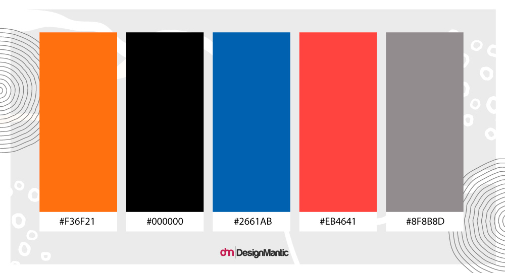
If you are starting an entertainment brand and want it to make a splash, try to inject some life into your brand with a bit of color. Going against the current will do you a world of good.
10. Insurance
If the entertainment logos – an industry that’s supposed to be all about vibrancy – ain’t doing it, can we expect some color variation from insurance logos?
If we go by top industry leaders – Berkshire Hathaway, Ping An Insurance, AIA Group, China Life Insurance, and Allianz – things do seem a bit alive.
In addition to the usual blue and black, we also have orange, red, green, and white. Some variety, at least. And surprisingly, too. The insurance industry very closely deals with finance and banking – two industries that always have to portray strength and dependability.
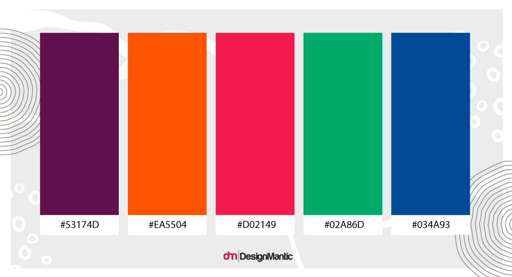
Therefore, it’s remarkable to see all these nice colors – orange, green, red – in the palette above. None of these colors is usually associated with reliability or power, yet, in branding, using these warm colors plus green signals a brand that wants to seem welcoming, approachable, exciting, and growing.
Wrapping Up
Color palettes of established names in the various industry tell a whole different story of priority shifts when we look at some new entrants in the market. Newer brands, in every industry, are more experimental and want to break the mold. More popular names, however, seem to be more invested in their legacy. At some level, it makes sense. Most of these older logos refer to classic brands and hold a nostalgic power with their consumers.
But there’s a difference between being classic and outdated. To protect your brand from being shoved to that second category, try revamping it at the right time. Just like Facebook did with Meta. Let your changes and shifts permeate through your designs so you can create legacies that transcend generations and cultures.

