While the lines for what is considered modern in graphic design have become a lot blurry in recent years – a shift from simple and understated to a lot of flare and details – for Christian visual identities, things are still pretty under control. We are witnessing a lot of simple and minimalistic typefaces to enhance the serious nature of the brand message. The colors are muted, simple, and flat. The intent is to look calm and composed instead of flashy and unbridled.
Perhaps the most experimentation being done in modern religious logos is in the area of icons. Abstract design leanings are hard to miss and traditional cross designs are being shunned in favor of more creative expressions.
To take a somewhat detailed look at what a modern church logo design looks like, let’s discuss a few points.
1. It Is More Than Just A Cross
For a modern church brand identity, think of creative icons that are not traditionally related to religion. The abstract design is going to be your best friend here. This approach will also work well for your business if you offer services specifically for religious organizations like accounting for churches, fundraising or graphic design. Presenting your church brand identity in visuals that are hard to pin into restricted categories will help you create a modern design for a religious or spiritual organization. Something more natural, and more welcoming.
Even if you want to go with a cross logo for your church, there are more than one ways to design it. Deconstructing it, merging it with other icons such as a tree or a crown, and wrapping your church’s first letter artistically around it are a few ways to go.
We also recommend using stained glass images, a flame icon (to signify resurrection), or bird imagery to denote the Christian logo. Being more experimental in your icon choice is the gospel truth for modern church brand identity. Using outdated, predictable, and contrived imagery for your modern church branding will negatively impact your brand image.
Image Source: Dribbble
Image Source: Behance
Cross logo for church
2. It Has Stately Type
Typography has a huge role to play in creating modern church brands. You need to strike the perfect balance between serious and inviting. Choose a typeface that looks imposing without being looking aloof. Your modern church needs to have an air of inclusivity, a fresh approach, and openness. Clean type with smooth lines,`serif fonts that have a stately and imposing feel but look streamlined will achieve this effect.
Related: How Typography Plays With Consumer Moods: A Dance of Letters!
Rounded letters with a gentle touch to them is also a great option if you want your modern religion logo to have an earthy, more down-to-earth feel. Montserrat, Trajan Bold, and Aaargh are some nice font choices.
Image Source: Behance
Book logo with cross on the cover
Image Source: Dribbble
3. Its Colors Are Soothing And Calm
The less is more approach is a building block of modern graphic design. While it can definitely have a larger than life personality, most designers and clients go for a cleaner and crisper image when they go for a modern brand identity. Nowhere is it more apparent in church branding than in colors. Most modern church brands go with calming and soothing shades of cool colors such as blue and green. Even warm colors are used in shades that are flatter and in a matte finish. Peach, sky blue, and pink can be modern church logo colors but without any sheen or shine.
We also see a lot of earthy colors – brown, beige, and black – make regular appearances in church logo templates that are going for a modern look. You can definitely use brighter hues in your approach but keep them on the minimal side. A single stroke of neon green, for example. Or a bright pink that is offset by a cool grey. Even the flaming orange can be used if you are keeping its shade on the controlled side and adding darker gradients with it.
Overall, keep your color choices in logo design clean and calming if you are aiming to design a modern church brand. This isn’t a place for screaming yellows or blazing greens, for instance.
Image Source: Behance
Image Source: Dribbble
Bird logo with dual shade circle
4. It Has A Stacked Layout
Most modern church logo designs use a combination mark – icon and text – where the icon is stacked on top of the text for the maximum impact. A stacked layout is the more common and popular layout design for corporate branding. It allows the icon to take center stage in the visual hierarchy, and therefore, make the icon a hero for the design.
Related: How to Use Visual Tools to Increase Engagement for Your Online Business
For such a layout, the type is usually present in a smaller weight, to make the icon look even bigger. A stacked layout helps people recall the brand more effectively as we remember shapes better than we remember a string of words.
So, go with a stacked layout for a modern church look and create a shape that is even easier (and interesting) to remember and recall.
Image Source: Behance
Classic cross logo design in a block
Image Source: Dribbble
5. It Isn’t Necessarily A Combination Mark
While most church brand identities utilize a combination mark to create their logos, it doesn’t have to be the case every time. Break the mold and do something different. Using only pictorial marks or relying completely on typography logos may make your modern church logo sample even more attractive.
Compared to a solely typographical logo, a pictorial mark is more attractive and more modern. In the digital sphere, especially, a pictorial church logo can find its place quite comfortably. The reason is, the modern/younger audience is used to seeing brand logos that are completely graphical. Apple, Twitter, and other famous pictorial logos have ingrained us to look at shapes and immediately draw meanings from them.
So, create a combination mark or not – it really doesn’t matter. As long as have an interesting graphical symbol attached to your logo design, people won’t forget it too easily.

Image Source: Dribbble
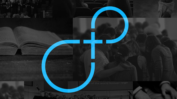
Image Source: Dribbble

Image Source: Dribbble
Related: 9 Tips To Enhance Digital Media Presence For Your Church
Summarizing
Minimal design principles affect modern church branding quite hugely. Therefore, look for design elements that emphasize the less is more approach. Everything should be either spick-and-span clean or so artfully disruptive that it justly captures the vibrancy of your religious outlook.


