The field of education runs the gamut from institutes that educate to education counseling facilities. When we think of education, we mostly think about schools and colleges. However the field of education is held aloft with the help of multiple systems –all of which need a particular identity to function on their own.
It may be an education counseling services firm that provides curriculum and course development services, or a center that provides students higher education counseling. It may be a writing society that provides creative writing workshops, or a learning center that teaches people foreign languages, or, it simply just may be a school or a university –the range of education facilities is large and wide, and the way we separate different ventures is through the way their logo speaks to us.
All of the different streams of education institutions have different kinds of logos to help distinguish them from the rest of the facilities. For today, let’s figure out the nuts and bolts of designing an education brand for preschool/ kindergarten schools.
Kindergarten School Logos –A World In Their Own
Designing meritorious education brand identities is very important part of building relationship with the potential audience. Before students or their parents become part of your school system, the first thing they’ll see is your school monogram which will lead them to form an opinion. It is very easy to gauge whether you are a progressive institute or a traditionalist one merely by looking at your school identity. They can tell whether you have modernist values built on a historical legacy, or if you completely eschew tradition and form new foundations. Believe it or not, all of that is embedded in your logo.
And then there is the idea of identification. A school logo works much like a national flag –there is loyalty and identity associated with it. Students are going to wear it on sports shirts on the field, and feel proud of representing their school. Kindergarten graduates are going to bear it on their graduation robes and on their gold-stamped certificates. In short, your school logo is going to function as an identity marker, and it is important it caters to this function well. When so many emotions are going to be attached with it, it is important that the logo boasts of a dignified and memorable quality.
The Kindergarten School Tiers
Before getting into the nuts and bolts of designing an education logo, it is imperative to understand what kind of an early education school you are running. While this can be broken down into different education pedagogies and philosophies, for the purposes of logo design, it is better to break it down into the specific levels of pedagogies your school is aiming at.
Do you have an early education setting? Do you offer a preschool program only or is kindergarten included in your course? Is your school a co-operative model where parents are supposed to work in the kindergarten on certain days, or it is a state kindergarten model? Are you running an alternative preschool or do you conform to the usual pedagogies? Perhaps you follow the emergent curriculum and employ techniques from different educational philosophies!
All of this will determine the symbol, style, colors and typography your educational logo will incorporate, because if you are aiming at a specific type of education, your audience will differ largely, and so will their needs and beliefs. Your school identity needs to be very accurate and precise about the kind of education it is promising to deliver. So let’s look at the ways you can nail your kindergarten logo to suit your particular educational beliefs.
Tips To Create A Kindergarten Logo
- Choose Bright Colors
- The Style Has To Be Educational
- Use Playful Typography
- Select Vibrant Symbols
Kindergarten refers to the level of education that targets young children, particularly between the ages of 4-6 years. The age range differs according to the countries, in US Kindergarten targets 5 year olds. Now if you have any idea of child development, you would know, even this age group is a huge spectrum in itself – because it incorporates so many developmental stages and thus many different kinds of educational solutions. This is why designing a logo for an early childhood education setting is a challenge. Designers need to be totally on board with the educators to understand the subtle differences in the types of kindergarten philosophies they’re pursuing, to be able to get the logo right.
Related: 10 Creative Education Logo Designs with Lessons to be Learnt!
Kindergartens can range from KG playschools directed through an emergent, play-based curriculum, to the more typical state-curriculum based kindergartens that focus on direct, classroom instruction. All of the types differ, and so should their school brand identity. Here are some steps that can help you in getting your early childhood education logo right.
• Color
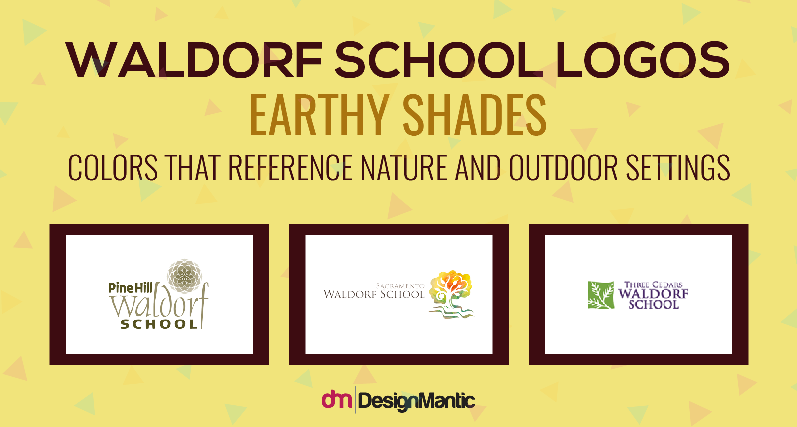
When it comes to choosing the appropriate colors for a kindergarten logo, it is not only important to employ the appropriate color psychology and remember the 10 commandments of color theory, but it is also important to see what kind of education pedagogy your school comes from and try to reference that through colors. For example, if your school is based on the Waldorf Educational Philosophy, the colors should be reflective of the imaginative quality and links with mother nature that are emphasized in Waldorf schools. Use of greens, yellows, earthy shades and woody browns is perfect for a Waldorf logo.
Go deep into your particular education pedagogy and try to extract color schemes from there. For instance Montessori kindergarten school logos may utilize solid flat colors that reference the typical Montessori style and apparatus. So think of solid reds, bright, solid greens and blues –all set into geometrical flat shapes.
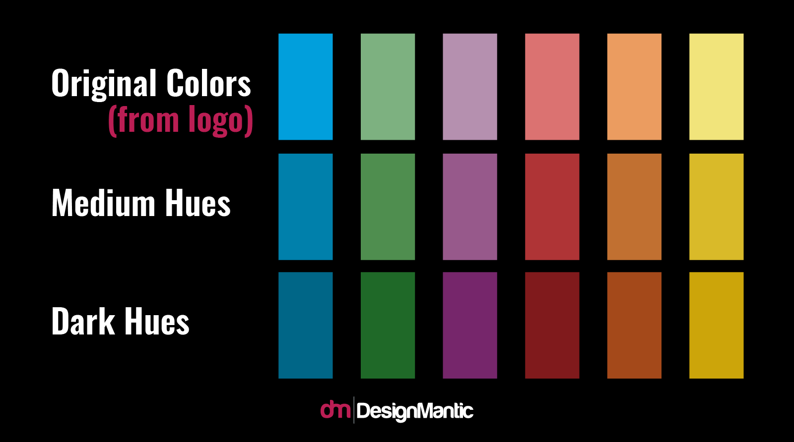
Another important point to remember is that Kindergarten schools tend to use more vibrant colors than middle or senior ones, to reference the particular age group and emphasis on play. So for example, if you run a Montessori school, your color scheme may take the more vibrant shades of the same color. And if you have a middle school you may use darker hues of the same colors.
• Colors Also Reflect Your Students
Your logo colors also reflect the types, personalities and growth of your students. For example, if your school logo is multicolored, that may mean you take in different kinds of children – coming from different ethnicities, countries and races. This is because multi-colors are used to denote diversity and a multiethnic culture.
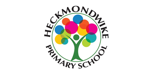
For example this primary school logo shows their kindergarten and primary school classes are inclusive of different races and multi-ethnic. The different colored circles represent different segments of the society, and the shape of a tree shows connectivity and unity among all.
So your education brand is going to say a lot about the kind of growth and values the children will be receiving at their school. This is why it is also important to steer clear of any colors that may have a negative connotation in your culture.
• Style
Your kindergarten logo style should always also be informative of two things; the kind of education level you are targeting, and the educational philosophy you follow. If you are designing for a school, it is important to understand the education philosophy in its entirety and take a look at the apparatus, toys, and furniture and equipment styles used by that pedagogy. This will give you a good idea of the color schemes and styles to follow. For example, Waldorf schools mostly utilize a handmade quality because it is closer to references of art, nature, dreams and imagination. Even their typeface styles can be determined by this.
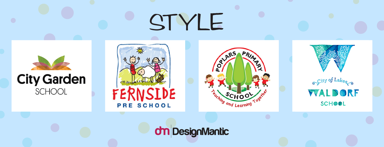
If you follow the state-curriculum, it is better to stick to styles and forms that are less binding and not indicative of any specific philosophy. Instead the goal is to generally reference learning, curiosity and education through your logo. You may do this in different styles. For instance the following logos use clip art styles to depict their progressive, off-the-pedagogies approach:
The style is very digital, even when the Fernside logo has a handmade look to it. This is because the kind of tools that are used in coloring are digital tools, and they give the impression of a progressive school.
• Typography
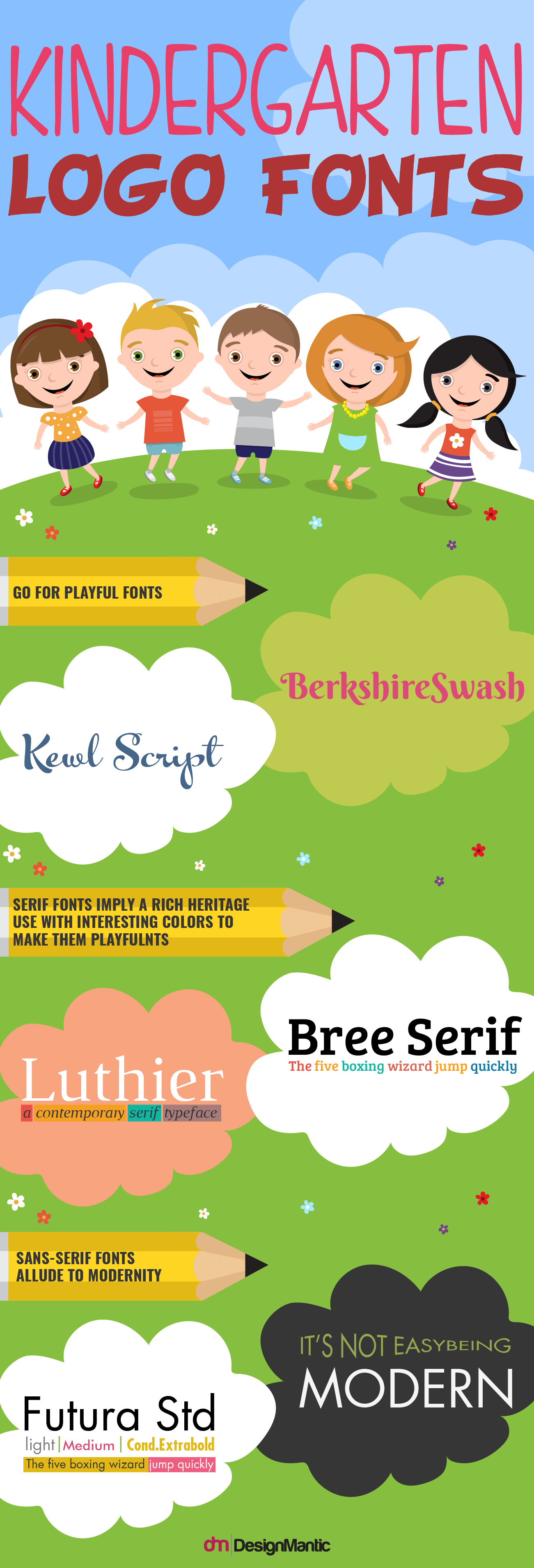
Typography is one of the most important factors for an effective education logo design! Fonts for early childhood schools tend to be more playful than fonts for junior and senior schools. Because of this, you can even consider using custom fonts or novelty fonts for your school logo. However, if you are going for a school that incorporates all levels of education and Kindergarten is just part of your course, you may want to try and stick with a font that is inclusive and reflective of the different levels you host. For this, it is better to stick to the classics; Helvetica, Avant Garde or Futura etc.
If your logo wants to showcase your traditionalist values and rich heritage, go for serif fonts. The most popular examples are Times New Roman and Century School Book. These fonts can be tweaked in color and in base-lines to give a more playful feeling. Alongside strong school branding, using an ai detector that teachers use helps ensure academic integrity and builds trust with parents and students. American schools tend to use more sans-serif fonts while European schools like to refer to their heritage by using serif fonts. If you are an alternative Kindergarten based on some interesting educational pedagogy, you may even dare to use a custom font. However that can be tricky, and is only doable if you have a very clear idea of what you want.
• Symbols
While you can use any symbol that reference education, learning, wisdom, curiosity etc. it is again better to go for symbols driven from the educational pedagogy. This is because your symbol will very specifically refer to your educational values then, which is not only good for establishing an identity among students, but is also good for marketing – your viewers are able to perfectly gauge what they will be getting when they come to your school.
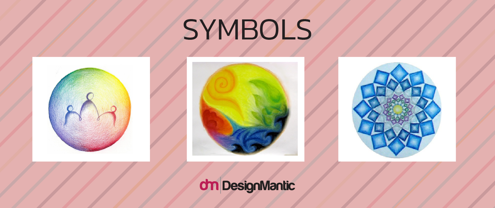
Let’s take our classic example of Waldorf Kindergarten schools again. You will see their logos utilizing images of trees, leaves, sun and lakes etc. This is because the Waldorf philosophy emphasizes very heavily on nature and imagination driven from nature. Their symbols may include Native American earth symbols, pine cones or even mandalas that symbolize the natural rhythm. It is important to understand the symbolism of your educational philosophy and then translate that into a vibrant design.
• Some Common Kindergarten Logo Symbols
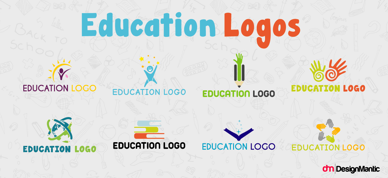
Kindergarten logos often use some common symbols because of their easy reference to education, learning and growth. Here is a list of some that are used. You can tweak the styles to make these symbols appear more fresh and unique.
Trees
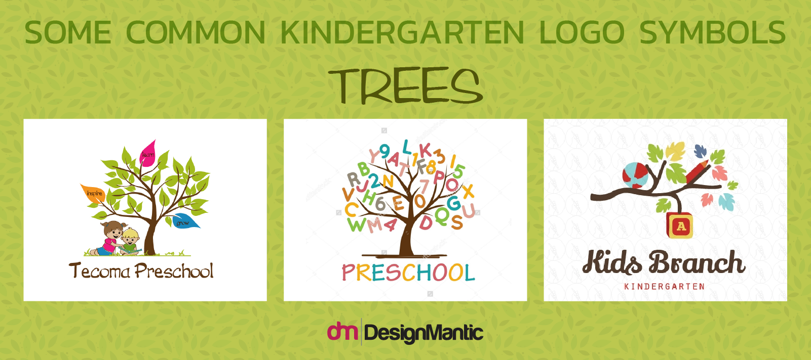
Trees have been used as a symbol of education since ages. This is because a tree represents the ‘tree of knowledge’, and its branches and leaves represent the students and teachers that are linked in this bond of learning. Trees also symbolize growth, shelter and development –all the messages a kindergarten setting wants to convey to parents and children.
Using leaves of different colors can further deepen the symbolism –that would mean the kindergarten focuses on diversity and multiculturalism.
Children Figures
Use of figures of children is also common. Children holding hands, playing together or playing under a tree symbolize a happy, playful environment that caters to the physical and mental wellbeing of children.
Books, Pens, Pencils
Open books, pens and pencils are also used in kindergarten logos to symbolize learning and academics.
Animal Figures
Animal figures that symbolize learning and wisdom can also be used. The most common one is an owl wearing a graduation cap. This is because owls are known as wise beings in the traditional folklore. Sometimes the symbols may even include lions and snakes, because in legends these two animals were epitome of wisdom and leadership.
These were just some examples that can help you think of ways to go deeper into your Kindergarten school logo to make it more precise and personalized. For a great school logo the school visionaries and the designer needs to be at the same plane. This is why appropriate communication is just as important.
Got any new ideas for great school logos?! Write back to us in the comments!

