When Pierre Bonnard said, “Color does not add a pleasantly quality to design, it reinforces it”, he may as well have been talking about pink. There are very few colors that are able to have the kind of appeal that this one does. While in logo design, all of the color palettes and spectrum are important, pink stands out due to its impact in sending targeted and strong messages.
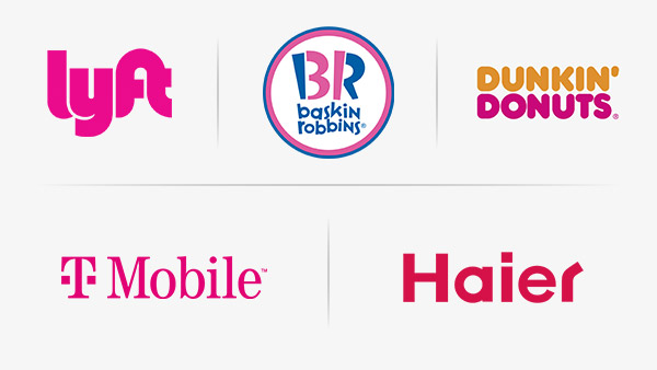
Colors are a critical element of design and they need to be chosen very carefully. If you want your business to become successful and be recognized as a unique brand then the first visuals have to make a powerful impact. The right colors in the logo will help you build a connection with the consumer immediately. For example, pink color catches the eye anywhere and works well in quite a few industries. If you consider the color spectrum of famous logos such as Dunkin Donuts, Haier or Baskin Robbins, they all have shades of pink or hints of its tone.
Going further, this article will tell you all you need to know why pink as a color in design is so popular and what it represents!
The Significance Of Pink
According to surveys and reports, around 70 percent of people recognize brands by their symbols and logos. They associate the colors with a particular feeling or memory. When it comes to logos and web design, pink has a significance that goes back years. Since the beginning, the color pink, has come to be known as feminine. Be it in advertising campaigns or branding, pink is the color that dominates where the target audience is made of young and adult women.
The usual belief is that anything in pink will be ‘girly’ or playful and sometimes this can actually be an advantage. In graphic design, pink color is related to softness and sweetness and is effectively used to symbolize a good or fun time. Designers and brand owners looking to attract female consumers or run an awareness campaign related to a feminine cause try to focus on pink. Keeping in mind the gender and age preferences, they add the color in symbols or to their wordmarks and lettermarks.
The Association Of Pink With Women
Pink is to women what blue is to men. From a young age, colors for girls and boys have been put in boxes and specified according to the gender. So blue is masculine and pink in all of its shades is feminine. Due to this, companies and brands make their color selections in such a way that they are not only able to show the industry but also the target market. Look at it this way, there are a lot of beauty logos that might have pink color in them while logos in construction or technology may usually have grey, black and blue color schemes.
Over time, pink has remained associated with women and has taken on different meanings that are mainly considered feminine but have a universal appeal. For instance, you can say that pink color carries a message of love globally. It shows elegance and beauty, liveliness and hope. In a few studies about colors in visuals, it has been discovered that pale pink tones or pastels can have a calming effect on people as well.
Both these logos feature pink as the dominant color and can be used in branding and marketing campaigns to send positive messages and engage the consumer.
Butterfly logo with pink and purple
Pink Logo with girl and wings
There are quite a few companies that have used the pink color in their branding for creativity and to bring out joyful emotions. Barbie’s logo is created in a shade of magenta-pink that is now popularly known as Barbie-pink. The target market for the Mattel, the company which produces the dolls, has been young girls and the brand design is very specific to that.
Image Source: Behance
If you look at this logo design, you will see that combined with typography and script which looks like it’s been written by a young child, the color pink is quite appealing for its audience.
Let’s take a look at some more brands and awareness campaigns that are created around the pink color.
Breast Cancer Awareness
One of the most commonly recognized pink symbol in the world is the pink ribbon that has come to be associated with breast cancer awareness. From the early 90s, the ribbon in pink was given to people to promote the cause of awareness within people about breast cancer. Soon afterwards, the symbol became famous across countries as Estée Lauder and Self Magazine began supporting the campaign widely. The pink color was chosen to show hopefulness, health, healing and support for women suffering from the illness. It is a shade of pink that is known as ‘150 Pink’ and is highly soothing in appearance as well.

Image Source: Pinterest
The pink color in the logo above sends a message of unity and life. When you see pink ribbon logos anywhere, you automatically think about the awareness campaign and standing with the survivors.
Breast cancer ribbon with heart logo
heart and woman logo for awareness
Take a look at these two logos for the campaign. You will see the color bringing out a feeling of positivity and empowerment as well. In the first logo, the ribbon has been merged with a green leaf which also shows new beginnings and strength.
LG: Life’s Good
While pink may not be a popular choice in electronics logos, LG, one of the biggest companies in manufacturing such products, went with the color in their logo design.
Image Source: Pinterest
The L and the G are stylized to show the name of the company where else the pink emblem is created in a way that it forms the image of a smiling face. Pink is the central color in the logo and is combined with cherry red for an appealing effect. This color sends a warm and friendly message which the brand wants to convey.
Star Logo for company
This pink logo created for a business is also quite powerful and represents confidence and softness which are both associated with the color.
Victoria’s Secret: PINK
The lingerie and clothing company launched this separate line with the name Pink. It’s targeted towards young women and girls, and has been positively received by them since its launch.
Image Source: Victoriassecret.com
The logo with its pink color and typography is designed to catch the eye of the consumer immediately. This tone of pink represents youth, fun and friendliness, and the brand has effectively used it to engage its female audience.
Bag with wings logo
This is a good example of a logo for a company looking to attract a young and female group of customers.
T-Mobile
The telecommunications company stands out in the market with its bright pink logo. In fact, the shade of magenta pink in the logo has been trademarked by the company.
Image Source: t-mobile.com
With the T in pink, the business has managed to appeal to the consumers and is known for its vibrant quality. Its color scheme also stresses upon the message of compatibility and user-friendliness.
Summing Up
Sometimes, companies are might hesitate in using pink in their brand identities but it can be an ideal choice. With suitable complementary colors, you can have a logo that can be used to make an impact as a brand symbol on products and merchandise such as clothes, shoes, bags and even mugs.
Pink is one color that has a lot of sides. On one hand, it can be taken as delicate and soft, while on the other, it can represent empowerment and confidence.
So do not hesitate to play with colors in your business logo and come up with a brand identity that helps you succeed in the industry in no time!


