The presidential election is only a week away, and the early voting numbers this year have already shattered records of the past election of 2016. It’s going to be interesting to see what happens on the evening of Nov 3. In the meantime, however, we are bringing you the top 10 presidential campaign logos that helped their candidates create a unique identity for themselves. And while not all of these logos were successful to reserve the Oval Office for their candidates – logos alone can hardly do that – they did help their contender run a strong race.
Related: Hillary Vs. Trump: Who Is Winning The Design Battle
Before we start analyzing each design individually, it is important to note that the US presidential campaigns run on some pretty established visual graphics. You’ll see a lot of red, white, and blue of the flag colors. The stars of the flag also make a regular appearance. And most logos are typographical in nature: wordmarks. The intention is to inspire the patriotism of the citizens and make the candidate look the perfect American to represent this great nation, that’s why such heavy borrowing from the national flag design. The wordmark logos are preferred as they reiterate the candidate’s name in the very design, hence, you are guaranteed that your candidate’s name will become a household mark in practically no time.
Now, come. Let’s see what our top 10 political logo designs are.
1. Barack Obama

Image Source: Wikipedia
President Barack Obama’s 2008 campaign logo will perhaps go down in history as the most effective and efficient graphic design asset ever bestowed upon a politician. Eschewing the tradition to use a typography-based logo, Obama went in for a strong pictorial mark as his official campaign logo. Well, technically, the official logo is a combination mark, with Obama’s name spelled out under the pictorial graphic, along with the year of the election.
But it’s the pictorial O that takes the cake here. First off, the fact that Obama’s name started with an O helped matters. It allowed the designer to use a circle as the main logo shape. For those new in the business, the circle is the most celebrated shape of all. It offers symmetry; something that the human brain really goes after. It also offers completion, uniformity, and harmony.
The three red stripes under the sky blue arc of O looked like a field with the sun rising from the horizon. The color use is also clever. The traditional navy blue mixed with a modern shade of the same color. This modern shade is usually present in tech logos and we are willing to bet that its presence on the logo resonated well with the younger voter base of Obama who became even more certain of his promise to bring ‘Hope and Change’.
In its conceptualization, the logo is intelligent; in its execution, it’s impeccable. The power of the original Obama logo was so great that they decided to go with the exact same design in their re-election campaign too.

Image Source: Wikipedia
2. Donald Trump
Regardless of whether you agree with Trump or not, the fact is he ran a pretty noteworthy campaign back in 2016. His MAGA hats became all the rage and the slogan proved to be quite catchy. The power in Trump’s logo, however, resided in his strong typography. A sans-serif font in block letters made his name look imposing and dominant – quite like the image he likes to portray.

Image Source: Wikimedia
Enclosed in a delicate border, the logo did not contain any distinct shape but the border gave it a form and acted as a container. The flag stars also made an appearance and increased the patriotic touch in the logo.
The colors in the logo are saturated but not too much. This exact right shade allowed the logo to have more light and appear confident. Trump’s 2020 logo is almost an exact replica of its 2016 one. Also, checkout Trump’s Space Force logo.
3. Hillary Clinton
Hillary Clinton’s logo is perhaps the only other one in this list that’s a pictorial mark. It’s distinct, and much like Obama’s tries to create a unique space for itself among the crowd of word-based logos. However, when it was launched, it was not very well received by online critics. They deemed it too strong and too masculine.

Image Source: Wikipedia
The fact is, the logo in its visuals is quite hip, modern, and on-the-dot. It doesn’t try to be overly complicated. By remaining a simple icon, it conveys its message of forwarding motion without leaving any room for ambiguities. The simplicity of the icon allows for it to be a versatile icon. It can take many colors, patterns, and shapes. The chosen colors of a deep-set red and a calming blue are quite on-point too.
One of the most interesting things about this logo is that unlike most presidential candidates, Hilary Clinton chose to use her first name initial in her logo. Perhaps it was to make her seem more approachable and make her name a household brand. Or, it could be a bid to create her own mark away from her famous husband’s name. Who knows?
4. Jeb Bush
Another candidate that chose to forsake their famous family name and run with their first name is none other than Jeb Bush. When he ran for president in 2016, he had a choice to make. Should he draw upon the legacies of two former presidents in the family or carve his own niche? As evident from his famous logo, he chose to do the latter.

Image Source: Wikipedia
Jeb Bush’s logo was a wordmark logo, following in the footsteps of many past candidates. The unique thing about this logo, however, was the use of the exclamation point. The exclamation mark not only added excitement to the logo but turned the logo into a chant. It also made the candidate look more relatable. So what if he belongs to a rich and famous family, he’s just Jeb. The guy wants to be your friend!
The logo is also extremely simple in its concept and execution. Just a name and a preposition. And it works. The chosen serif font does not look aloof and the shade of red is just the right balance of bright and dark. The year of the election mentioned underneath the name seals the design.
5. Robert Kennedy
Another presidential candidate who belonged to a famous political family was Robert Kennedy, younger brother of the 35th American President, John F. Kennedy. Robert Kennedy was a famous politician in his own right and made a name for himself as a modern and liberal politician. However, unlike Jeb Bush, when Robert Kenney ran for president in 1968, he did not shy away from using his famous family name.

Image Source: 4President
Kennedy’s logo was all typography. No borders, stars, signs, icons, or anything. Just thick, block letters in a sans-serif font that made his already popular name even more prominent. The colors – red and blue – that were used were lighter in shade and had more white in them than was customary for that time. The colors were also flipped on each other at an oblique angle, which added dimension and momentum to the design.
6. Joe Biden
Biden was the running mate of a president that holds the most memorable political logo icons of all-time. So naturally, people were expecting a lot. And while Biden’s logo does fall short in the creativity department, it more than makes up for it by being simple, modern, and powerful.

Image Source: Wikipedia
The typography is strong, which makes his name stand out. In all caps, the type does not make him seem too approachable but the sans serif font prevents the logo from looking too aggressive. The balance is achieved by making his name look powerful but not imposing.
The three red stripes that make up the letter E not only draw parallels to the national flag but also add forward motion to the logo design.
7. Jimmy Carter
Jimmy Carter ran for president as an ‘outsider’ in a time when the voters were pretty disenchanted with established career politicians. As an outsider, he chose to avoid the typical visuals of the presidential campaigns. Most famously, his presidential campaign did not use blue, white, and red colors of the national flag. Instead, he chose to go with green.

Image Source: Amazon
And it worked. His promise that ‘I’ll never lie’ was what people wanted to hear when the whole nation was reeling from the after-effects of the Watergate Scandal. The slogan promising integrity as well as the color green helped him cement his campaign’s success.
Another way his campaign decided to set itself apart from the rest was the avoidance of any kind of graphic logo icon. Instead, they went with a black-and-white picture of the candidate himself and hoped that these distinctions will set him solidly apart from all the rest of the candidates – which they did. And it all worked out in his favor.
8. Ronald Reagan
Ronald Reagan ran against incumbent President Jimmy Carter. For his campaign to be successful he needed to strike a strong image – something President Carter had not been able to do during his presidency. To that end, Ronald Reagan chose to go with a simple but dominating and impressive typography-based logo.

Image Source: Wikipedia
His campaign chose the navy blue color of the flag and a traditional serif font. His use of the serif font was intentional. It conveyed authority, deliberation, and strength. Reagan’s message was clear for everyone paying attention: where Jimmy Carter was casual (with his signature grin), Reagan was more formal and authoritative; if Carter wanted to seem approachable, Reagan wanted to cast a more serious and assertive figure.
The Ronald Reagan logo made another interesting choice to add more strength to the design. The campaign chose to use the same font with the same weight for the VP candidate’s name as they were using for Reagan. It conveyed to the public that more than choosing a new leader, they were choosing a strong team.
It all worked splendidly in Reagan’s favor. The use of a simple wordmark made things uncomplicated, the color was what the American public knew and trusted, and the font held strength and promise.
9. George W. Bush
Using patriotic design elements from the national flag is probably a rite of passage for anyone running for president – or so it seems. Take any hopeful candidate’s logo, you will see one or more elements from the flag – color, stripes, stars – decorated on the logo.
But George W. Bush went for the whole flag.

Image Source: 4President
His 2000 campaign logo featured the flag right next to his name. The choice made sense. One of the key points of his campaign was about military strength. The use of the flag image made sure that people associated him with the commanding power of the US military.
The use of the deep navy blue and blocky sans serif font also reiterated that message. He used an almost similar logo design for his re-election campaign in 2004, as well. Then, he wanted to continue the war on Iraq that he had started in his first term. The continuation of the logo design helped him secure his re-election.
10. Bill Clinton
Bill Clinton’s 1992 campaign logo was very reflective of that time. In true 90s fashion, the logo had a lot going on in a limited space. Not only the colors, stripes, and stars of the flag were used but Clinton’s name and the simple words ‘For President’ also used three different font weights to add meaning to the logo.

Image Source: Digital Commons
The design used his full name for the logo with his first name in a much smaller size than the imposing weight of his last name. The latter was further made more impressive by using a fairly large star in place of the dot of the small case ‘I’.
The red and white stripes protruding from the star were designed in a way to show movement and progression. Perhaps in an effort to convey to the public that he will usher the country in a new era of progress and change. Overall, the logo had a lot of personality and character.
Especially if you consider the fact that only in four years, he made some drastic changes to his reelection campaign logo and went a totally different route. His 1996 logo was more news-like and pretty straight forward in the use of fonts and colors. No large stars or wavy stripes either. And it was for the better. With all the scandals plaguing the presidency in 1996, he needed to tone down the original design and present a more cautious and serious look, which he did.

Image Source: The Boston Globe
Last Thoughts
Analyzing election campaign logos is a lot of fun. Trying to gauge the personality of a candidate through their use of colors, fonts, and shapes. Attempting to determine the kind of president they’ll be based on how they have designed their logo. Trying to see if we can any glimpses of their hidden selves through their use of unique design elements. And most importantly, if the logo can determine a candidate’s success.
Related: Why We Woot Melania Trump’s ‘Be Best’ Logo?
As great as political logo analysis is, it cannot tell you much about which candidate will win and what they are trying to say between the lines. No matter how great a logo is, it’s the man and his message that people respond to. If those things don’t hold much weight, the size of your font won’t be able to do much to get you the election.
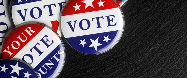
So, go out, vote, and make it count.