Yoga Logos Need Conscious Design Decisions
The opening of any business needs a serious approach to keep the day-to-day affairs in control and branding is one of the many important factors to take your business ahead. Same is the case with yoga studio or yoga practice. The first thing you will need for marketing and branding is a yoga logo that calls for special attention when in making because of the nature of the business. Yoga logos need a spatial flow, flexibility and a natural, harmonious alignment because it needs to reflect the flexible nature of your yoga practice.
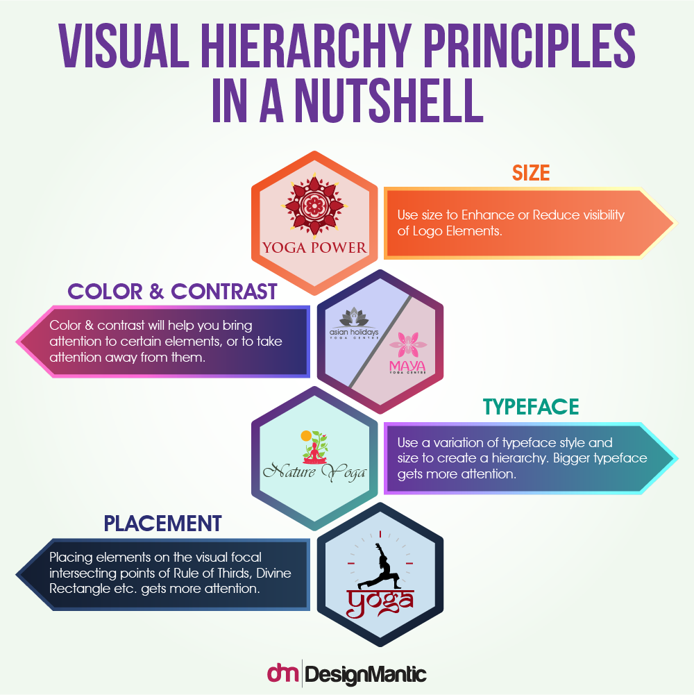
As yoga makes us aware of the spiritual and harmonious side of ourselves, the same should also be reflected in your yoga logo design. An element that can only be achieved through conscious design decisions. One of the best ways anchor your design decisions is to use visual hierarchy principles and tools. These tools help govern your overall design so it progresses toward flow and betterment.
Let’s explore the possibilities how we can use this visual hierarchy to end up making memorable and effective logo designs.
Why Hierarchy Is Important For Yoga Logo Design
Visual hierarchy is an important concept in graphic and logo design. The aim of all visual designs, whether it is a logo or a flyer, is to grab the attention of the viewer and help him decode a message in a convincing way. A well-designed logo makes the viewer knows exactly what it reflects. This integration of information is the basis of a good design and is achieved by following the principles of visual hierarchy, a structural element of logo design. It helps designers arrange the logo elements in a systematic order that governs the patterns how a customer think of a certain brand. How your viewer navigates through the logo design, depends largely on the hierarchy you create.
Understanding The Concept Of Relationships & Hierarchy
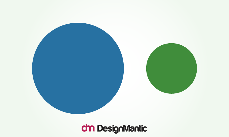
Before we move onto other techniques of creating a good visual hierarchy in your yoga logo designs, let us make you understand that the concept of hierarchy stems from the concept of relationships. When people look at visuals, they instantly try to organize the visual information in relationships. For example, consider this visual:
An average human being is not going to process the above image as “two circles”, instead, he will perceive it as a blue circle and a green circle or a big circle and a small circle. Basically, the person will compare the two elements together and find ways of differentiating them. Or, in other words, you can say the person will create a visual relationship between the two.
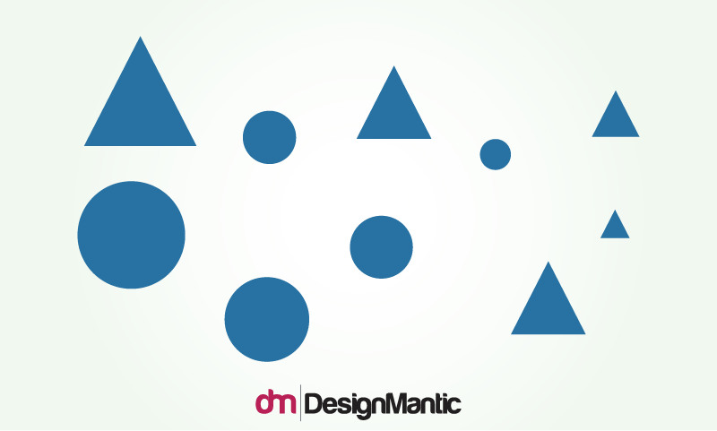
Similarly, when the visual gets more complex like the image below, the human mind will try to form even more complex relationships based on similarities and differences. Instead of viewing all elements separately, the human mind will try to group it together in a relationship.
Related: The Visual Design Glossary
Similarly, when you design a logo, each element is going to be viewed in relation to others. This contextual nature of design helps form a basic hierarchy and you can use hierarchy in a meaningful way to create the details you want.
The Visual Hierarchy Toolbox Which Can Help You Design Great Yoga Logos
So let’s get to business now! What are the tools and techniques you can use as a designer to create a good hierarchy in your logo design? Here are some of the things you can do:
1. Going Big
Size of a logo makes a very impactful difference and is a very obvious attention grabber. So, the biggest, the better. You can use different sizes in yoga logo design to grab consumers’ attention to a particular aspect of the logo. Size also helps users form a relationship of proportions. So, it is important that you relate size to the concept of ‘importance’ or ‘dominance’ in designing your yoga logo. Your biggest logo elements should always be the ones that you feel the most important. So for example, if you want your yoga studio name to stand out the most, like in the case of wordmark logos, the company name should be written in big, bold characters.
Image: YogaTreesf
Yoga Tree is San Francisco Bay area’s premiere yoga center with most renowned yoga studios that features top-class yoga instructors from around the world. Its logo uses the merger of two big trees that is the primary element of the logo and is eventually the center of attention. Then comes the name of yoga practice i.e. Yoga Tree, all in upper case to make a lasting impact. The designer keeps the font size of wordmark logo consistent and scales relatively big, so it is not outshined by the image.
Image: JivamuktiYoga
Similarly, this yoga logo uses the size factor to highlight a snake in yogic posture. The third eye in the logo is used as a symbol to highlight mediation linked to yoga and the pair of eyes show the mystical side of the business. The desing keeps the wordmark in a relatively smaller size, a smart variation in size that helps the logo look clean.
2. Color & Contrast
The color is another important tool that can be used to create a visual hierarchy. The interesting thing about color is that while it can be used to organize the structure of a logo, it is also a personality tool. This means the colors you choose will not only convey a visual hierarchy but will also convey subliminal messages about your company’s personality.
Bold colors with a marked contrast will demand the viewer’s attention while receding colors will divert the attention. You can use this color application in logo shapes, symbols, and even fonts. Whatever needs to be emphasized should have a bold or contrasting shade, and whatever needs to be de-stressed, should utilize muted colors.
Here are some examples of yoga logos that use color to create a visual hierarchy.
Image: kiragrace
Logo for Kira Grace breaks down colors into the level of importance. It uses a flat icon for Lotus flower, a healing symbol, coupled with gray shadow. The use of gray in the wordmark causes the shocking pink jump out vividly stealing all the attention in first glance. The use of negative space between the symbol and wordmark is ample enough to lend it a breathing factor.
Image: Cyndilee
The logo design for Cyndi Lee yoga studio uses three circles in contrasting colors to create a hierarchy. The most dominant element in this circle logo is the combination of three circles that resembles the All Seeing Eye. While the text is actually smaller in size than the symbol, it is comparable because of black color. So at the end, the two elements become equally attention grabbing – the symbol because of color contrast and the text because of its black color.
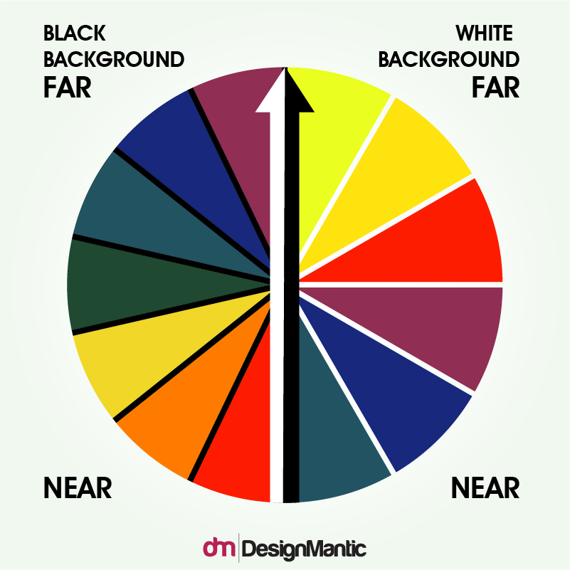
Colors also have a hierarchy of their own, where certain colors will seem more important and “near” while others will seem to recede in the background or seem far. The colors that will seem far or near against a white background, will work the opposite against a black background. Here is a guide to help you understand:
3. Typeface Weight And Pairing
Other than typeface size, weight and pairing also create a sense of hierarchy. Weight is the individual thickness of a character. Different weights, for example, bold weights or light weights can be used to create a hierarchy. By default, whatever is set in bold will grab more attention. Similarly, a big size of a typeface and scale grab the most attention.
Pairing refers to the font combinations you use together. For example, serif with sans serif, stylized or script fonts coming together etc. Some fonts are by default more attention-grabbing because of being bulky or dominant in nature. For example, a serif font of the same size and scale will be more dominant than a sans-serif font of the same size and scale. You can use this information to your advantage in your yoga logos by using different levels of fonts, where the most dominant one is the company name. The second attention-grabbing one is the tagline.
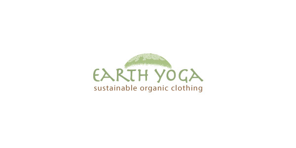
Image: EarthYogaClothing
For example, the above logo uses decorative sans serif font in upper case to support humanistic sans serif font in lower case. The tagline in this case is de-emphasized using a low intensity color, style, and size.
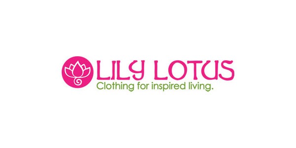
Image: lilylotus
This logo uses two types of fonts, a script font as well as a sans-serif. The name of the yoga practice is given emphasis with the help of size, while the tagline is given second place in the hierarchy because of its font size and style. However, the placement of the yoga studio name still gets enough attention, so it is not fighting for it.
Which brings us to our next point – placement of elements and space!
Placement
Placement of elements and space is an equally important factor whether you want to bring attention to a specific element or withdraw attention. For example, one of the ways in which placement can be used is with the help of negative space. When there is more negative space around an element, it is emphasized. Less negative space around the elements means that they are viewed as a group, thus decreasing the importance of individual elements.

Image: Omstars
The negative space around the elements in this logo is highlighting the symbol as well as the wordmark equally. How the element is placed allows you to treat two separate elements equally, even if they vary in size and color.
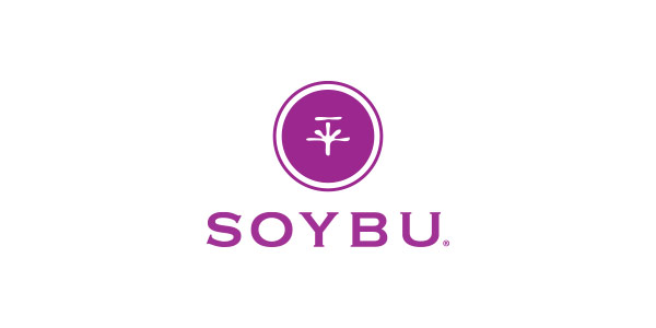
Image: Soybu
This logo makes the use of symbol as a primary focal point at a certain height above the wordmark that is actually the name of yoga studio. This placement helps keep the text in just as much emphasis as the symbol.
This was a short guide to help you understand visual hierarchy in logos. Each of these techniques and principles can be broken down further and analyzes in even greater depth… because the more depth your design has, the better it is executed.
Logo design industry has so much to offer and there is no dearth of design ideas. If you want to come up with a perfect posture for your yoga service logo, all you need to keep in view are some elements and factors that we have discussed in this article. Only patience is the key for a well-thought yoga logo that radiates spirituality and calmness.


