Who needs clutter, especially when you are trying to focus and the mess does not allow you to pay attention? Same goes for websites and digital reading. With the world getting digitalized with every tick of the clock, more and more millennials are spending most of the time on the internet. This calls for a clean, clear approach towards website designing. Here is when the need for incorporating negative space jumps in to pull off a perfect website design strategy and plan.
In a bid to attract more traffic to the websites, there is a drastic increase in website designs that are knitted around the negative space for an increased readability. The sudden surge in the number of blogs, that usually use negative space, might also be the cause for the rising trend. Incorporating negative space in website designing is something that must not be ignored to avoid a disoriented design. Such designs should stem through a negativity for all the positivity out there making use of most common elements of design.
Homepage Design
1. Snapchat
Ever wondered why Ghostface Chillah hovers alone on the homepage of snapchat? Well, call it an ingenious case of negative space usage. Considered as one of the most popular interactive platforms with the web design to die for, no matter snapchat enjoys such a large number of users. It does deserve all the brouhaha that surrounds it.
2. Poppies Flowers
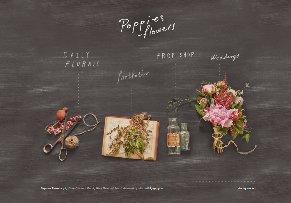
Floral business is all about colors and breathing in the sensuous fragrances that keep you in a mist of life scents. Poppies Flowers seems to know the fact as its website design is one of the most creative ones. A background with blackboard-like-texture is used as to provide the negative space that is further balanced with handwritten font and some business related tools. Marvelous!
3. Buffalo
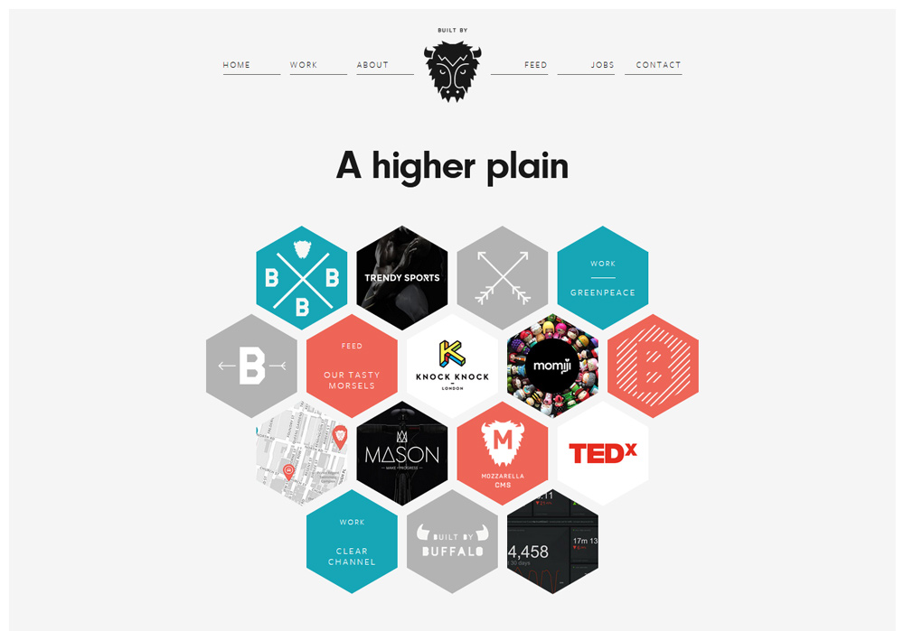
The homepage of website design agency, Buffalo, makes the use of colorful benzene shaped structures surrounded by negative space. Not only does it provide some space to breathe, it also makes the visitors feel focused for a mindful scrolling experience.
4. Dropbox
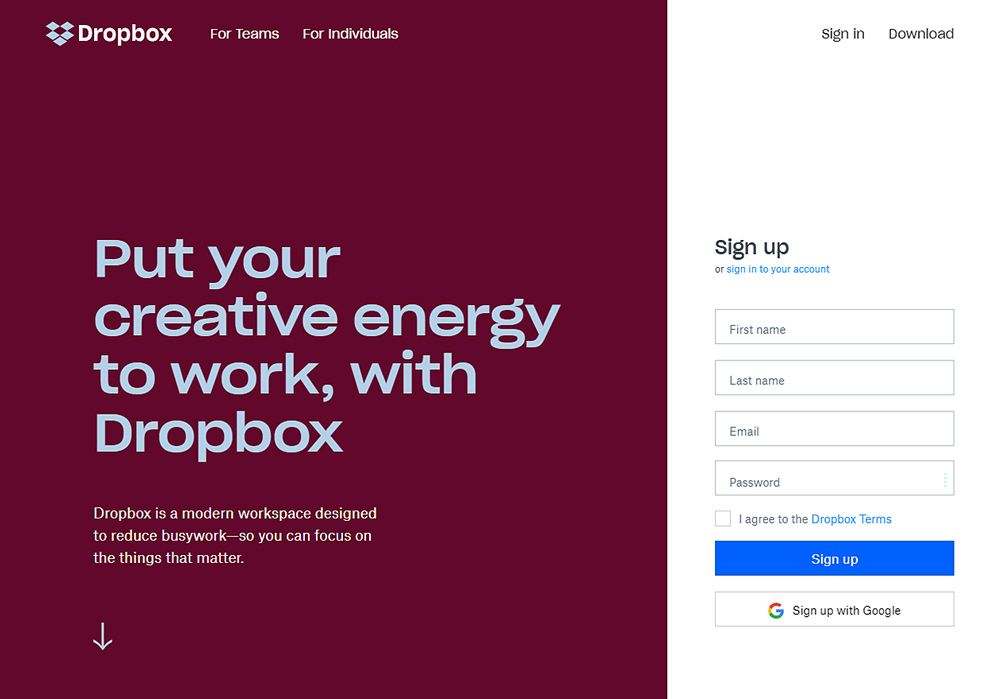
The homepage of Dropbox is a masterpiece, we would say. What a clever way to use contrasting colors and making the negative space speaks for all age groups. Right efforts that lend the website a laid-back touch!
5. Chanel
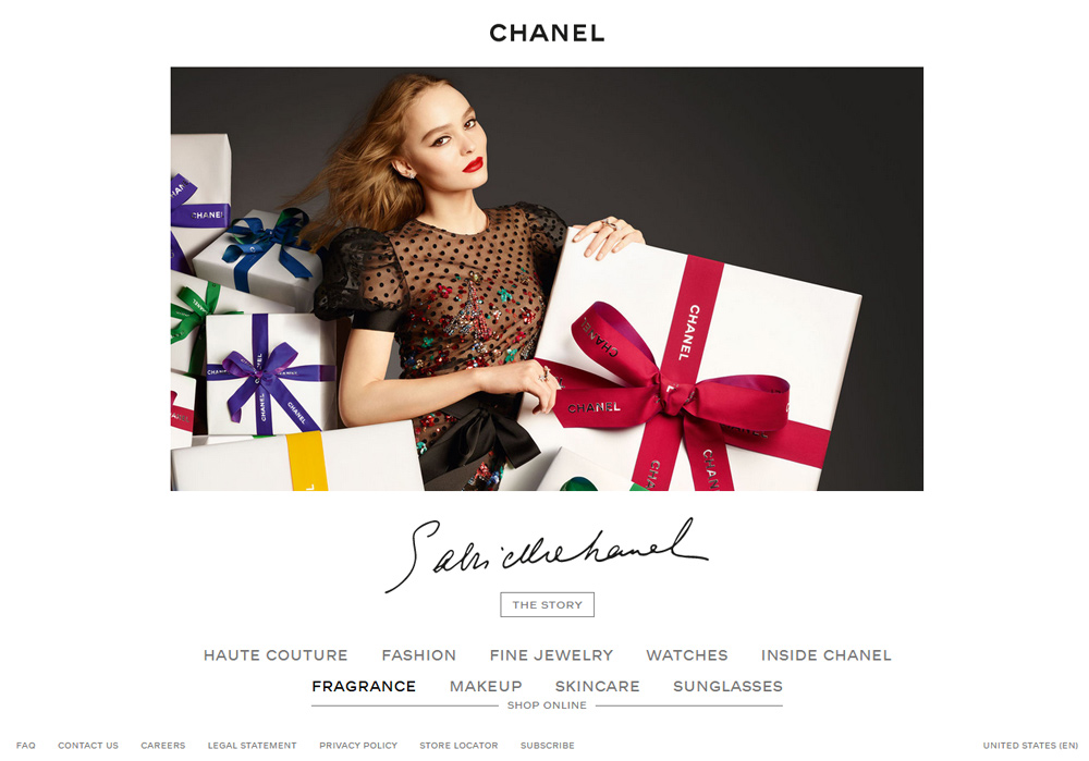
Fashion and cosmetic giant, Chanel, owns a fabulous website. As the industry it belongs to, calls for a focused approach towards making the people look beautiful, its website’s design shouts for the same; sophistication and modest approach for an ultimate user experience.
Related: 100+ Design Resources Every Graphic Designer Should Bookmark
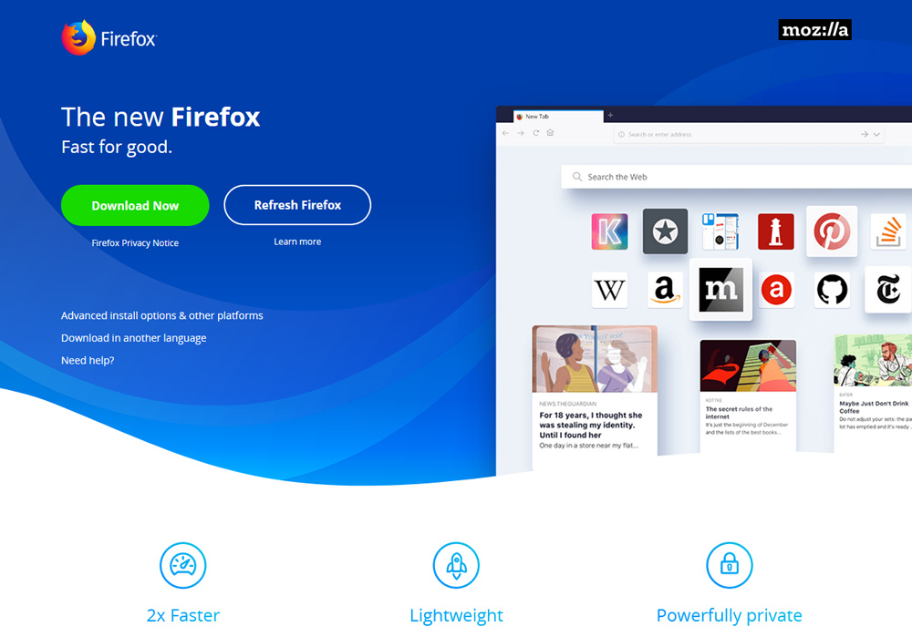
6. Firefox
The blue gradient in the background along with a half-cut window on the right at Firefox website creates a user-friendly environment. The creative usage of negative space allows users to access the website’s contents without getting lost in the content, creating easy access to information.
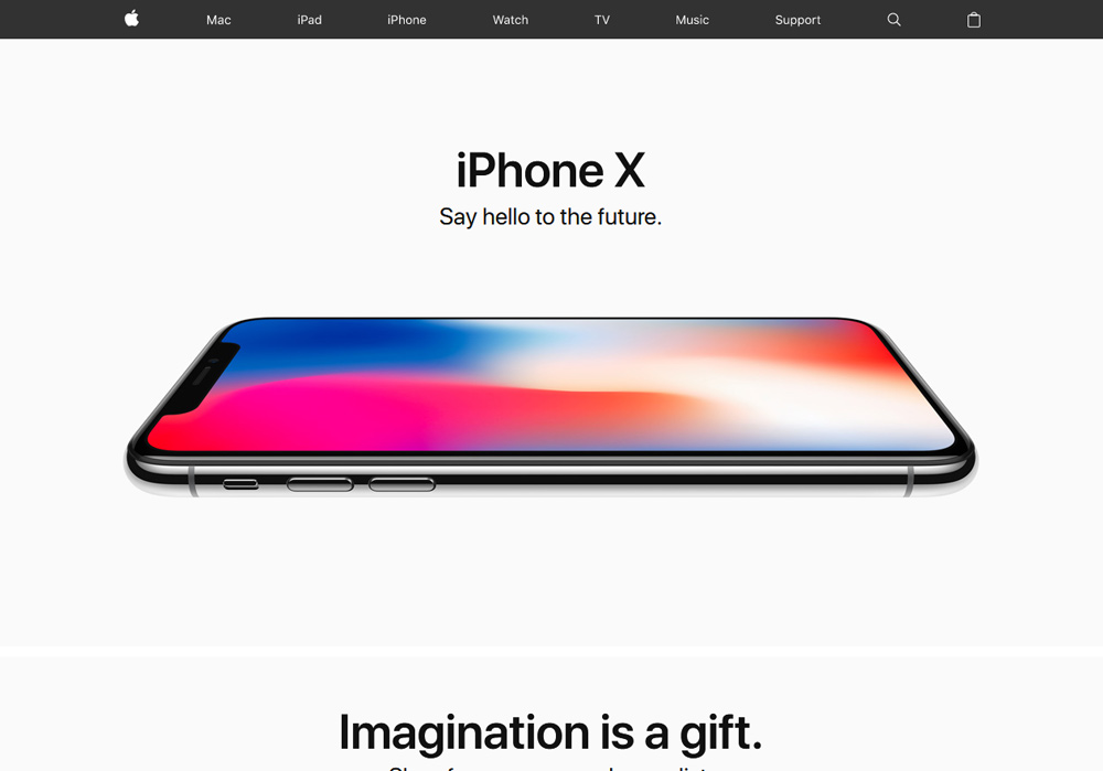
7. Apple
Nobody wants to have a look at a masterpiece by a tech giant placed amongst the clutter. That might be the reason that Apple uses extra space around its newly launched products so that the products get highlighted and not the other way round.
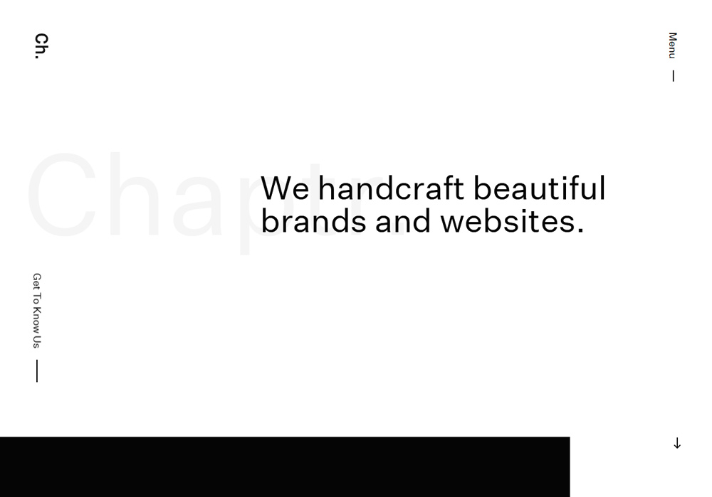
8. Chaptr Studio
With the most influential tagline ‘We handcraft beautiful brands and websites,’ Chaptr Studio is all about website designs. No wonder that their web design showcases a humble approach using an enough space to make sure that the users’ attention is not diverted.
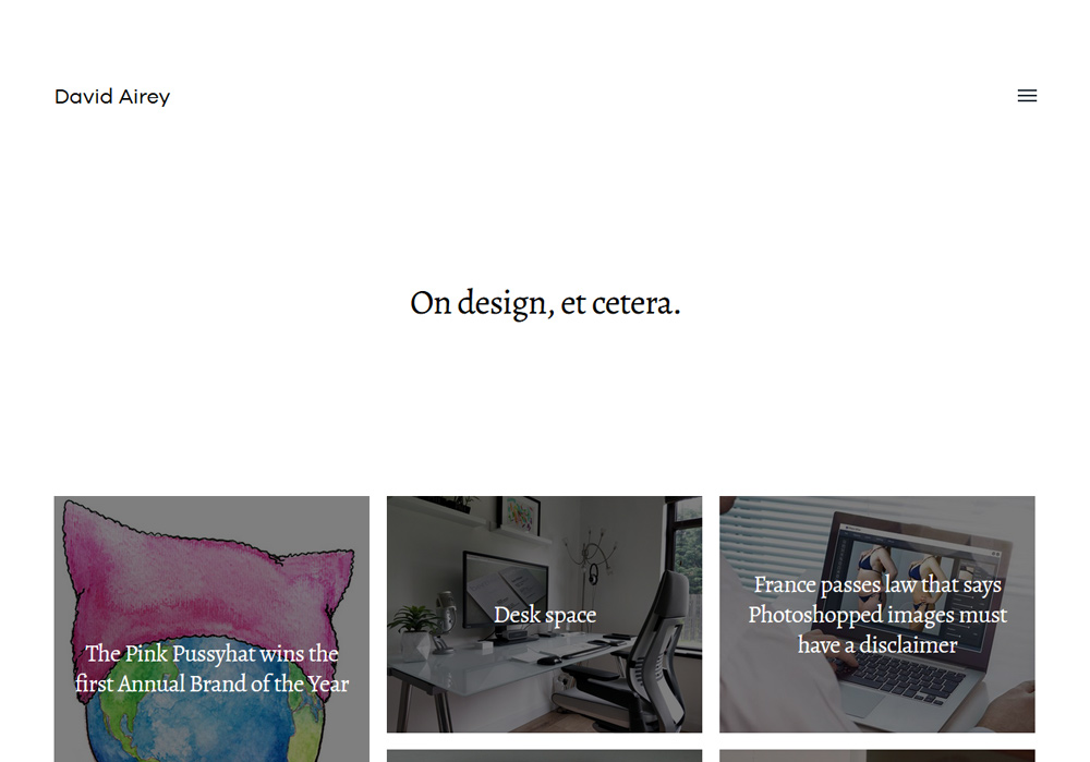
9. David Airey
A logo and brand identity specialist, David Airey, knows the business of website design well. Keeping the upper-half of his website more-or-less text-free and making more of out of negative space, he makes sure that the visitors scroll down to get engrossed in website’s content.
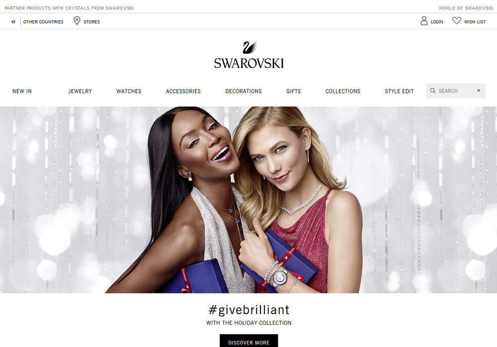
10. Swarovski
Diamonds are touted as girls’ best friends and Swarovski’s website seems to befriend every girl out there. Using a well-crafted negative space with plain and subtle design, it does not allow anyone switches sites for the jewelry shopping.
Related: The Visual Design Glossary Explained For Aspiring Designers
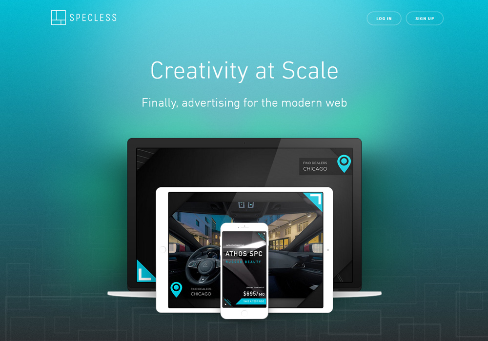
11. Specless
While the company specializes in modern web designs, the website of Specless does justice to its objectives. As you keep scrolling through the website, you will want more, the desire that comes with a relevant usage of negative space.
Blog Design
12. SessionM Blog
A cool aqua blue welcomes the users who visit Session M Blog. A curious case of negative space, it surrounds the readers to make them divulge in an ultimate reading experience.
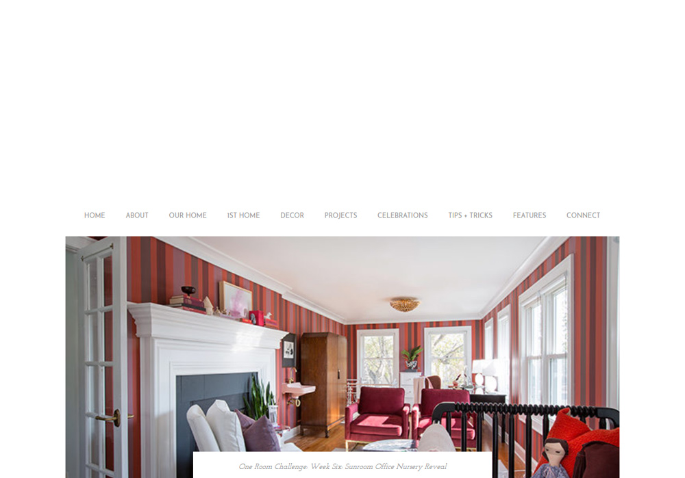
13. The Makerista
Gwen Hefner has a very clear approach to life and her business blog, The Makerista. With the upper half of the home page void, the blog design makes the use of visual hierarchy for a focused reading experience.
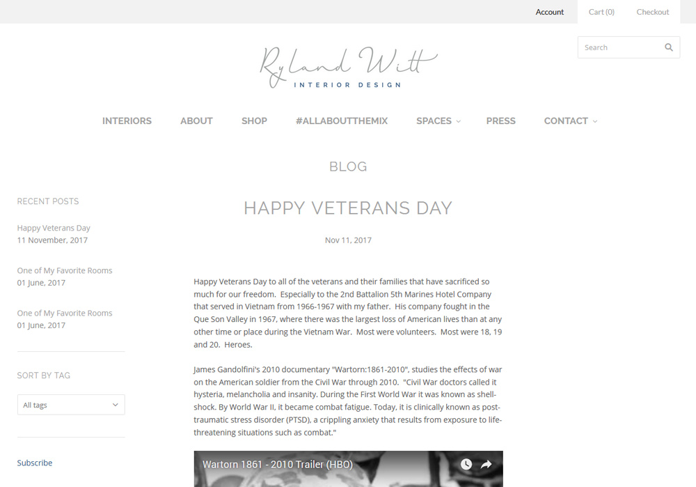
14. Ryland Witt
Ryland is known as one of the best interior designers and his blog is no exception. Keeping it clutter-free seems to be the designer’s mantra to gain more readership.
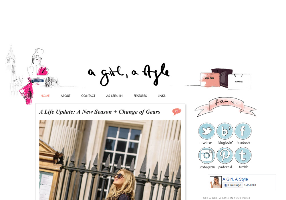
15. A Girl A Style
The blogger Briony Whitehouse rightly says ‘Welcome to my dream world. And believe us, her blog A Girl A Style is nothing less than a dream world. Enter her blog site, and you will be amazed with the creativity at its best. At Briony’s blog, ‘Design is the king.’
Related: 20 Brilliant Design Blogs To Bookmark
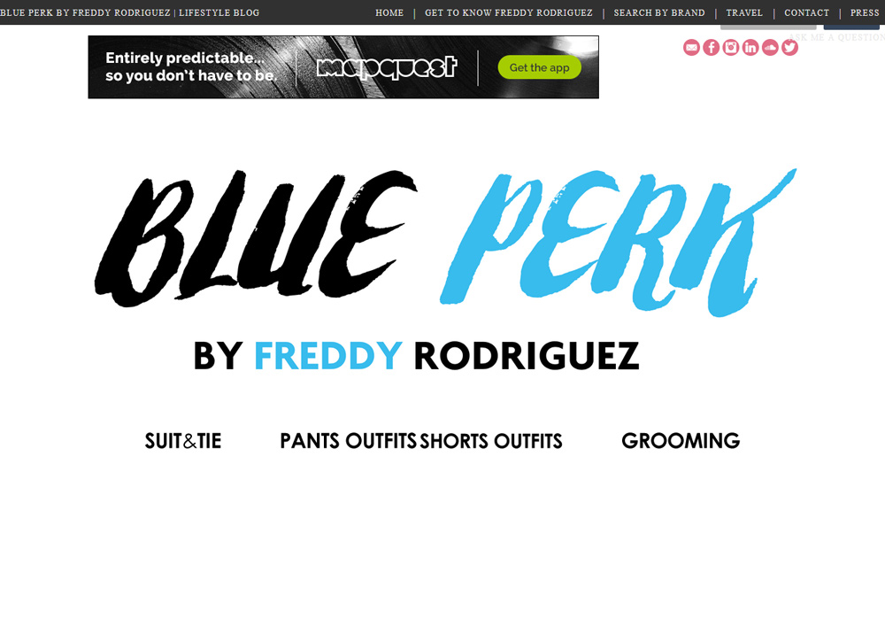
16. Blue Perk
Who keeps the right side of a website void? Well, Freddy does at his blog Blue Perk and does it the right way. Feel more focused with tempting lifestyle pictures and ideas.
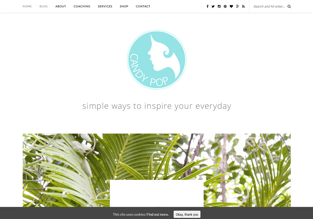
17. Candy Pop
Natasha Denness’ Candy Pop is an award-winning blog. As it focuses on personal development and personal care, the minimalistic blog design does not let readers witch sites once they are in. And yes, do have a look at the logo!
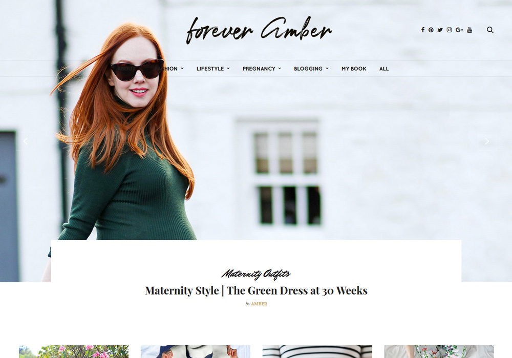
18. Forever Amber
A journalist-turned blogger, Amber is considered to be one of the top bloggers in UK for her blog Forever Amber. As soon as she realized the importance of some breathing space in website design, she jumped out of the cluttered designs and her blog site is the proof of the same fact.
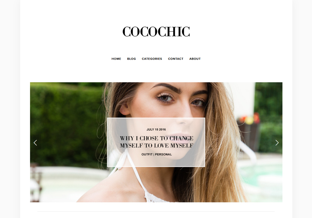
19. Coco Chic
Steph looks so positive and full of life in her stunning snapshot surrounded with negative space that her blog Coco Chic is loaded with.
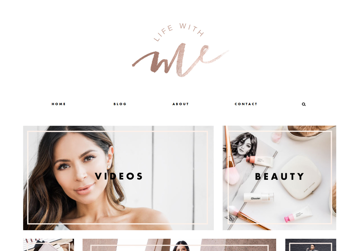
20. Life With Me
Live the life full throttle with Marianna’s tips. Her blog, Life With Me, aims at flushing out all the negativities of life. With quirky lifestyle ideas and routine stuff within a cleverly designed blog site, Marianna does make her readers spoiled for the topics.


