The fashion industry is primarily a visual industry. Everything about it is based on the imagistic beauty, and it is important to reflect this quality in all aspects of the fashion business. Whether you are designing cuts and patterns of the clothing or deciding upon visual branding elements, every facet of the business must reflect beauty and elegance. Therefore, when it comes to branding, your fashion business logo should possess the same visual attraction.
But what is it that makes or breaks a fashion logo? What is it about some logos that just captures people’s attention and makes a long-lasting impression? Why do some logos seem so well put together and clean, while others seem confused and like a mess? In this article, we are going to look at fashion logos through the lens of some design principles.
![]()
Design principles are design guidelines that help you achieve beauty and poise in your logos. Using one or more of these principles correctly in your design may be the difference between a fashion logo that works and one that doesn’t. Let’s look at some ways you can use to bring more creativity and uniqueness in your fashion clothing logos.
Repetition
Repetition is an important design principle that brings an overall movement and progression in your design. Repetition means repeating the same element at a set interval. For example, repeating a certain shape or a color at a regular interval counts as repetition in design.
Now while this may seem counter-intuitive to the layman, it is actually considered one of the design’s best practice. Repetition, when done correctly and tastefully, does not look mundane or run-of-the-mill. Instead, it makes the design look unified and cohesive.
Here are some benefits of repetition in your Fashion Clothing logo:
- Repetition makes your fashion logo follow a certain line of thought or theme.
- Repetition allows for a unified visual branding.
- You can safely repeat the same elements in other areas of your branding.
For example, the following is an example of repetition in a fashion brand logo:
![]()
The Chanel Logo repeats the letter ‘C’ twice, backward and forward, to create a nice overlapping image. The double ‘C’ stands for Coco Chanel, who designed this logo herself in 1925. The logo uses repetition to create harmony, balance, beauty and unity in the logo. It also allows for unity in graphic design –all the brand needs to do is focus on their ‘C’ to create different and new compelling images.
Difference Between Repetition And Pattern
While you may also use Pattern in your fashion clothing logo, right now the principle we are discussing is repetition. And it is slightly different from the pattern. A pattern is where a set of elements are repeated throughout the design, instead of the repetition of one single element. For example, this is an example of a pattern:

In the above pattern, you can detect a repetition of three different types of shapes. A regular, set interval of repetition of these multiple elements, makes up a pattern.
These icons are an example of repetition where a single shape or element is repeated throughout to create an overall image:

Let’s look at some examples to see how some brands have used repetition in their fashion logos.
Using Geometric Shapes To Create Repetition

The above logo by Tommy Hilfiger uses a very simplified form of repetition. They repeat two kinds of rectangles to make the overall logo. The rectangles are then rendered in different colors; red, blue and white. A simple sans serif font graces the overall logo and gives it a very modern look. The logo is minimalistic, clean and compelling.
Geometry plays a great part in logo designing, if you want to use this approach, you can make use of circles, triangles, hexagons or any other shape to create a repetition in your logo.

Using Symbols Of Font Characters To Create Repetition
Repetition in your fashion clothing logo may also be created using font characters or symbols. For example, in the case of the already discussed Chanel logo, an image is created using the letter ‘C’. You can use the initial letter of your brand name for this kind of repetition. Brands love to use this technique in their logos.

Using Organic Elements To Create Repetition
You can also make use of organic shapes to create repetitions. These shapes do not necessarily need to be set, well-defined shapes. It can be anything that you create; a part of an arc, a free flowing curve or even anything else. For example, these fashion boutique logo icons use organic repetition:
![]()
Related: 10 Stunning Logo Designs Of Beauty Blogs Winning Over Fashionistas
The benefit of this approach is that you can create more robust images for your logo. You can pick and choose the repetitive element based on many different things. For example, it can be an element that represents your brand, or it can even be just a stylistic element that is repeated for a visual effect. Here are some more examples of repetition:
![]()
Movement
The second design principle that would guide your fashion clothing logo towards design’s best practice is creating movement in the design. Movement means guiding your viewer’s eye toward a certain focal point. In logo design, it is also called as “flow”.
Having a movement in your design can help you create an emphasis towards a certain thing, or it can make your overall logo design seem alive. For example, in this image, the designer has used repetition to create movement. The movement is created through the difference in the orientation and distance:
![]()
Let’s look at some ways of creating movement in your logo design:
Lines
Movement in your logos can be created with the use of lines. You can either vary the line sizes or the line path. Curved lines create an immediate sense of movement, however, you can incorporate movement with the use of linear lines as well. The following are some examples of lines that have been used to create a sense of motion:

You may use the initials of your Fashion Clothing to create a visual like the one above. Rendering your initials with movement creates interest in your logo.
Dunhill’s Logo Makes Use Of Lines To Create Movement
Dunhill is a luxury fashion brand for men that creates men’s ready-to-wear clothing, perfumes and accessories. The following logo by Dunhill makes use of lines to create a sense of movement. The idea is very simple, the designer draws up the lines of the font characters to create a sense of upward movement. It leads the viewer’s eye upwards and creates a sense of movement in a static design.
![]()
The simple act of motion transforms what would have been an ordinary, mundane wordmark logo into a unique wordmark! This is how movement can help you in your logo design.
Curves
Incorporating curves in your fashion logo creates a sense of movement. These curves may be in the form of repetitive elements or even in the form of non-repetitive movements.
![]()
Let’s look at some examples of logos that make use of curves to create movement.
![]()
This is an example of a fashion logo that is using non-repetitive movements to create a sense of movement. The movement can be seen in the curve of the hair, in the curve of letter S and A and also in the overall placement of the design. When you create movement and motion in your logo design, not only is it light on the eye, it also keeps the user engaged with your design for longer, because the user is being systematically led down a path of movement.
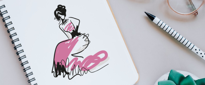
![]()
In the above example, the arc segments are used to create movement in the logo. The flow can be seen in the mannequin’s dress, and hair as well as the font.
The most famous curve used in a logo is perhaps Nike’s swoosh. Nike is a brand that focuses on fashion sportswear and accessories. Nike keep’s their logo very active and sporty with the use of black color and a very ‘moving’ swoosh:
![]()
Shapes
Shapes can also be used to create logos. If you are using repetition with shapes, your logo can incorporate movement either by varying the size and placement of those shapes or by placing the shapes down a curve or a linear progression.

You can either make use of the same shape, set in a variation of sizes and orientation, or you can make use of organic shapes that have a flow within them. Following are some examples of fashion icons that are used in fashion logos, which also incorporate movement in shapes:
![]()
Color
Did you know color can also be used to create movement in your logo design? Yes! The color is an important element of design that adds depth and value to your overall design. Often, we only think of colors in term of color psychology. However, there is a greater way to explore color as well, and that is by exploring the depth and impression that can be created using color variation and color gradation.
Color can easily be used to create a sense of movement and progression. This is done by varying the color shades or using colors that create a spectrum. For example, if you look at this color spectrum, does it seem to be moving forwards?

Similarly, this spectrum creates a spiral movement because of the way colors are arranged.

The color is a great way of introducing movement in your design. It can be used in conjunction with shapes or even without them.
Related: The Handy Color Glossary for Newbs
These color gradations can be used in different ways. You may make a spectrum of warm colors, cool colors, primary colors, or secondary colors. Or you may just go deep into one specific color; for example different shades of blues or different shades of greens.

Undefined Edges
Leaving your images with undefined edges is another way of using movement in your design. You can make your logo more active and full of movement by either blurring the edges of any of the elements of your logo or giving it an undefined that makes it seem like the images is continuing beyond the frame or beyond the lines.
For example, take a look at this logo icon:
![]()
How does it manage to create a movement? It does that by using the curve, yes, but also by making the image undefined. There are no boundaries or edges for this image, which gives it a continuous quality and makes it look like it may continue outside of the frame as well.
Here is another example that shows how you can leave the image undefined to create movement. In this case, the blur is what creates the movement.
![]()
This blur may also be created by the use of colors, for example, a color spectrum that fades into whiteness will give movement to the image with the use of color.
You can use such form of movement to illustrate important points about your clothing line. For example, you may illustrate that your company is a fast fashion, an urban fashion company. And the use of movement in your logo will illustrate this point.
Conclusion
Exploration of simple principles of design can give a new life to our logo design. It is worthwhile to go down this lane because not only do these principles illustrate design’s best practice, they also give you new tools to demonstrate your concepts.


