One minute it is a regular evening, and the next there is a wreath on the door, a few lights in the corner, and suddenly your mind clicks! The Holiday Season has begun. With that realization, your shoulders instantly drop, your mood lifts, and everything else feels warmer.
You may think it is nostalgia at play, but it is usually biology flexing its magic.
The holidays are not just a vibe, but the colors, shapes, glow, and decor all come together to trigger the oldest parts of your brain. These are the parts that respond to safety cues and togetherness before you can even logically calculate what is going on. There’s a reason a glass ornament feels comforting, and why red and green don’t just look right, but instantly signal gifts, bounty, and celebration.
‘Tis the season where festivity is less about tradition and more about design.
Let’s break down the science of it.
The Merry Geometry Of Joy
Geometry plays a silent role in festivity, but its impact is loud. Take a look at holiday decor; most of it is round or curved. For instance, ornaments are round while the wreaths are circular. Almost none of the decor is sharp or jagged, and that is not just by accident.
• Pointy Shapes Trigger Danger
Humans, by design, are cautious around jagged shapes. A study by Bar and Neta at Harvard Medical School researched human response to curved and sharp shapes. They found that people constantly preferred curved objects over sharp ones. The reason is quite interesting. Brain scans from the study revealed that the object with sharp angles instantly activates the amygdala, which is the brain’s alarm centre.

Experts believe it has something to do with human history. The sharp edges resemble objects that once posed danger, such as thorns, teeth, and weapons. However, rounded shapes signal safety. Interestingly, the love for curved shapes is not just limited to avoiding fear.
• Round Shapes Signal Rewards
Here’s a quick experiment.
Say the word Bouba out loud.
Now say Kiki

Don’t think too hard, and tell which one feels round and which one feels sharp.
This is an instinctive reaction called the Bouba/Kiki effect. This effect gives us insights into how our brains connect shapes, sounds, and emotions. Across cultures, languages, and even races, people always match the soft, rounded shapes with Bouba and the sharp,
jagged ones with Kiki. No training required, our brains instantly get it, and it instantly bridges all the design gaps across cultures.
Having said that, holiday decor is Bouba. All the wreaths, berries, bells, and decor are soft shapes, with soft edges and soft sounds. Our brain reads roundness as friendly. Bouba shapes feel safe, sweet, and approachable. Kiki shapes feel alert, edgy, and intense, which is great for action movies, not so much for relaxation.
During the holidays, our space fills with visual bouba, which signals to the nervous system that it is okay to lower its guard, making the space much more welcoming. Another way of seeing the impact of shapes on the holiday festivities is the circle itself.

Image Source: iStock/Povareshka
The shape of the wreath, a bauble, and even a dinner plate are all of them symbols of social cohesion. Holiday decor leans heavily into these curves because they soften the harshness of winter, creating a warm, friendly atmosphere. These decor signals that it is okay to gather close, linger, and feel safe.
Magical Fractals And The Holidays
Nature has several tricks up its sleeve, but Fractals is a holiday exclusive. Do you ever try to draw a Christmas tree on paper with all the lights, ornaments, and texture? The result is almost always a mess. That is because on paper, all of these elements are visual chaos, but in reality, they are quite charming.
That is the magic of fractals. Fractals are patterns that are repeated at different scales. It is like wherever you look, the pattern keeps echoing itself. You may find it in the snowflakes, the pine cones, and even in the frost on the windows.

Image Source: iStock/artvea
Our brain loves that kind of thing because it knows precisely how to read organised complexity. According to research by physicist Richard Taylor, humans are hardwired for fractal fluency. When we look at these patterns, our physiological stress drops by 60%
Holiday decor leans heavily into these fractals for a reason. They tell our nervous system that the environment is safe and comforting. This is why a decorated tree, a snowy window, and all feel like a warm hug that our brains love.
Festivity In Colors
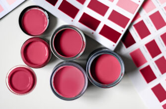
• Red & Green
Colors do a lot more than just look pretty. Take the evergreen combination of red and green; despite sitting on opposite ends of the color wheel, they create a beautiful contrast.

Image Source: iStock/InspirationGP

Image Source: iStock/Atstock Productions
According to the Law of Simultaneous Contrast by chemist Michel Eugene Chevreul, placing two complementary colors together can push the brain’s photoreceptors to go into lateral inhibition. This effect causes colors to make each other appear brighter, richer, and more vibrant than they truly are. That’s why choosing colors wisely matters, especially in festive design. The result? Every ornament, ribbon, and garland seems to pop—proof of how powerful the right color tools for graphic designers can be. When used well, our eyes and brain can’t help but notice the magic.
There’s also an evolutionary reason red and green feel so right together. In the psychology of colors, this pairing taps into deep-rooted human instincts. For our ancestors, red against green meant “ripe fruit found,” which was a signal of reward and abundance. That instinct still lives in our minds today. It’s a principle often explored in any good book and guide for colors, and it explains why a deep green tree adorned with red ornaments instantly feels festive, joyful, and full of life.
• Blue & Silver
On the other hand, blue and silver are not as vibrant, but they take a calmer, cooler approach, helping our minds slow down and have the urge to curl up in a warm blanket with family and enjoy the lazy days of the holidays.

Image Source: iStock/Martin Barraud
The holiday design is not magic, but balance. While the red and green energize and excite, the blue and silver calm and soothe. But together they create the perfect mix to instantly put you in the holiday mood.
• Gold
Gold during the holiday season simply glows. It reflects light and adds warmth that simply lights up the space. Our brains connect this kind of glow to firelight and sunsets, things that make us feel safe and special.

Image Source: iStock/Eugene_EM
And for centuries, gold has been a symbol of value and security. A golden ribbon here and there or a metallic ornament, and even small touches of gold can instantly elevate the holiday decor.
How To Design Joy The Scientific Way With DesignMantic
The holidays are the favorite time for designers. This is when the rules lose, and creativity finally gets a chance to breathe. And it is not just about decorating spaces; brand designers can use this time to shape the brand and its festive identity.
So no matter if you are refreshing your logo, designing a campaign banner, or want to print brochures, the goal remains the same. Make people feel something before they think anything.
Here are our guides on how to design festive elements for different branding materials:
• Logo Design
The festive season is the perfect moment to let your logo vibe with the holiday spirit. Rather than giving it a full makeover, this is the time to soften your logo—round the corners and choose a slightly gentler typeface so it feels warmer and more inviting. The guide to typographic logos often emphasizes that subtle changes can make a big emotional difference. In fact, following the commandments of typography reminds us that thoughtful restraint and balance matter more than dramatic redesigns—especially during the holidays.
Colors do a lot of heavy lifting in logos. But you do not need to replace your entire palette. Adding deep red, forest green, or gold elements as accents can be more than enough. Keep in mind that a festive logo should always feel familiar before it even feels festive.
Tips:
- Add subtle gold or metallic outlines to icons or text for a festive glow.
- Use seasonal accent shapes (small stars, snowflakes) sparingly to maintain professionalism.
- Test the logo at small sizes (like social icons) to make sure festive tweaks still read clearly.
- Swap one flat color system for a gradient or soft glow to make the logo feel warmer without overdoing it.
• Complete Branding
The entire charm of holiday branding is its cohesiveness. Go with a simple festive palette and stick to it across all your assets so your branding feels intentional. Moreover, rounded elements and soft curves are your best friends. Go for motifs such as snowflakes and wreaths as they are repeated and can instantly trigger holiday festivities in the audience.
Stay consistent in the typography, too. Choose one typeface for the headers and another for the body text, and use a consistent font pair throughout the design. As for the imagery, stick to one style that is also recognizable, so it does not take away from the story.
Check if colors, shapes, and fonts repeat naturally across social media visuals and posts, emails, and banners. If something feels out of place, tweak it. This way, you will stay consistent and celebrate the festivities more noticeably.
Tips
- Align your holiday visuals across social posts, emails, and website banners.
- Limit your palette to three main colors plus one metallic to avoid visual chaos.
- Use subtle, repeating patterns in backgrounds to create visual hierarchy.
- Keep icons and symbols consistent in style (flat, 3D, line art, etc.) across assets.
- Audit your assets weekly to ensure new content fits the holiday theme.
3. Flyers
Flyers are designed to grab attention quickly. You must begin by organizing a strong visual hierarchy, then choose high-contrast colors like red and green to instantly add energy, and opt for rounded shapes or circular design to give the flyer a more welcoming look.
It is easy to get lost in the festivities and crowd the flyer; avoid that by using whitespace smartly. This will keep the flyer readable while you can add subtle holiday motifs, such as Christmas tree decor or snowflakes.
In flyers, you can also use gold or metallic accents to add a bit of sparkle to the overall design. The key is first to grab attention and then use design to deliver your message effectively.
Tips
- Place your main call-to-action in a prominent, uncluttered space.
- Use metallic accents like gold or silver to create sparkle without overwhelming the design.
- Keep text short and scannable; no one wants a wall of words.
- Test for readability from a distance. Since flyers are often glanced at quickly.
- Add small repeating shapes (stars, holly leaves, ornaments) to guide the eye naturally.
4. Social Header
Your social header is the first thing people see online, so it needs to set the mood instantly. The colors, shapes, and layout should clearly signal warmth, joy, and festivity at a glance. As a good practice, start with one dominant festive color, pair it with a calmer tone, and sprinkle in metallic accents for that extra glow—something that’s easy to plan using the right social media tools.
If an element isn’t necessary, let it go. Adding too many elements makes them compete for attention, which can feel mentally heavy. This approach is especially important when working on branding on a budget, where simplicity often delivers the strongest impact. As discussed earlier, our brains respond best to familiarity and relaxation. Design your social header as a warm invitation—one that welcomes viewers and instantly places them in a festive mood.
Tips
- Keep text short and legible; headers are often viewed on mobile devices.
- Use one focal image or pattern and let it breathe; avoid overcrowding.
- Repeat small visual motifs from your branding (like a gold star or curved ornament) for cohesion.
- Test your header on desktop and mobile to ensure it scales well.
- Align elements symmetrically or along a clear grid to create calm and balance.
Conclusion
Festivity is not just tradition but it is science. The colors, curves, and fractals all spark joy in our brains before we can even notice. With small tweaks here and there, any brand can turn into a festive celebration and a warm hug.
Put your creativity at play and bring your festive vision to life with DesignMantic and create designs that feel as joyful as the season itself.