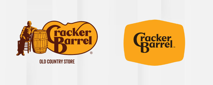
For those not living under a rock, Cracker Barrel changed its logo. But they didn’t just change a logo; they poked all of America, the internet, and everyone with an opinion.
Cracker Barrel thought it was a quiet brand refresh, but it turned into a full-blown internet spectacle. There was TikTok outrage, political commentary, stock market tremors, and a corporate U-turn so fast that it is still making our heads spin.
All of this unfolded in under a week. A simplified logo revamp triggered loud conversations around nostalgia, identity, and whether brands should ever touch the things their audiences hold close to their hearts.
We have all of this and more coming in this article as we dig into Cracker Barrel’s logo fiasco, the chaos that followed, and why the world simply wasn’t having it.
A Barrel Full of Trouble: Cracker Barrel’s Identity Crisis
Cracker Barrel, the 660 location chain known for nostalgic touch points such as the rocking chairs, the biscuits, and the warm, almost make-you-cry ‘grandma’s house vibe, suddenly decided that it needed a modern glow-up. They changed the interiors, added brighter lighting, updated the menus, and simplified the logo, completely destroying the nostalgia the place had.
This attempt at a quiet makeover turned into a storm that spun out of control. As soon as social media caught wind of the new logo, it went ballistic.
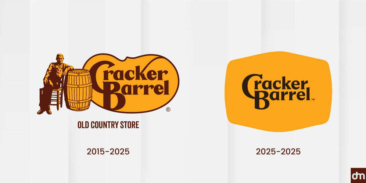
The new logo, sadly, was stripped of the iconic Uncle Herschel figure and the classic barrel, which is basically all of the Cracker Barrel personality. The stakes for this rebrand were high; Cracker Barrel allocated up to $700 million for this three-year rebrand.
IT TOOK THREE WHOLE YEARS to strip Cracker Barrel of its unique personality.
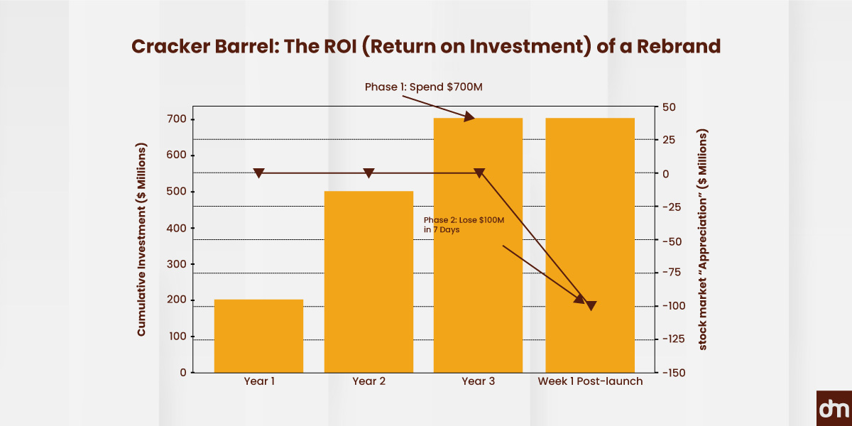
The company saw a nearly $100 million dip in stock value and an avalanche of criticism that even caught the attention of the White House. In short, the barrel was full, and it spilled trouble everywhere.
Cracker Barrel Isn’t Just a Restaurant, It’s a Time Capsule
Cracker Barrel isn’t just a place to eat—it’s a place people return to. It’s woven into road trips, long family lunches, and a version of America that feels warmer and frozen in time.
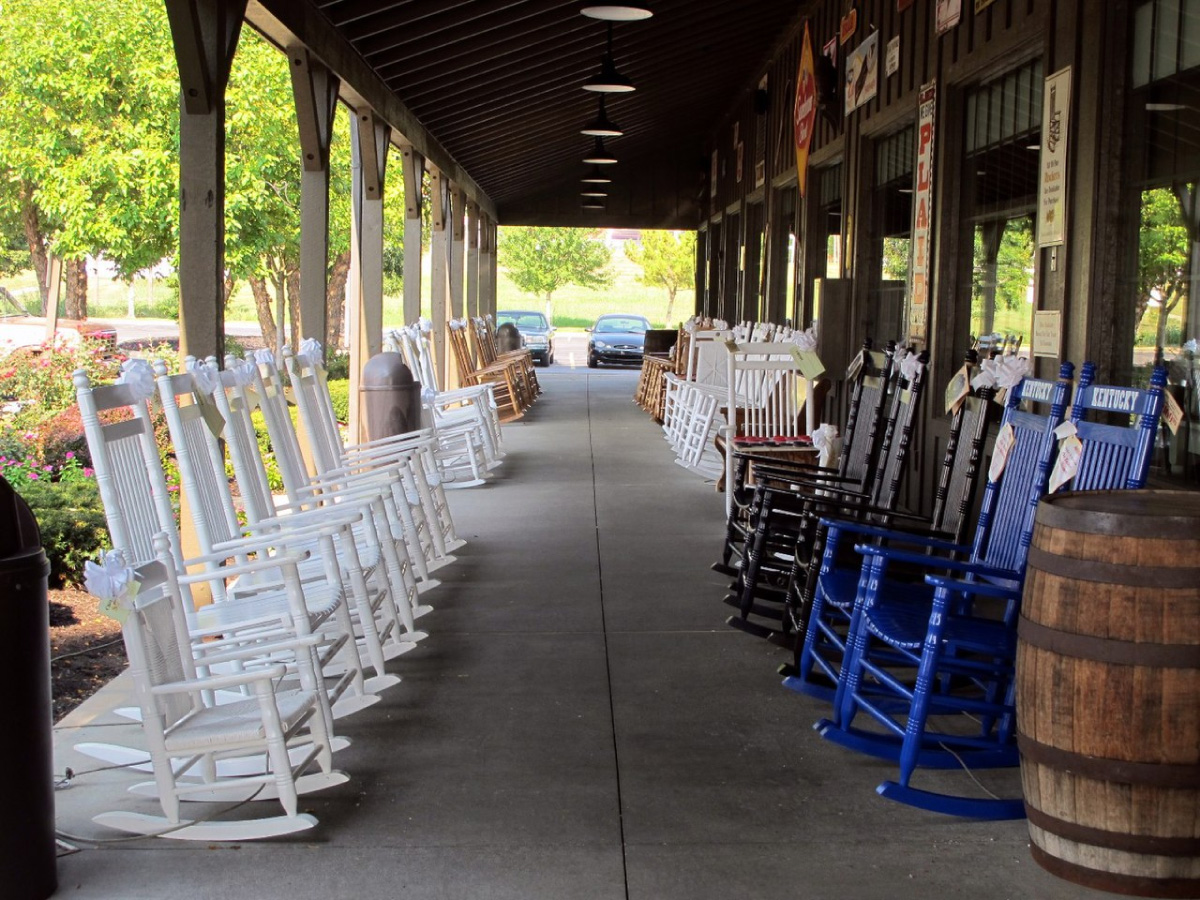
Image Source: commons.wikimedia.org/Cracker_barrel
Its strength is familiarity, not trendiness. Guests come for the creaky rocking chairs, the peg game on the table, and the nostalgic atmosphere. Real antiques fill every location to ensure consistency, so a Cracker Barrel feels the same no matter where you are.
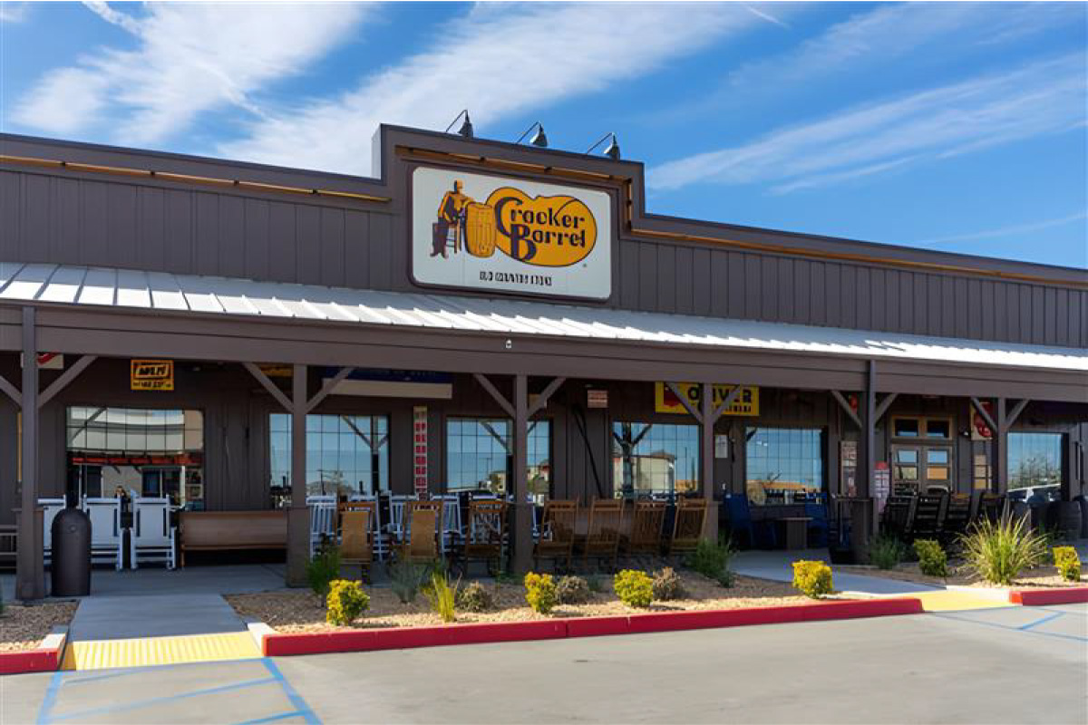
Image Source: iStock/sanfel
While others chase what’s new, Cracker Barrel stays the same. The menu rarely changes, breakfast is served all day, and comfort food leads the way. Older guests relive memories, while the younger ones find a break from an always-on digital world.
This is exactly why the rebrand struck such a nerve.
Cracker Barrel fans read the new visual identity as a loss. To them, the brand wasn’t just changing how it looked, but it was removing every detail that made it feel safe, familiar, and a big part of their emotional attachments.
Breaking Down the Cracker Barrel Logo Redesign—and Why It Failed
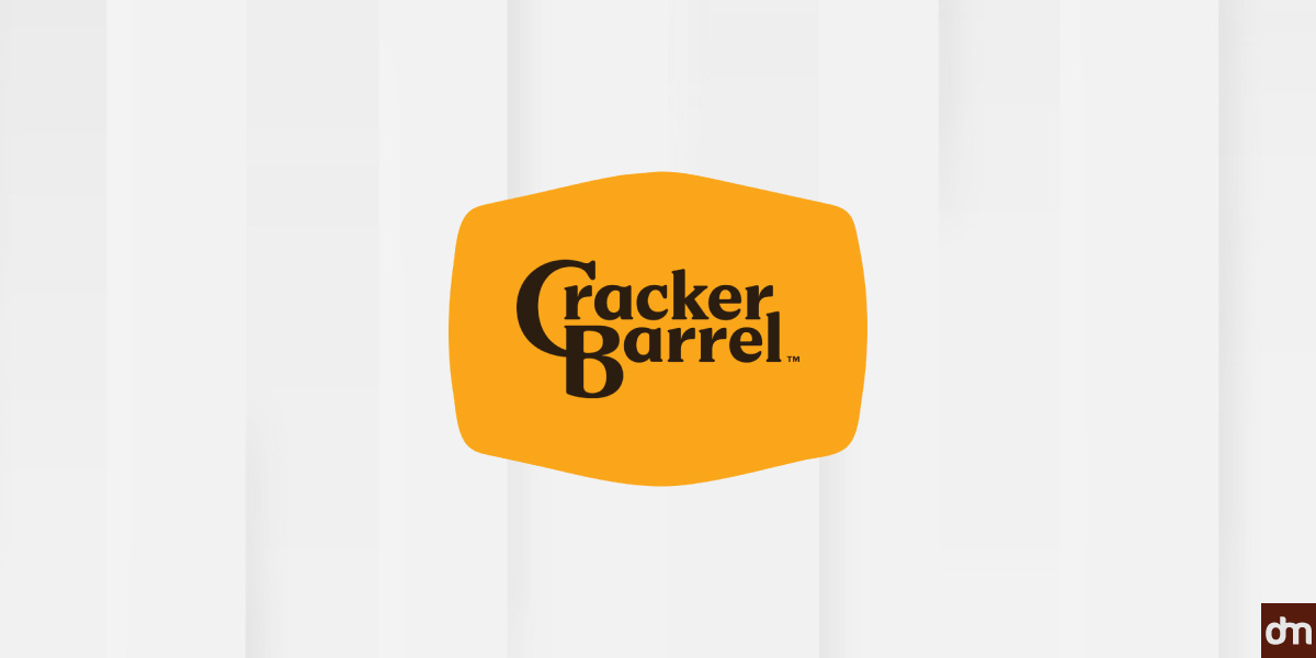
The backlash wasn’t just emotional; it was visual. When Cracker Barrel unveiled the new logo, the reaction centered on three core design elements: color, typography, and iconography.
From Warm and Earthy to Bright and Flat Colors
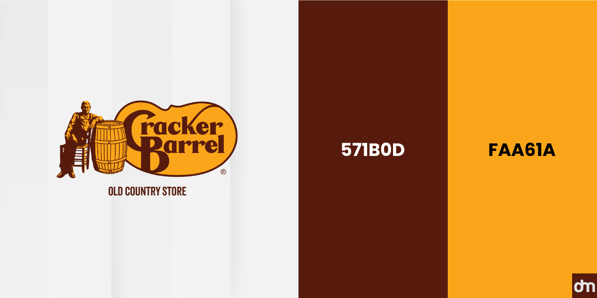
The original Cracker Barrel logo leaned into the muted, nostalgic color palette on purpose. Using commandments of color theory and old school color trends, the warm browns and soft creams weren’t trying to look polished or trendy. They were carefully selected, choosing the right colors to feel worn-in, familiar, and comfortable. Think of it as the visual equivalent of walking into a place that already sort of knows you—an essential part of its restaurant branding elements.
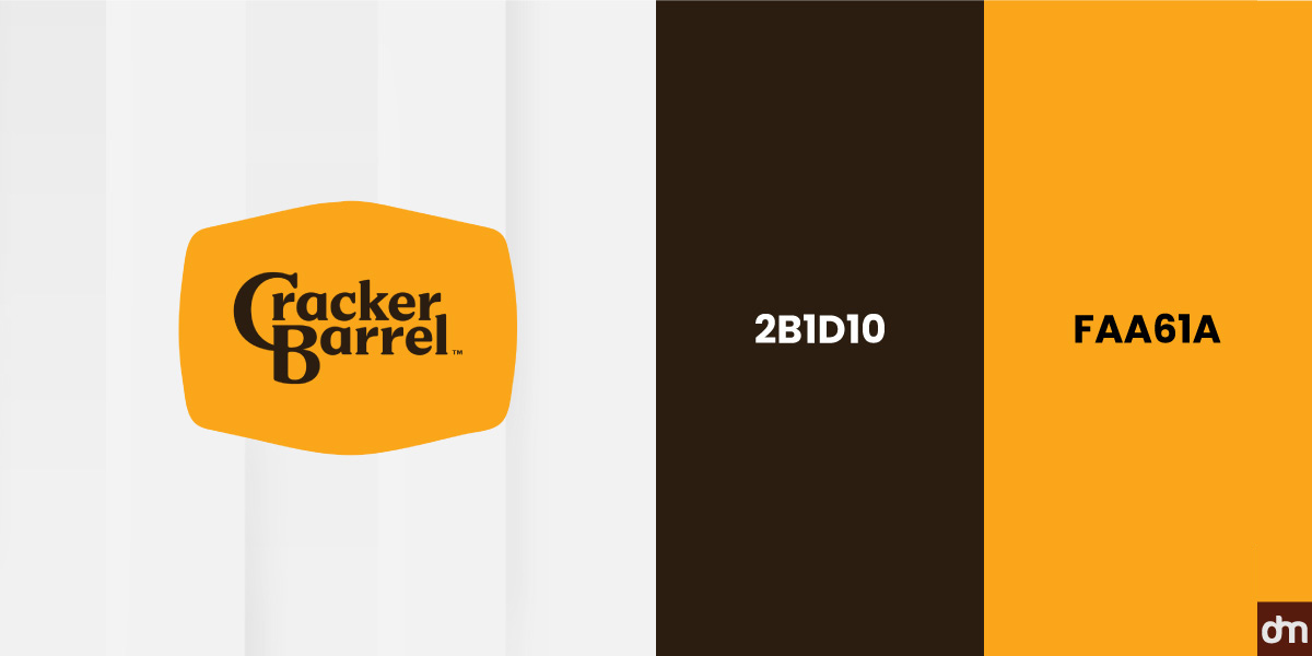
The new logo, by contrast, flipped the script entirely. It came in like a figurative wrecking ball, featuring a bright yellow energy with a loosely shaped barrel. On paper, it was cleaner and modern, but in practice, it changed the brand’s emotional tone completely. It ignored the psychology of colors in logos, failed at choosing the colors wisely, and broke away from the color trends that had long defined the brand. What once felt rustic and grounded suddenly felt flat, bold, and corporate.
From Folksy and Familiar to Clean and Corporate Fonts
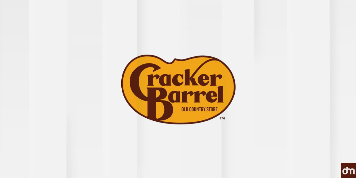
The typography of the logo was one of the most noticeable shifts in the redesign. While the original logo used a typeface that complemented the consumer mood, the new one felt lazy. The old font had uneven strokes and a handcrafted feel that looked and felt lived in, which perfectly aligned with the brand’s ‘Old Country Store’ identity.
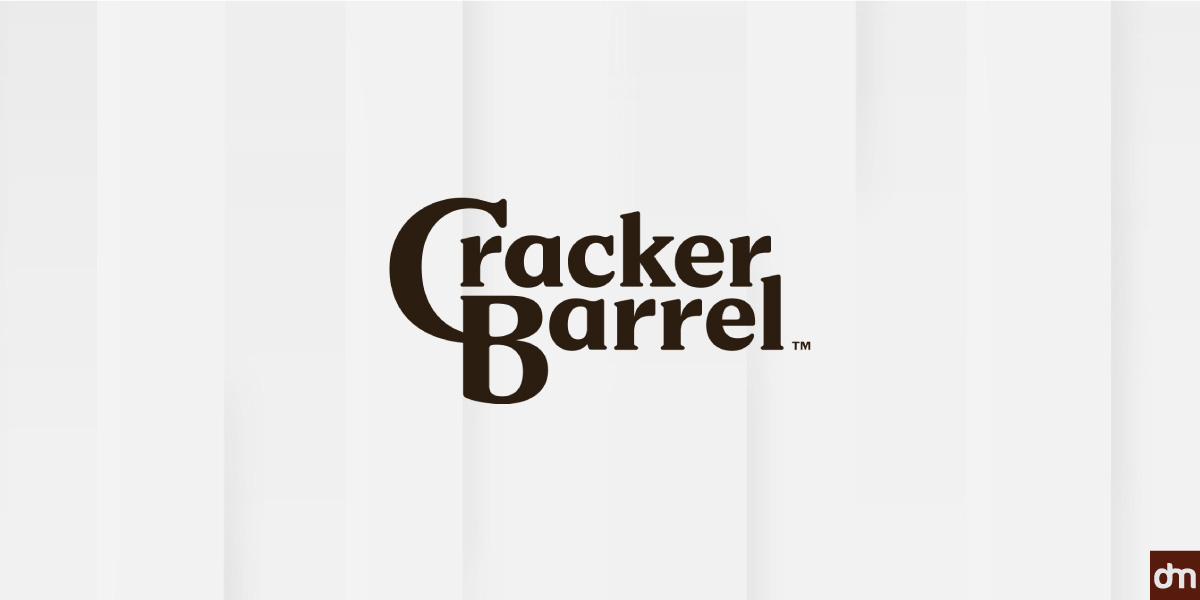
The new logo stripped this away in favor of a simple, modern wordmark. The letterforms were smoother, more uniform, and easier to reproduce across digital formats. From a functional angle, the update made sense. But from a brand’s perspective, it came at a hefty logo cost. It stripped away decades of visual personality tied to Cracker Barrel and introduced typography mistakes that instantly disconnected the brand from its audience.
From Narrative Imagery to None at All
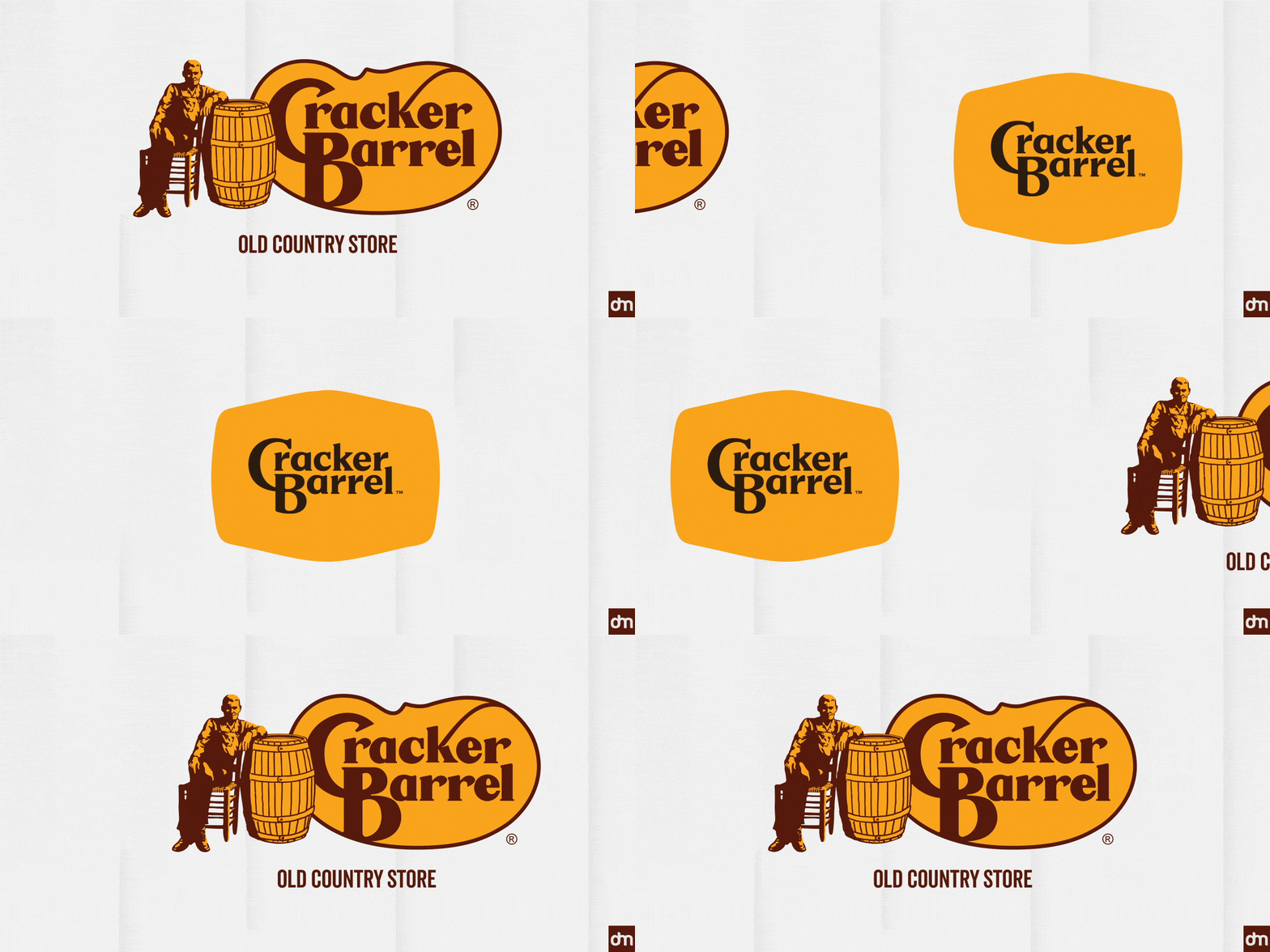
Perhaps the most controversial change wasn’t what was added but what disappeared. The original logo’s defining element—the illustrated old-timer leaning against a barrel—was gone. And with him went the “Old Country Store” line that had grounded the timeless brand’s identity for generations.
The new logo relied almost exclusively on type and shape, with the geometry of the logo design reducing the barrel to an abstract outline rather than a literal symbol. What remained may have been easier to adapt, but it no longer felt like Cracker Barrel.
The New Logo Sparked an Internet Meltdown
On August 19, 2025, Cracker Barrel unveiled a new logo: a simple wordmark on a yellow barrel-shaped background. Gone were the leaning old-timer and the iconic “Old Country Store” feel.
The internet reacted immediately. TikTok, X, and Instagram flooded with criticism, calling the redesign “corporate” and “soulless.” Influencers, media outlets, and even political figures weighed in. By August 21, the backlash had hit headlines, and the brand’s stock fell over 7%, wiping out nearly $100 million in market value.
Despite claims that the new logo “called back to the original,” it wasn’t enough. On August 27, Cracker Barrel reversed course and kept its classic logo.
This wasn’t just about design—it became a culture war. Long-time fans saw it as a rejection of Americana, and Gen Z criticized the brand for trying to be something it wasn’t. The backlash was about authenticity, trust, and preserving the brand and brand identity.
The logo redesign sparked stock drops, memes, and political attention—definitely more than a simple grid issue.
Some joked that removing the design entirely might be the cleanest fix.
I propose a less confusing design. Feel free to send me a cheque in the mail. pic.twitter.com/xHJtHvHz4K
— Hoi Polloi (@PolloiHoi99974) August 20, 2025
A reminder that the internet never lets a logo launch quietly.
Here's your equity, habibi! pic.twitter.com/mUcZJTR361
— Imam Elmo (@ElmoJihadi) August 20, 2025
Reactions kept rolling in, proving brand updates rarely stay just about design.
The new one sucks and is just empty and depressing. I made this in five second on ChatGPT and think it has more aura. 😂 pic.twitter.com/u5Z4dfaXNn
— Mitra Hispana (@MitraHispana) August 20, 2025
When market accounts weighed in, it was clear the logo debate had escaped the design world.
New vs old pic.twitter.com/WgolBgMjdy
— Global Index (@TheGlobal_Index) August 21, 2025
Corporate U-Turns: Cracker Barrel Reverses Course
When the redesign backlash gained momentum, Cracker Barrel did what few brands do: they took back the logo. The rollback was a high-risk but strategic move.
We thank our guests for sharing your voices and love for Cracker Barrel. We said we would listen, and we have. Our new logo is going away and our “Old Timer†will remain.
At Cracker Barrel, it’s always been – and always will be – about serving up delicious food, warm… pic.twitter.com/C32QMLOeq0
— Cracker Barrel (@CrackerBarrel) August 26, 2025
By pulling the redesign, Cracker Barrel reframed the narrative. The reversal was a quiet reset, signaling to customers: we hear you. For those frustrated by the redesign, it restored trust and reminded people why they loved the brand.
Not everyone was pleased—some argued the company folded too quickly.
Don't fix things that aren't broken.. whoever made this decision should realize being woke is actually incredibly divisive. We're one people – united states of america ( all colors, all cultures) .. I travel a lot whenever I do. I always go to cracker barrel to eat. I like the…
— Cat Brown (@kittycat9371) September 8, 2025
And many even demanded the CEO be fired over the mishandled redesign.
Now fire your CEO and we'll all come back. pic.twitter.com/W3AveWvmDM
— Jeremy Prime (@DDayCobra) August 26, 2025
Not coming back until ceo is fired board is replaced and you go back to your roots and make fresh food
Bob Evans your competition does it and you can taste the difference didn’t even know until this stunt and I tried it BEvans is not processed BS— Vox Populi-Vox Dei (@Reignman8108) September 7, 2025
Next fire your CEO!
— Nothing (@AbsenceDeTout) September 7, 2025
But this wasn’t about protecting a “cool” new logo; it was about safeguarding decades of nostalgia in logo journey, trust, and emotional connection. In a world where brands rarely admit mistakes, the move was bold—and perhaps one of Cracker Barrel’s smartest in years.
Lessons from the Cracker Barrel Logo Backlash
The Cracker Barrel episode shows how closely a logo is tied to customer perception.
- Listen Before You Lead – Acknowledging customer emotions can be more powerful than controlling the narrative.
- Design Lives in Public– Logos aren’t revealed in a vacuum; once live, they spark conversations, memes, and debate.
- Ownership Is a Sign of Love – Passionate backlash shows your audience cares deeply and feels protective of your brand.
- Consistency Outlasts Trends – Familiarity and reliability often matter more than chasing the latest design fad.
- Handle Heritage with Care – Redesigning legacy brands requires respect for history, emotions, and long-held memories.
- Logos Carry Emotion, Not Just Aesthetics – The best branding connects with audiences on a personal, emotional level.
Bottom Line
This wasn’t a failure of design—it was a lesson in understanding audience attachment. Progress isn’t always about change; sometimes it’s about knowing what to preserve.

