Infographics are one of the most fun things we do at DesignMantic. Because you like our infographics so much and show great love every time we release one (thank you!!!), we have decided to share some of the behind-the-scenes work that we do.
Our process always starts with an interesting story that we want to tell. Sometimes, it’s us sharing the ABC Of Design with you. Sometimes, clarifying concepts like Basic Typeface Glossary. And sometimes, we get more technical and share stuff like the Top Kerning Rules.
But the bulk of what we do, infographics-wise, is simplifying design-speak to you. Busting myths and explaining stuff.
And this is how we do it.
Pre-Design Work
This is BTS work that happens in obscurity. Your audience may never witness it, but the amount of effort you make manifests itself into fascinating infographics that go viral.
And as creators of some of the most viral IGs in the graphic design world, we know what we are talking about.
Our world-famous infographic — The 10 Commandments of User Interface Design — is a great example.
It has gone viral a few times and gotten featured in loads of magazines and lists over the years.
The predesign work consists of three stages and includes data research, market research, and sketch design.
NFT marketing agencies also undergo these stages for their NFT marketing campaigns, but with a specific focus on leveraging the unique aspects of non-fungible tokens (NFTs) and blockchain technology.
• Researching the data
Your infographic is as good as the data it stands on. So, when gathering your statistics or information, trust only the most unimpeachable sources. You’re collecting information from several websites, reliable web scraping tools can help you gather and organize source material faster. For example, when crafting infographics related to blockchain technology, sourcing data from a reputable RPC node provider ensures accuracy and reliability.
Before choosing any data set or a lone fact from it, ask yourself:
- If this is accurate
- If this is useful
- If this is meaningful
You have to put your data and your information into context. If your data isn’t meaningful enough to support the context, find worthier data sources.
Only cite the most authoritative data. If people cannot trust what your swanky infographic is saying, the design alone will not be enough to make it click-worthy. Furthermore, you can extract Google news articles to find recent and relevant data that supports your claims and enhances the credibility of your infographic.
• Researching your audience
Infographics are meant to convey information quickly and clearly. Researching your audience helps you identify key data that will be the most relevant for them. One effective way to manage this research is by using Airtable, which allows you to organize and analyze audience insights seamlessly.
It will also help you learn what your audience is looking for, their preferences and knowledge level, the data that will be the most useful for them, and the style and tone that they will be most receptive to.
By researching your audience, you optimize their cohesion and comprehension by presenting your data in the most insightful and engaging way possible.
• Sketching your design flow
Use a pen and paper and write down the way you want to present and organize your information.
Establish a flow so the eye follows a logical progression from one point to the next.
Sketching your design flow on paper makes the actual design work easier by giving you a kind of blueprint to follow.
Establish a flow for your design, so that the eye naturally goes from one block of information to the next.
11 Design Tips For Excellent Infographics
Consider them tips, best practices, or rules — whichever name you call them by, these are the fundamentals that we follow for great infographic design.
And today we are sharing them with you.
1. Tell a story with your data

Caption: A visual guide to creating medical logos
Multiple stories live in a single data set. Which one are you going to tell?
The story you choose will lead all the decisions you make from now on. If your story is about the magic of color theory in web design, it’s going to be a comprehensive narrative. You’ll explain things, give examples, and share advice.
Very different from a comparison tale between bold and pastel hues for abstract logo designs, where your story is going to be short and to the point.
Depending on the story you’ve chosen, create an IG outline. Ask yourself:
- What message do you want to send?
- What action do you want your audience to take?
- What is the key data that is most relevant to your message and objective?
Then arrange that data in a hierarchy and create a natural flow. Once you have created an outline, move on to the next step.
2. Keep your design focused and make it purposeful

Caption: A visual list of the most relevant information
Graphic design always works with precious real estate and infographics are no different. Make the most effective use of the limited space you’ve been given by creating a purposeful, focused design.
Choose elements — colors, fonts, layout, everything — that help you convey your message most succinctly and soundly, a principle that tools like Flux 1.1 embrace to enhance design efficiency.
If you prefer bright and bold colors but your subject matter is serious and demands a professional presentation, perhaps a minimalist and flat color scheme might be more appropriate.
By staying true to your message, you succeed in creating an infographic design that’s also focused on the objective.
3. Choose a layout that fits the type and scope of your data

Caption: How women leaders influence diversity and gender parity in different spaces
There are several different kinds of infographic layouts out there so choose wisely.
One-column IGs are great for lists and simple statistics that don’t need a lot of storytelling to do.
For comparisons, we usually follow two-column layouts so the differences are clear at a glance and easy to remember too.
Staggered infographics help with complex storytelling where you are covering a lot of ground: historical context, timelines, definitions, statistics, and more. Therefore, a mix and match of different layouts work best because different kinds of data benefit from different kinds of visuals.
In the end, the best layout is the one that fits the type and scope of the information you’re sharing.
![]()
Caption: A list layout for popular religious logos
4. Use grids to organize and align elements
<
Caption: All you need to know about grid systems
Grids allow us to arrange our data and information in the most natural and progressive way possible. Keeping alignment in check and proportions in order, grids are fundamental in establishing a hierarchy and building comprehension.
To get the most out of them, use grids to divide your data/message into sections. Each section can tell a different part of the story. You can keep the design uniform on all sections or use colors and type combos to brand each section differently for most emphasis.
The way you place your information and the proportions you choose, also communicate the importance of the data individually and in the context of the entire story. So be mindful of that.
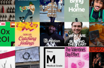
5. Choose the best charts, icons, and other visuals

Caption: This design has all sorts of engaging visuals to keep you hooked.
Infographics are a visual mode of communication. So keep the text only as a secondary character and let your icons, charts, and images shine.
What are the different kinds of visuals that you can use in your infographic? Let’s see.
- Your brand logo
- Different kinds of charts (bar charts, pie charts, graph charts, and more)
- Icons
- Illustrations
- Diagrams
- Maps
- Photos
- Emojis
- And more.
To ensure your infographics resonate with all segments of your audience, create inclusive visuals. Presentation matters and when people can see them in your data, they’ll feel included and more inclined to share what you have created with others.

Caption: We have used all sorts of visuals in this single infographic. Banners, textured fonts, symbols, graphics, illustrations, and whatnot.
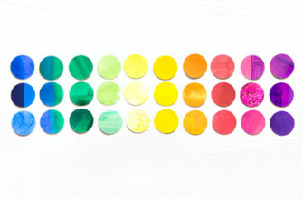
6. Make the most emotive use of colors

Caption: Colors are one of the most strategic choices designers and marketers make for brands.
We say words are powerful, but what about colors?
Colors impact us without ever uttering a sound. To ensure your infographics pack the mightiest punch, choose relevant colors that fit most naturally with your message. Writing about technology? Add a healthy smattering of blue and purple.
Talking about agricultural logos or something similar? How about a calming green palette?
If you are dividing your infographic into sections, colors again come in handy. Choose different shades or tints of the same color for a monochromatic palette or go crazy with different colors for different sections.
But don’t be chaotic. Choose colors that are harmonious together even if they are different.
7. Choose legible fonts
![[INFOGRAPHIC]: The 10 Commandments of Typography](https://www.designmantic.com/blog/wp-content/uploads/2014/04/font-infography.jpg "[INFOGRAPHIC]: The 10 Commandments of Typography")
Caption: Understanding the rules that guide the use of typography
Your text may not be the main character here but it still has an important role to play. Choose fonts that look good together and improve legibility.
Tools like FontJoy and others are a great help when you want some good type combo ideas.
The combinations you choose must also fit nicely with the rest of the design as well as the theme of your topic. If your subject is playful, you can choose a whimsical font. For something more serious, choose between serifs and sans serifs for a confident look.
Remember that your font will also impact your hierarchy. Serifs usually look better as header fonts while sans serifs have a higher legibility for body text. But don’t feel limited by these rules. Feel free to flip the script if the occasion calls for it.
8. Use contrast

Caption: The contrast of red and blue makes the information more appealing and authoritative
You need contrast to create an impact in your infographic. Stop people by their tracks (or cause their scrolling to cease) by creating drama and intrigue through contrast.
By placing two elements together that are nothing alike, you achieve contrast that not only attracts the eye but also improves hierarchy and meaning in the design.
Contrast is created through color, shape, font, and other differences and then placing those different elements in close proximity to each other.
9. Create a balanced design

Caption: A perfectly balanced infographic design
Your infographic design should look balanced and in proportion.
Now, balance doesn’t mean that all sides in the design should be equal in visual weight. It’s simpler than that. You create balance by giving each element in design its proper place in design.
Balance translates into a composition that’s harmonious and stable. Therefore, it can both be symmetrical and asymmetrical.
Symmetrical balance is where both sides of the composition are present as mirror images of each other. You look at symmetrical balance and don’t even notice it. You just take the entire picture as a whole. Think of comparison infographics that are divided into two columns. Mirror images. Equal weight.
An infographic with perfect symmetry:

Asymmetrical balance is more dynamic. The visual weight is more on one side than the other. It creates energy and movement. You have to engage with the design and take an active part in understanding it.
A high-energy asymmetrical infographic:

Asymmetrical compositions look their best when you make a timeline infographic. The movement flows and the story continues. Symmetrical compositions are naturally perfect for comparisons, dos and don’ts, and pros and cons lists.

Caption: A perfectly balanced infographic design
10. Leave plenty of negative space
![]()
Caption: We call it white space too but as you can see, it’s not always white.
We keep hyping up negative space in logo design, but the fact is, all great graphic design is made up of plentiful negative space.
Its benefits become tenfold when you are creating something as visually busy as an infographic. The more data you add, the more room you should leave for that data to breathe. Don’t cram all that stuff into a tight space and expect it to go anywhere.
It won’t.
Instead, surround it with white space from all four sides and between the lines too so people can read it without feeling rushed or suffocated.
11. Follow a consistent visual style

Caption: Thematic visuals create engaging graphics
Now that you have chosen all the important elements of design, it’s time to take a look at them to make sure they all follow a shared theme.
Visual consistency will keep the user hooked while distractions will cause them to stop mid-way.
Make sure that in addition to elements harmonizing with each other, it’s necessary for them to be in tune with the language of the data too.
So, for example, if you are writing about The Best Cursive Fonts For A Beauty Logo, you know the audience isn’t expecting anything hard-hitting. Plus, the beauty industry usually favors lighter colors, so use those for an on-brand infographic.
In the end, just let your data and your audience guide your hand. What works for them, works for your infographic.
Conclusion
In the world of information overload, infographics help you break down data and consume it bit by bit.
Simplifying complex ideas, infographics are the superheroes that engage your audience, enlighten them, and appeal to them to think deeper, make changes, and have fun doing it all.
To create infographics that go viral and become click-worthy, maximize the power of data visualization using the tips we’ve shared today. Transform your infographics into unforgettable visual masterpieces and make your message impossible to ignore.